Chapter 04. Linear Models
- this chapter introduce linear regression as a Bayesian procedure
- under a probability interpretation (necessary for Bayesian word), linear reg. uses a Gaussian distribution for uncertainty about the measurement of interest
4.1 Why normal distributions are normal
- example:
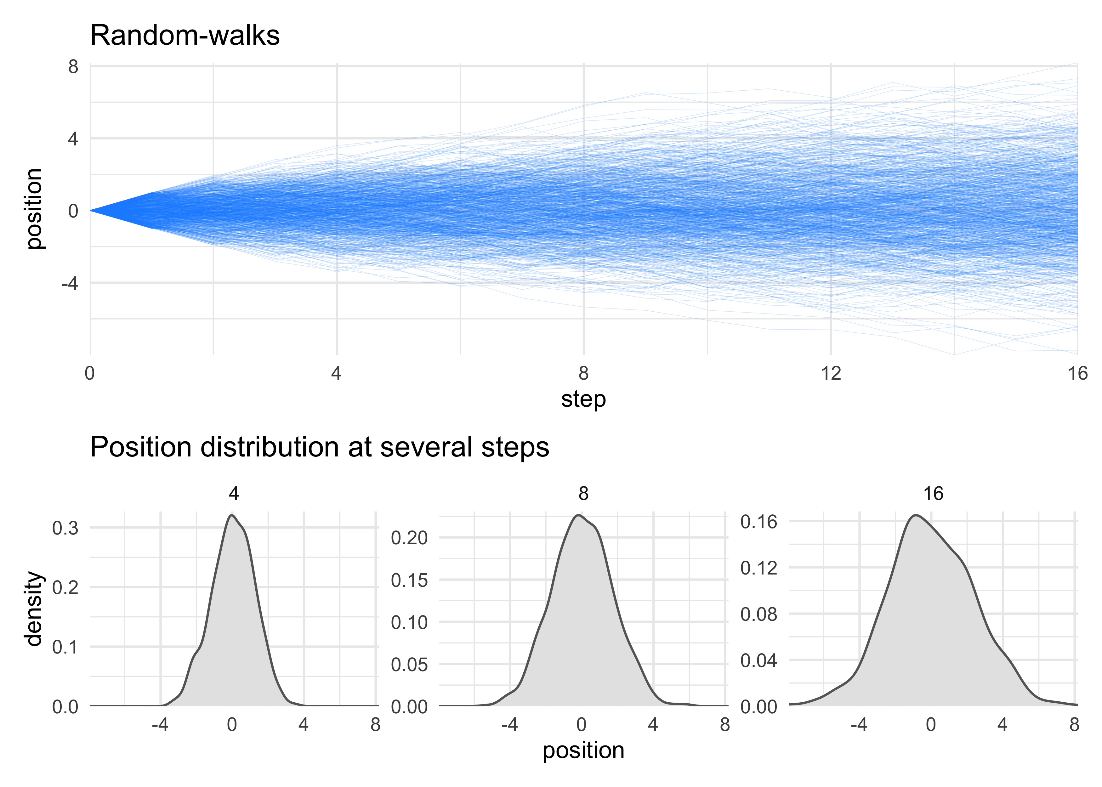
- you have 1,000 people stand at the half-way line of a soccer field
- they each flip a coin 16 times, moving left if the coin comes up heads, and right if it comes up tails
- the final distribution of people around the half-way line will be Gaussian even though the underlying model is binomial
4.1.1 Normal by addition
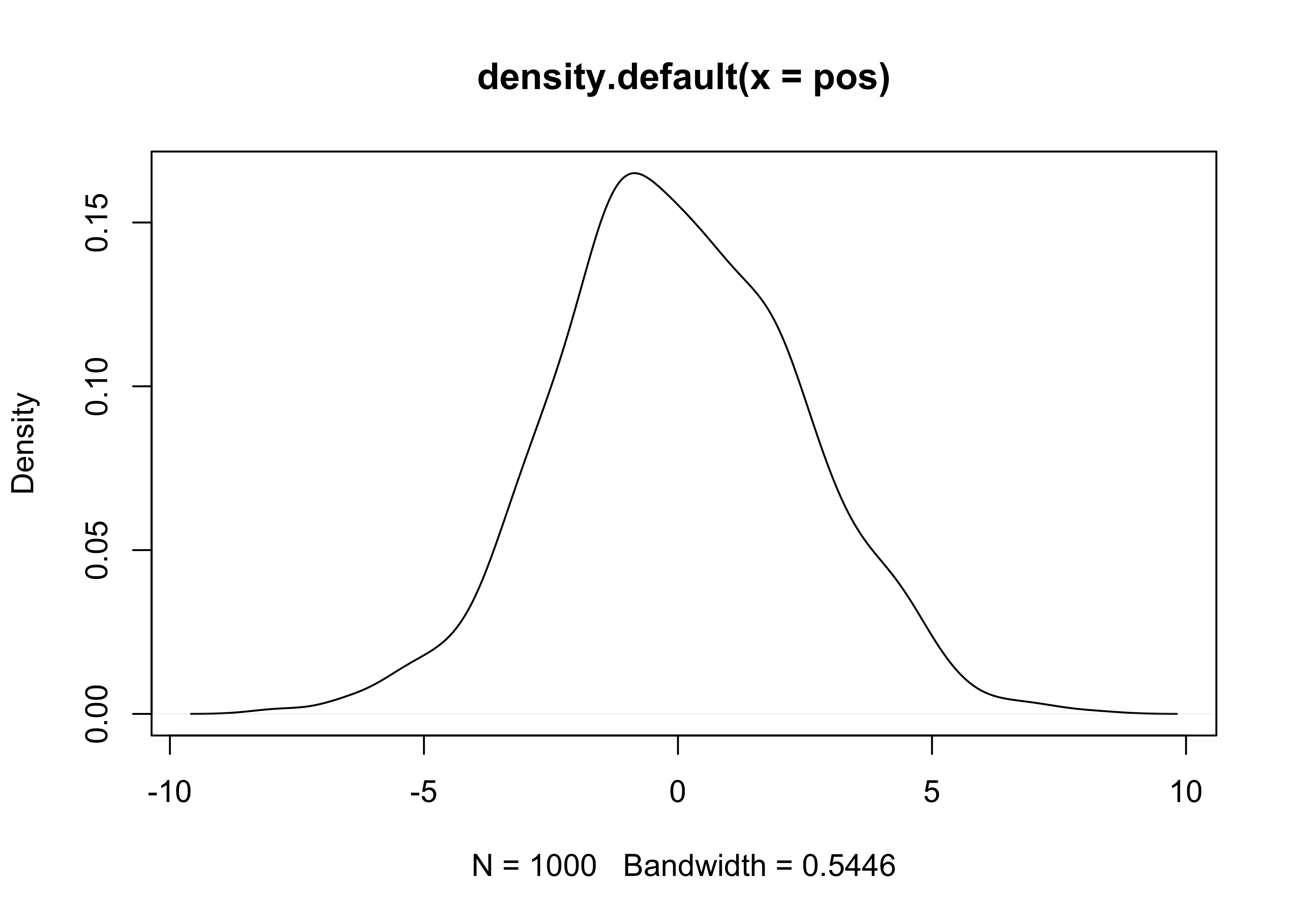
- we can simulate the above example
- to show that the underlying coin-flip is nothing special, we will instead use a random values between -1 and 1 for each person to step
pos <- replicate(1e3, sum(runif(16, -1, 1)))
plot(density(pos))
set.seed(0)

n_steps <- 16

position_data <- tibble(person = 1:1e3) %>%
    mutate(position = purrr::map(person, ~ c(0, cumsum(runif(n_steps, -1, 1))))) %>%
    unnest(position) %>%
    group_by(person) %>%
    mutate(step = 0:n_steps) %>%
    ungroup()

walks_plot <- position_data %>%
    ggplot(aes(x = step, y = position, group = person)) +
    geom_line(alpha = 0.2, size = 0.1, color = "dodgerblue") +
    scale_x_continuous(expand = c(0, 0)) +
    scale_y_continuous(expand = c(0, 0)) +
    labs(x = "step", y = "position",
         title = "Random-walks")

step_densities <- position_data %>%
    filter(step %in% c(4, 8, 16)) %>%
    ggplot(aes(x = position)) +
    facet_wrap(~ step, scales = "free_y", nrow = 1) +
    geom_density(fill = "grey90", color = "grey40") +
    scale_x_continuous(expand = c(0, 0)) +
    scale_y_continuous(expand = expansion(mult = c(0, 0.02))) +
    labs(x = "position",
         y = "density",
         title = "Position distribution at several steps")

walks_plot / step_densities + plot_layout(heights = c(3, 2))
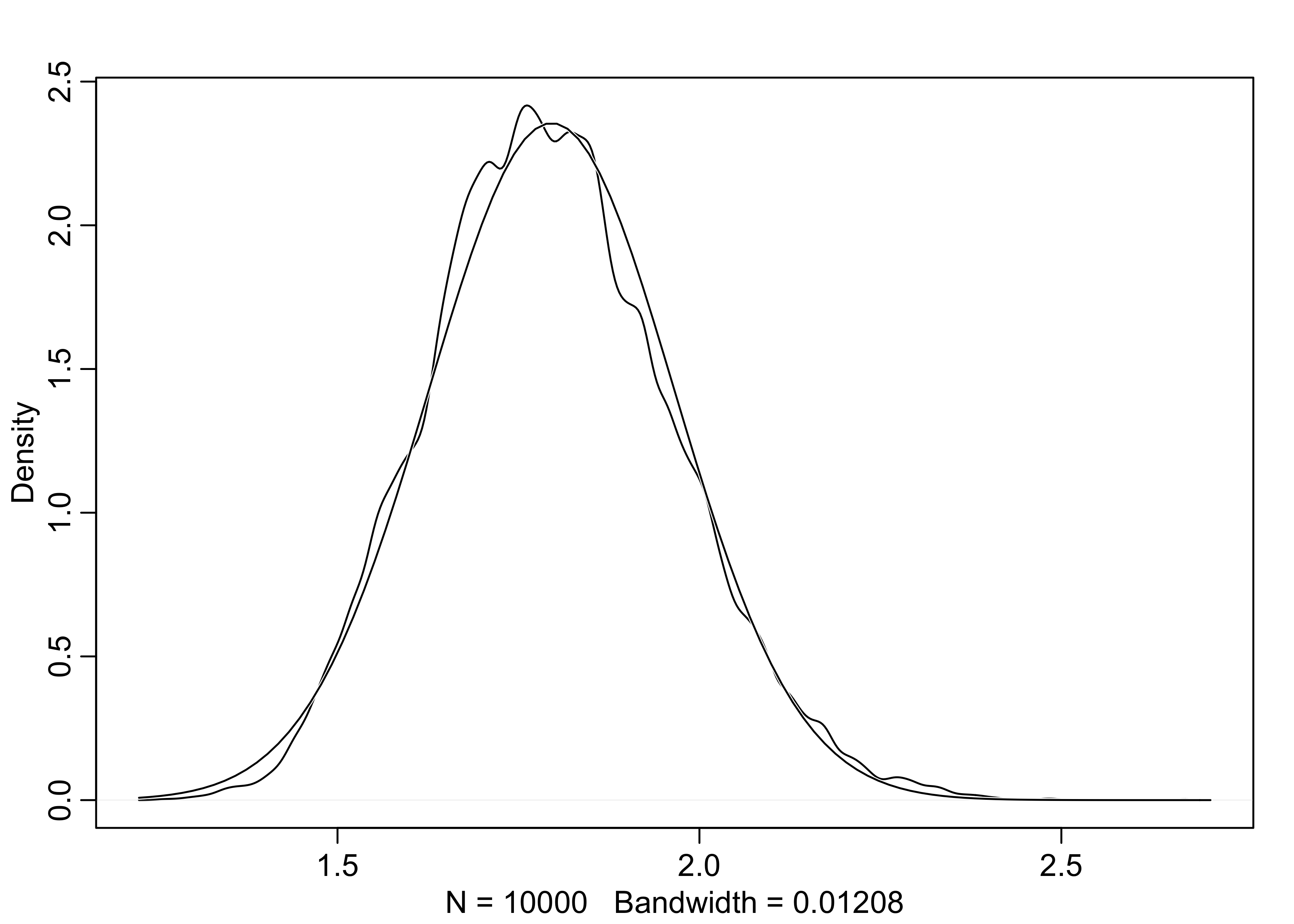
4.1.2 Normal by multiplication
- another example of how to get a normal distribution:
- the growth rate of an organism is influenced by a dozen loci, each with several alleles that code for more growth
- suppose that these loci interact with one another, and each increase growth by a percentage
- therefore, their effects multiply instead of add
- below is a simulation of sampling growth rates
- this distribution is approximately normal because the multiplication of small numbers is approximately the same as addition
# A single growth rate
prod(1 + runif(12, 0, 0.1))
#> [1] 1.846713
growth <- replicate(1e4, prod(1 + runif(12, 0, 0.1)))
dens(growth, norm.comp = TRUE)
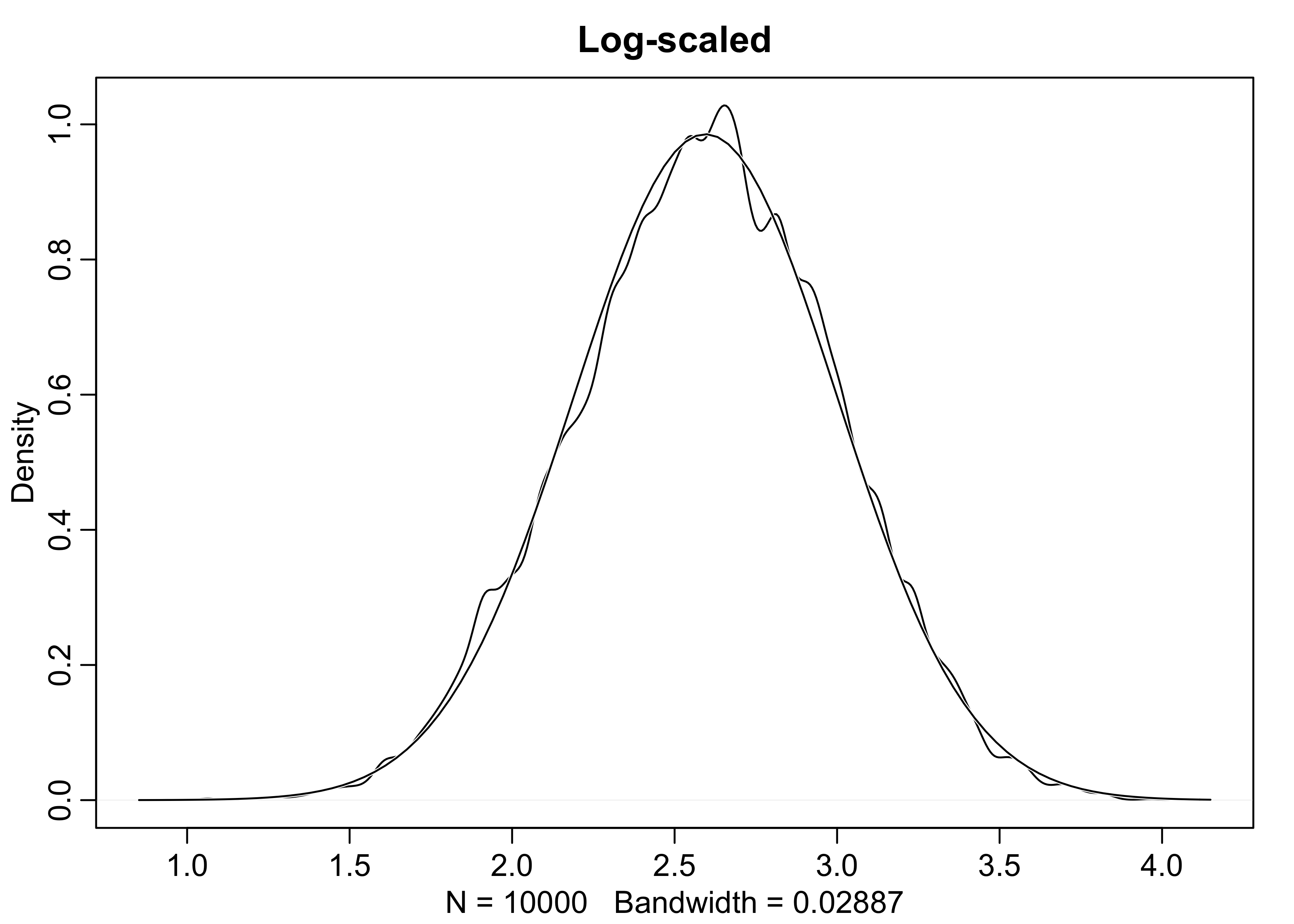
4.1.3 Normal by log-multiplication
- large deviates multiplied together produce Gaussian distributions on the log-scale
growth <- replicate(1e4, prod(1 + runif(12, 0, 0.5)))
dens(growth, norm.comp = TRUE, main = "Not scaled")
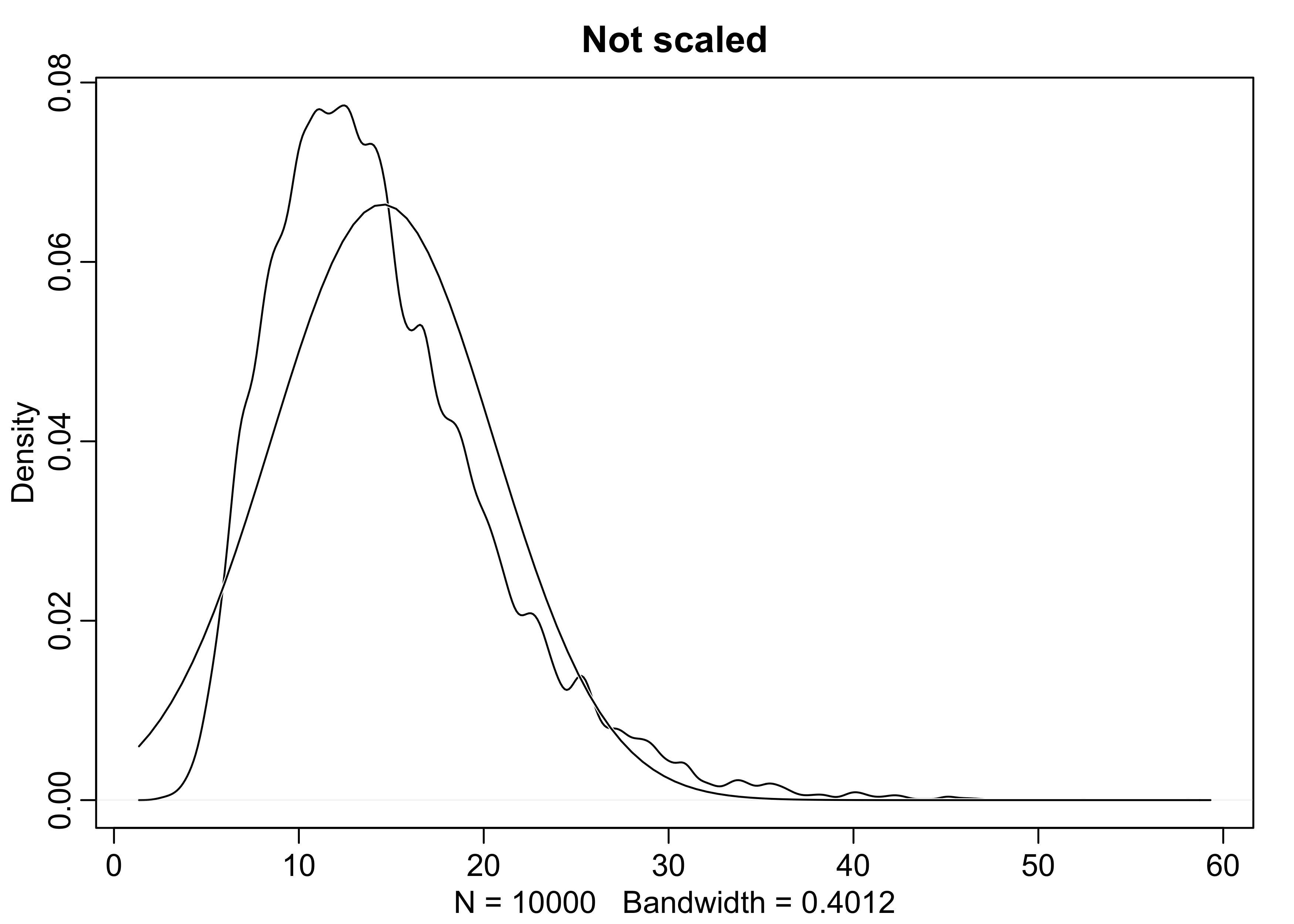
dens(log(growth), norm.comp = TRUE, main = "Log-scaled")
4.1.4 Using Gaussian distributions
- we will build models of measurements as aggregations of normal distributions
- this is appropriate because:
- the world is full of approximately normal distributions
- we often are quite ignorant of the underlying distribution so modeling it as a mean and variance is often the best we can do
4.2 A language for describing models
- here is an outline of the process commonly used:
- recognize a set of measurements to predict or understand - the outcome variables
- for each variable, define a likelihood distribution that defines
the plausibility of individual observations
- this is always Gaussian for linear regression
- recognize a set of other measurements to use to predict or understand the outcome - the predictor variables
- relate the shape of the likelihood distribution to the predictor variables
- choose priors for all parameters in the model; this is the initial state of the model before seeing any data
- summarize the model with math expressions; for example:
$$ \text{outcome}_i \sim \text{Normal}(\mu_i, \sigma) $$ $$ \mu_i = \beta \times \text{predictor}_i $$ $$ \beta \sim \text{Normal}(0, 10) $$ $$ \sigma \sim \text{HalfCauchy}(0, 1) $$
4.2.1 Re-describing the globe tossing model
- this example was trying to estimate the proportion of water $p$ of
a globe by tossing it and counting of how often our finger was on
water upon catching the globe
- it could be described as such where $w$ is the number of waters observed, $n$ is the total number of tosses, and $p$ is the proportion of the water on the globe
$$ w \sim \text{Binomial(n,p)} $$ $$ p \sim \text{Uniform}(0,1) $$
- this should be read as:
- “The count $w$ is distributed binomially with sample size $n$ and probability $p$.”
- “The prior for $p$ is assumed to be uniform between zero and one.”
4.3 A Gaussian model of height
- we will now build a linear regression model
- this section will build the scaffold
- the next will construct the predictor variable
- model a single measurement variable as a Gaussian distribution
- two parameters: $\mu$ = mean; $\sigma$ = standard deviation
- Bayesian updating will consider each possible combination of $\mu$ and $\sigma$ and provide a score for the plausibility of each
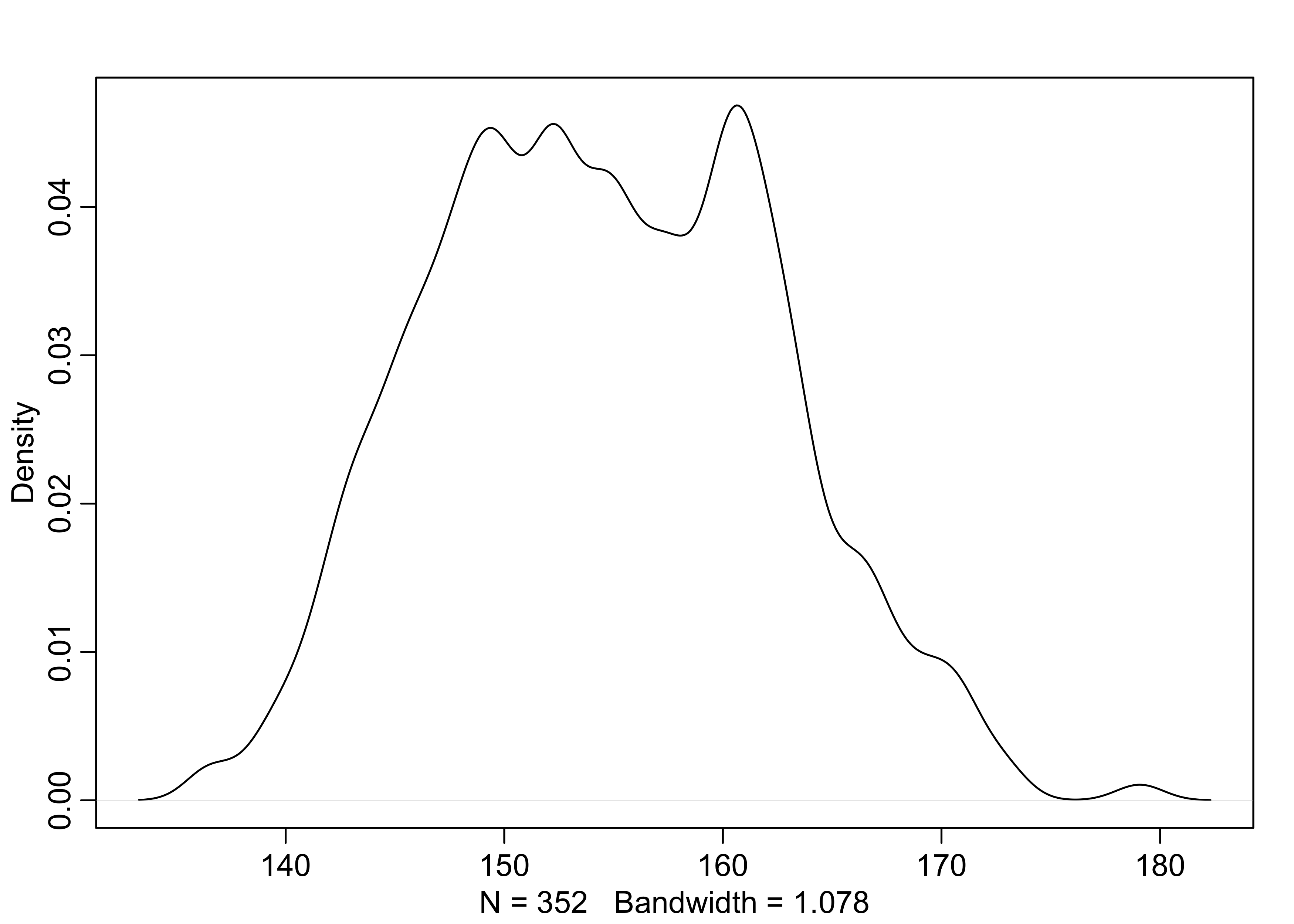
4.3.1 The data
- we will use the
Howll1data from the ‘rethinking’ package- we will use height information for people older that 18 years
data("Howell1")
d <- Howell1
str(d)
#> 'data.frame':    544 obs. of  4 variables:
#>  $ height: num  152 140 137 157 145 ...
#>  $ weight: num  47.8 36.5 31.9 53 41.3 ...
#>  $ age   : num  63 63 65 41 51 35 32 27 19 54 ...
#>  $ male  : int  1 0 0 1 0 1 0 1 0 1 ...
d2 <- d[d$age >= 18, ]
nrow(d2)
#> [1] 352
4.3.2 The model
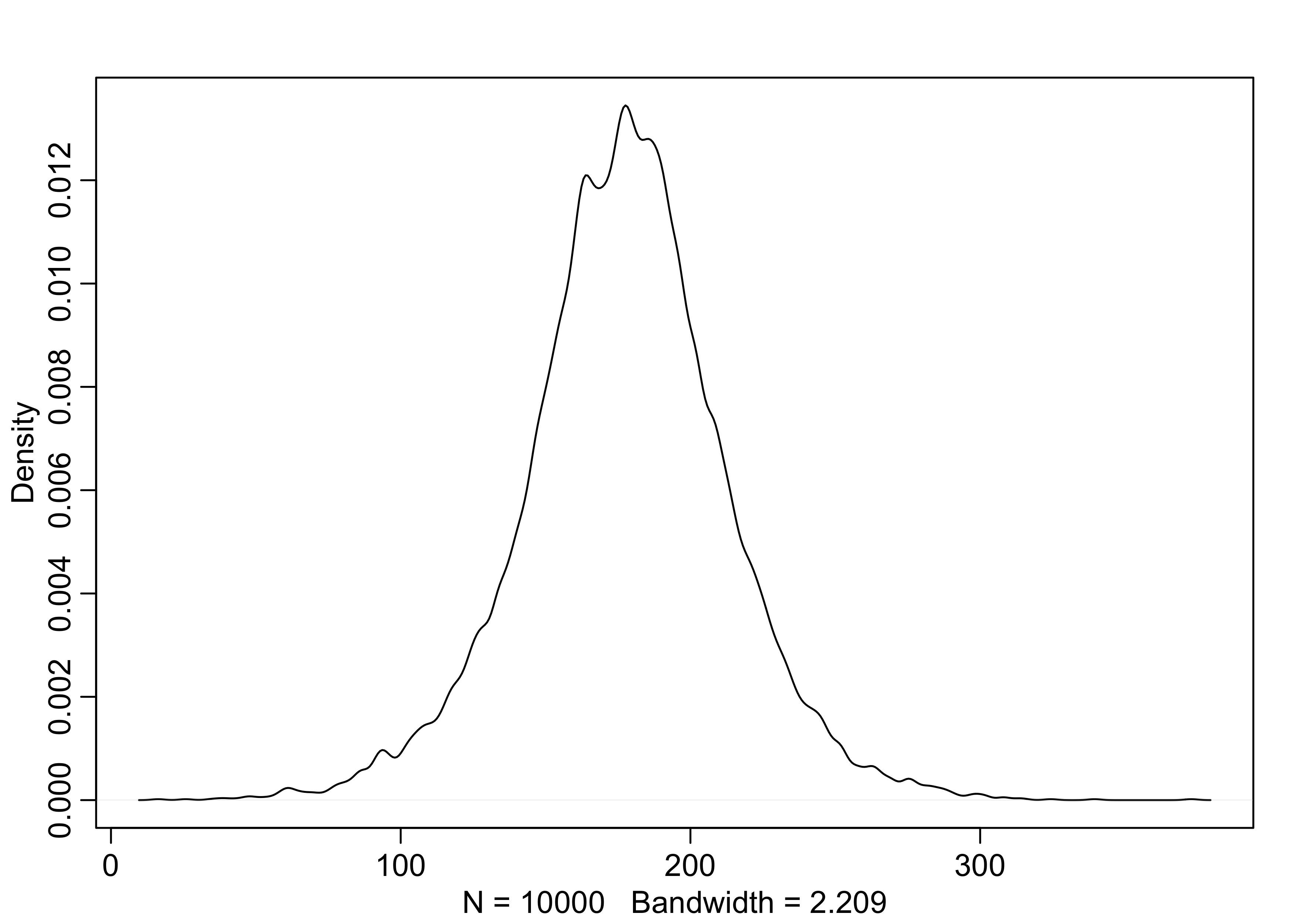
- the goal is to model these values using a Gaussian distribution
dens(d2$height)
- our model is
$$ h_i \sim \text{Normal}(\mu, \sigma) \quad \text{or} \quad h_i \sim \mathcal{N}(\mu, \sigma) $$
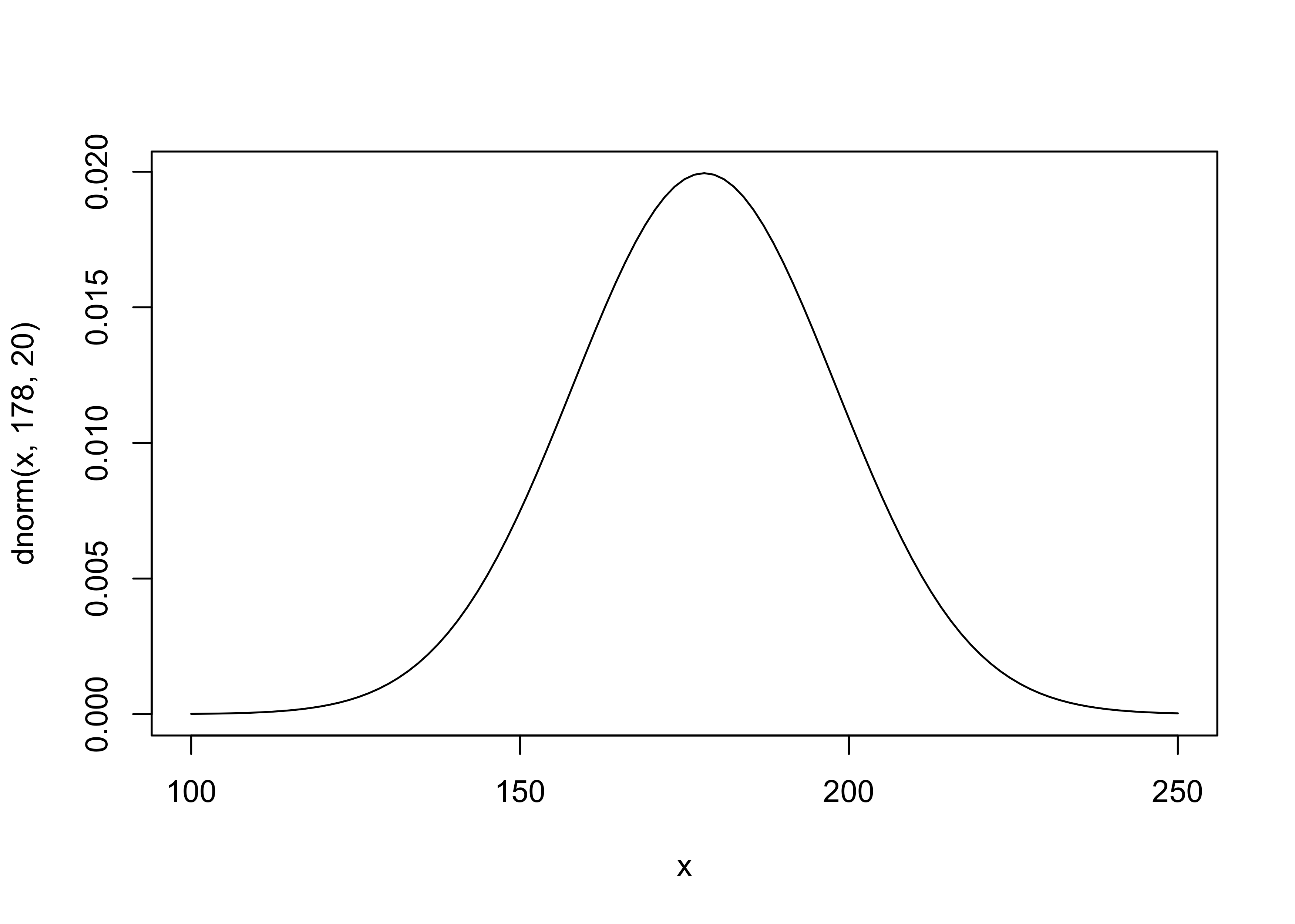
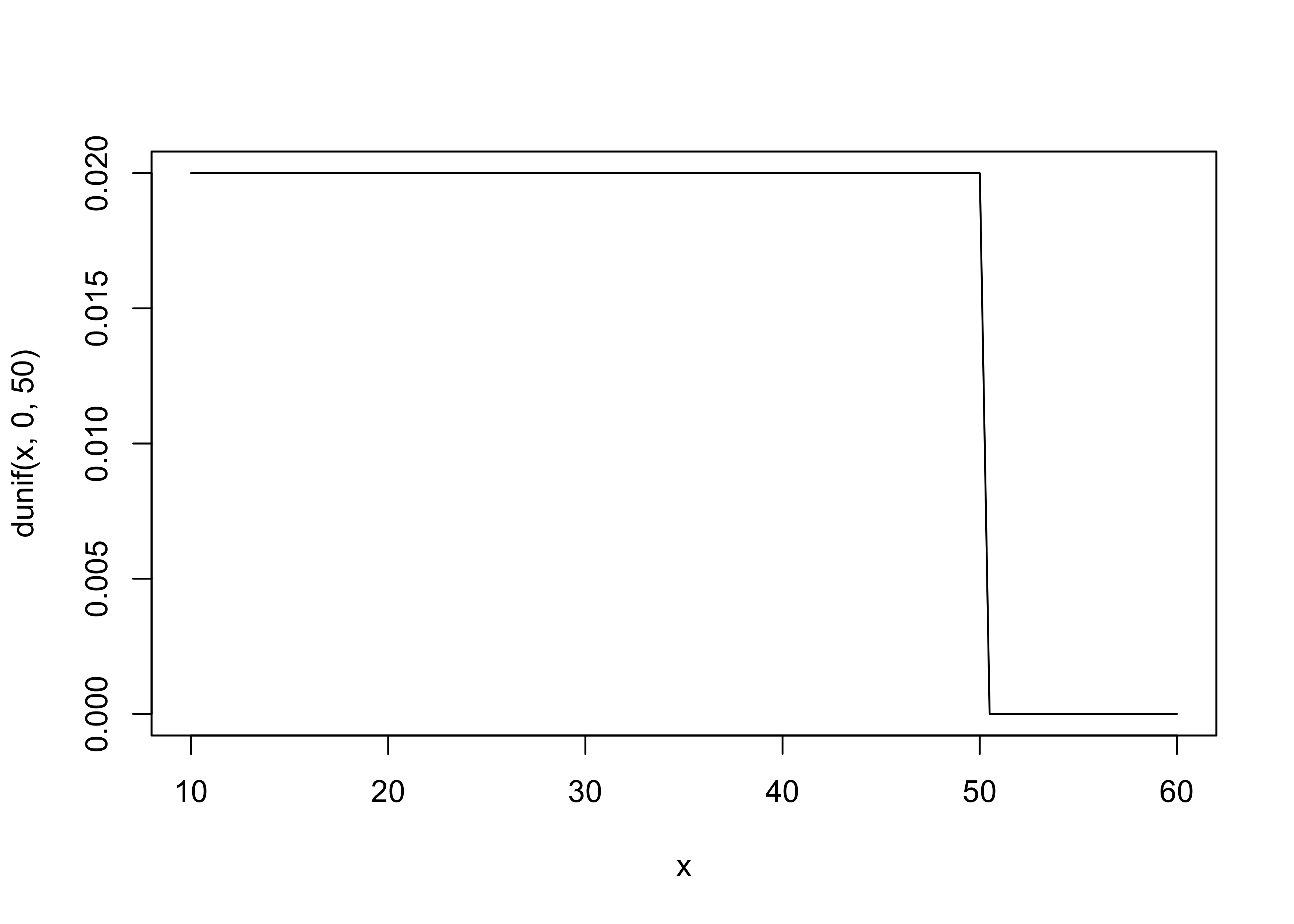
- the priors for the model parameters are below
- the mean and s.d. for the normal distribution for $\mu$ were just chosen by the author as likely a good guess for the average heights
$$ \mu \sim \mathcal{N}(178, 20) $$ $$ \sigma \sim \text{Uniform}(0, 50) $$
- it is often good to plot the priors
curve(dnorm(x, 178, 20), from = 100, to = 250)
curve(dunif(x, 0, 50), from = 10, to = 60)
- we can sample from the priors to build our “expected” distribution
of heights
- its the relative plausibility of different heights before seeing any data
sample_mu <- rnorm(1e4, 178, 20)
sample_sigma <- runif(1e4, 0, 50)

prior_h <- rnorm(1e4, sample_mu, sample_sigma)

dens(prior_h)
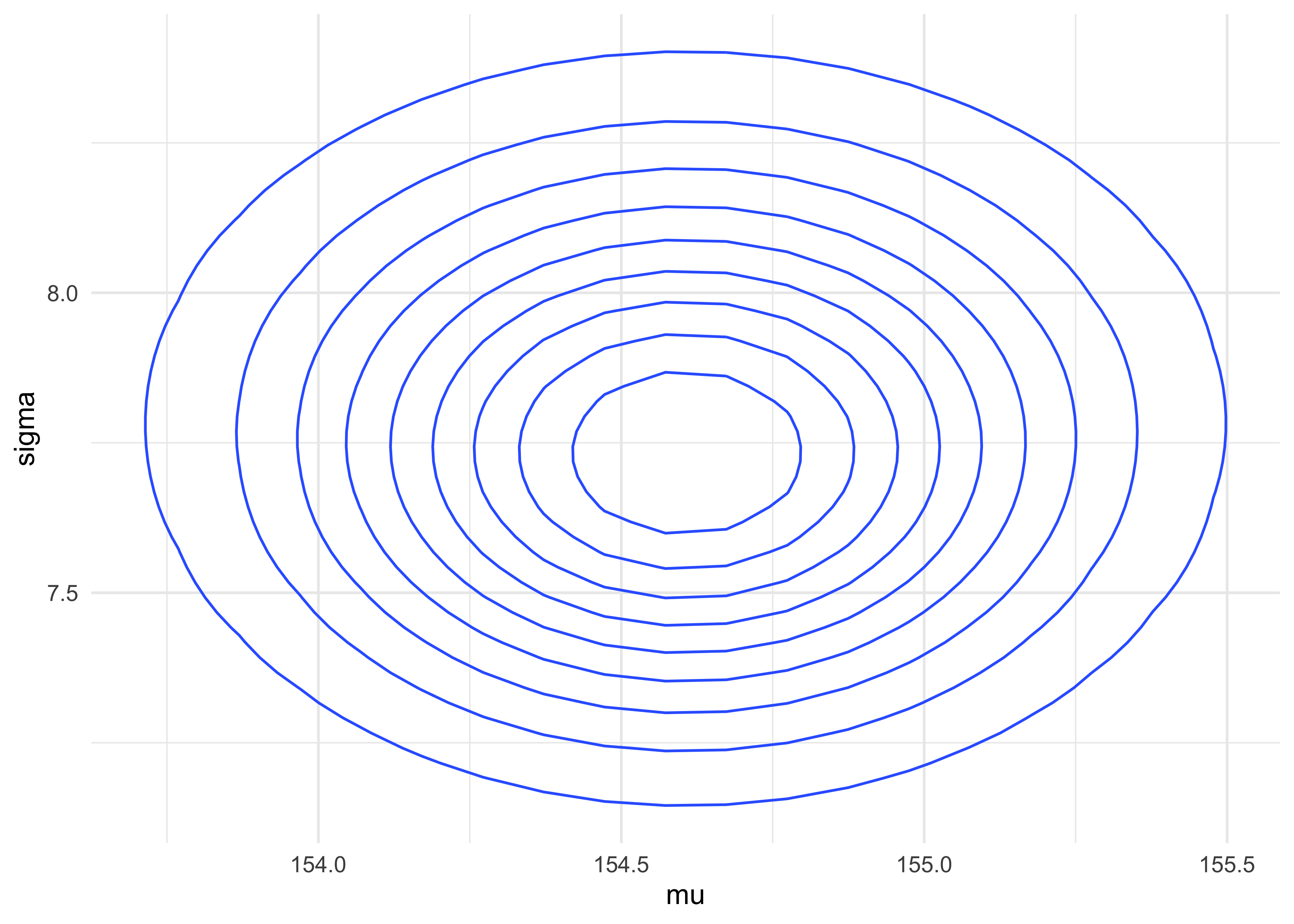
4.3.3 Grid approximation of the posterior distribution
- as an example, we will map the posterior distribution using brute
force
- later, we will switch to the quadratic approximation that we will use for the next few chapters
- we use a few shortcuts here, including summing the log likelihood instead of multiplying the likelihoods
mu_list <- seq(from = 140, to = 160, length.out = 200)
sigma_list <- seq(from = 4, to = 9, length.out = 200)

post <- expand.grid(mu = mu_list, sigma = sigma_list)
head(post)
#>         mu sigma
#> 1 140.0000     4
#> 2 140.1005     4
#> 3 140.2010     4
#> 4 140.3015     4
#> 5 140.4020     4
#> 6 140.5025     4
set.seed(0)

post$LL <- pmap_dbl(post, function(mu, sigma, ...) {
    sum(dnorm(
        d2$height,
        mean = mu,
        sd = sigma,
        log = TRUE
    ))
})

post$prod <- post$LL + dnorm(post$mu, 178, 20, log = TRUE) + dunif(post$sigma, 0, 500, log = TRUE)

post$prob <- exp(post$prod - max(post$prod))
post %>%
    as_tibble() %>%
    ggplot(aes(x = mu, y = sigma, z = prob)) +
    geom_contour()
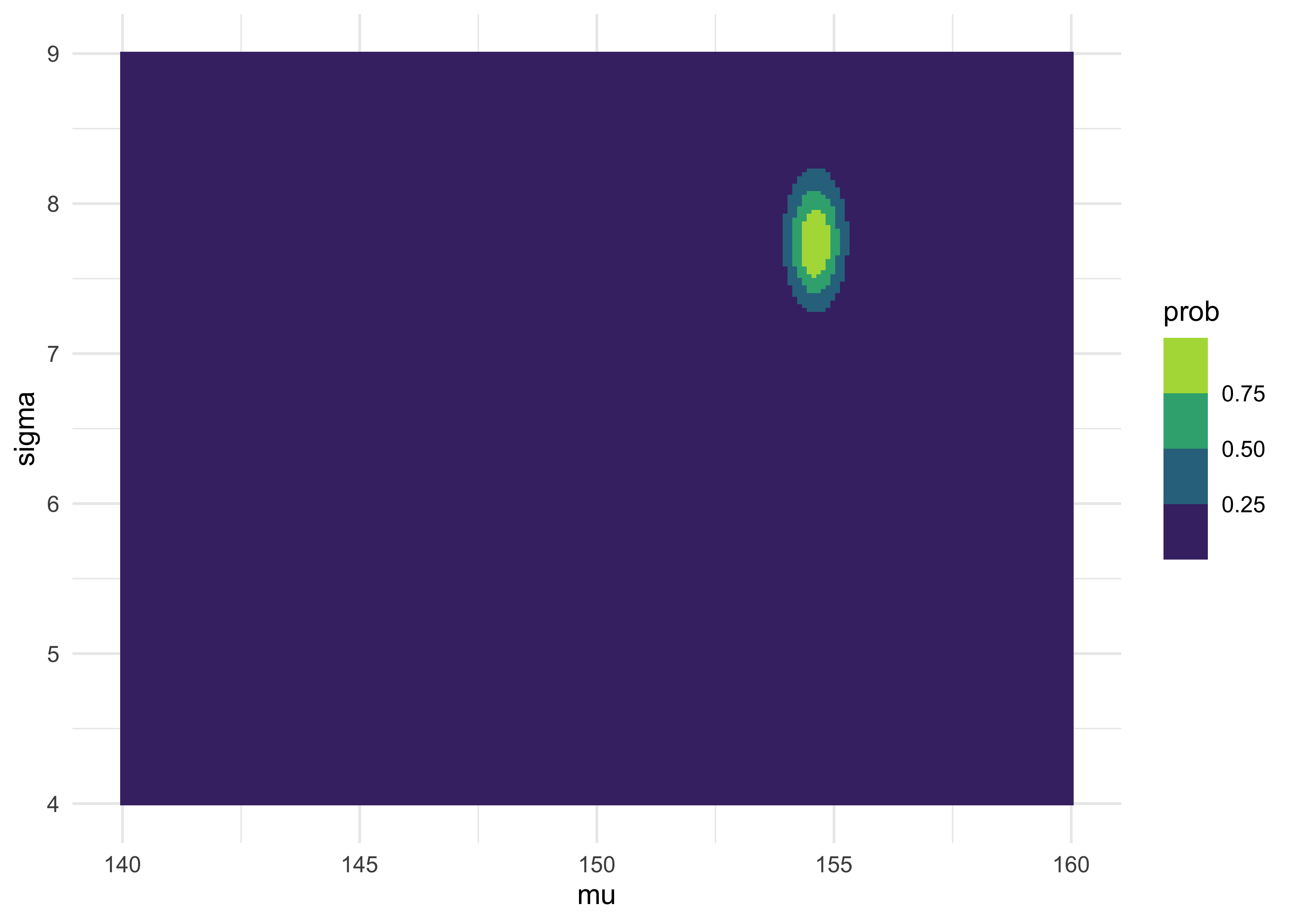
as_tibble(post) %>%
    ggplot(aes(x = mu, y = sigma, fill = prob)) +
    geom_tile(color = NA) +
    scale_fill_viridis_b()
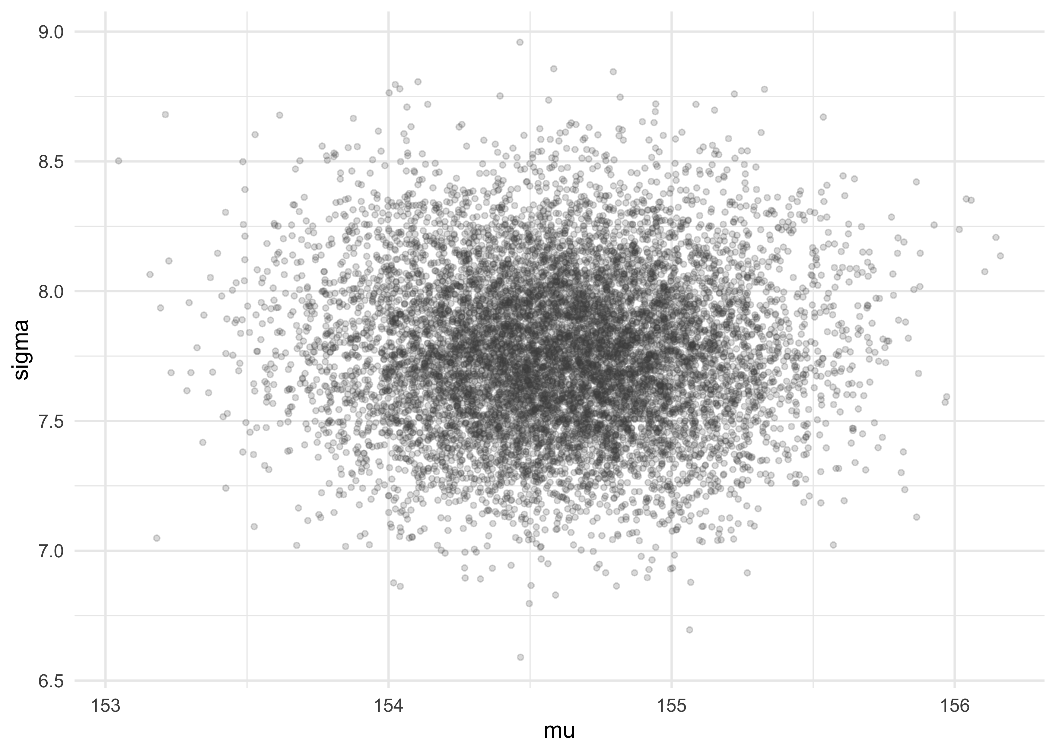
4.3.4 Sampling from the posterior
- we sample from the posterior just like normal, except now we get pairs of parameters
sample_rows <- sample(1:nrow(post),
                      size = 1e4,
                      replace = TRUE,
                      prob = post$prob)
sample_mu <- post$mu[sample_rows]
sample_sigma <- post$sigma[sample_rows]
tibble(mu = sample_mu, sigma = sample_sigma) %>%
    ggplot(aes(x = mu, y = sigma)) +
    geom_jitter(size = 1, alpha = 0.2, color = "grey30",
                width = 0.1, height = 0.1)
- now we can describe these parameters just like data
- the distributions are the results
tibble(name = c(rep("mu", 1e4), rep("sigma", 1e4)),
       value = c(sample_mu, sample_sigma)) %>%
    ggplot(aes(x = value)) +
    facet_wrap(~ name, nrow = 1, scales = "free") +
    geom_density(fill = "grey90", alpha = 0.5)
cat("HPDI of mu:\n")
#> HPDI of mu:
HPDI(sample_mu)
#>    |0.89    0.89|
#> 153.8693 155.1759
cat("\nHPDI of sigma:\n")
#>
#> HPDI of sigma:
HPDI(sample_sigma)
#>    |0.89    0.89|
#> 7.291457 8.221106
4.3.5 Fitting the model with map()
Note that the map() function has been changed to quap() in the 2nd
Edition of the course.
- now we can use the
quap()function to conduct the quadratic approximation of the posterior - recall that this is the model definition:
$$ h_i \sim \text{Normal}(\mu, \sigma) $$ $$ \mu \sim \text{Normal}(178, 20) $$ $$ \sigma \sim \text{Uniform}(0, 50) $$
- first, we copy this formula into an
alist
formula_list <- alist(
    height ~ dnorm(mu, sigma),
    mu ~ dnorm(178, 20),
    sigma ~ dunif(0, 50)
)
formula_list
#> [[1]]
#> height ~ dnorm(mu, sigma)
#>
#> [[2]]
#> mu ~ dnorm(178, 20)
#>
#> [[3]]
#> sigma ~ dunif(0, 50)
- then we can fit the model to the data using
quap()and the data ind2
m4_1 <- quap(formula_list, data = d2)
summary(m4_1)
#>             mean        sd       5.5%     94.5%
#> mu    154.607032 0.4120116 153.948558 155.26551
#> sigma   7.731651 0.2914160   7.265912   8.19739
4.3.6 Sampling from a map fit
- the quadratic approximation to a posterior dist. with multiple
parameters is just a multidimensional Gaussian distribution
- therefore, it can be described by its variance-covariance matrix
vcov(m4_1)
#>                 mu        sigma
#> mu    0.1697535649 0.0002182476
#> sigma 0.0002182476 0.0849232811
- the variance-covariance matrix tells us how the parameters relate to each other
- it can be decomposed into two pieces:
- the vector of variances for the parameters
- a correlation matrix that tells us how the changes in one parameter lead to a correlated change in the others
cat("Covariances:\n")
#> Covariances:
diag(vcov(m4_1))
#>         mu      sigma
#> 0.16975356 0.08492328
cat("\nCorrelations:\n")
#>
#> Correlations:
cov2cor(vcov(m4_1))
#>                mu       sigma
#> mu    1.000000000 0.001817718
#> sigma 0.001817718 1.000000000
- instead of sampling single values from a simple Gaussian
distribution, we sample vectors of values from a multi-dimensional
Gaussian distribution
- the
extract.samples()function from ‘rethinking’ does this for us
- the
post <- extract.samples(m4_1, n = 1e4)
head(post)
#>         mu    sigma
#> 1 154.1145 7.599922
#> 2 154.8011 7.305567
#> 3 154.7124 7.813402
#> 4 154.6557 7.511392
#> 5 154.9872 8.218177
#> 6 154.5500 7.601779
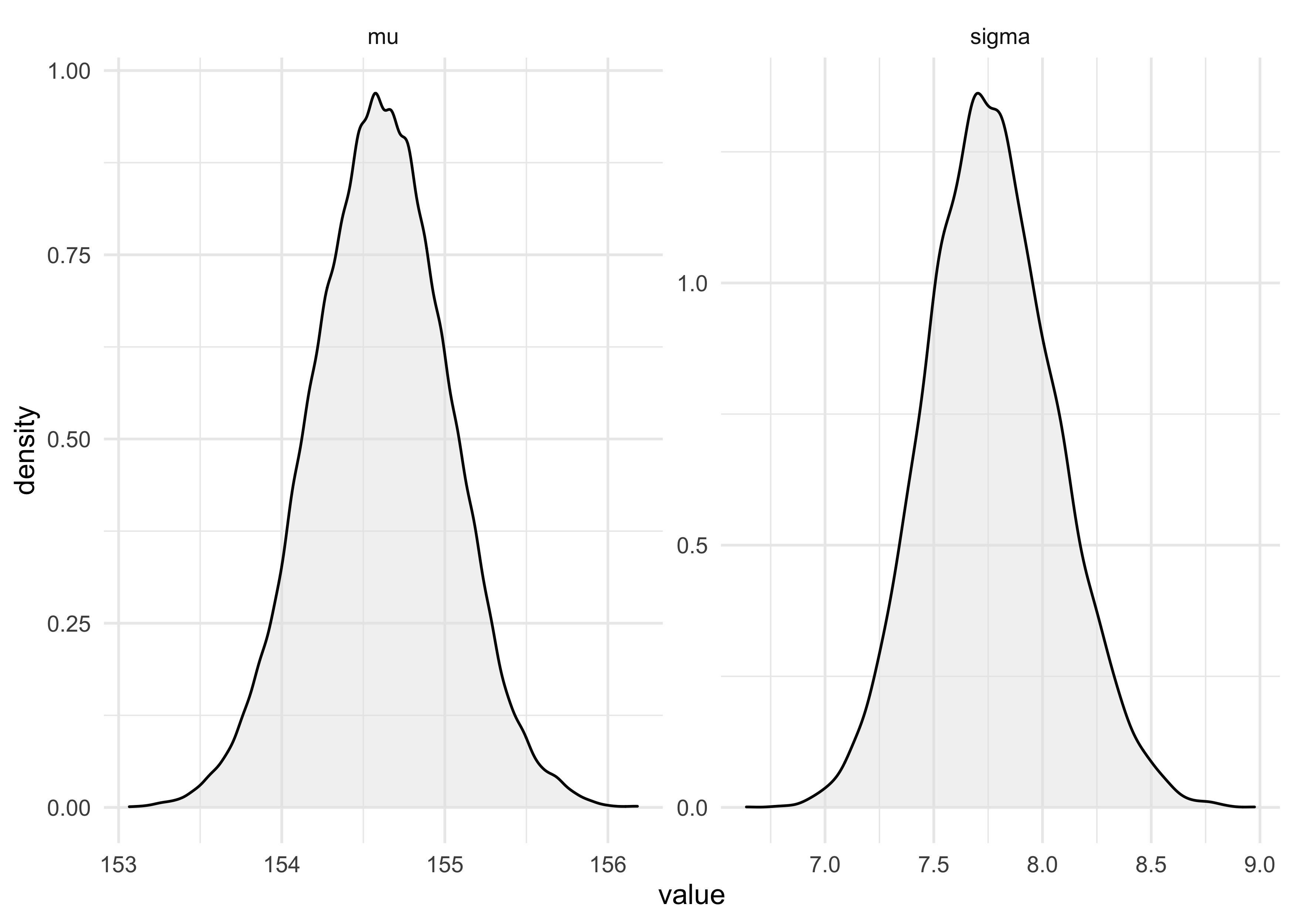
precis(post)
#>             mean        sd       5.5%      94.5%    histogram
#> mu    154.605370 0.4174050 153.935029 155.272336      ▁▁▅▇▂▁▁
#> sigma   7.733771 0.2884477   7.275115   8.193431 ▁▁▁▂▅▇▇▃▁▁▁▁
4.4 Adding a predictor
- above, we created a Gaussian model of height in a population of
adults
- by adding a predictor, we can make a linear regression
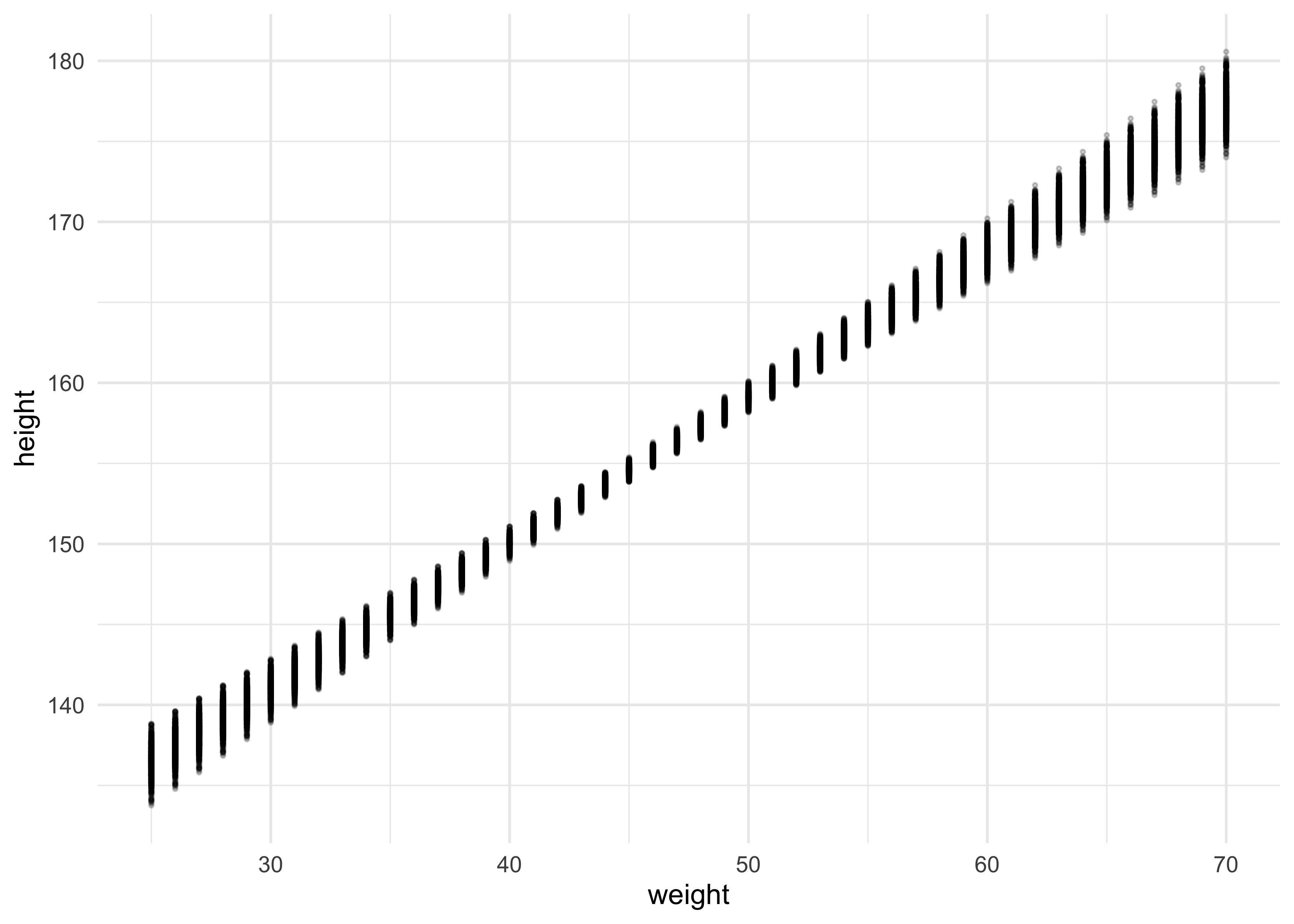
- for this example, we will see how height covaries with height
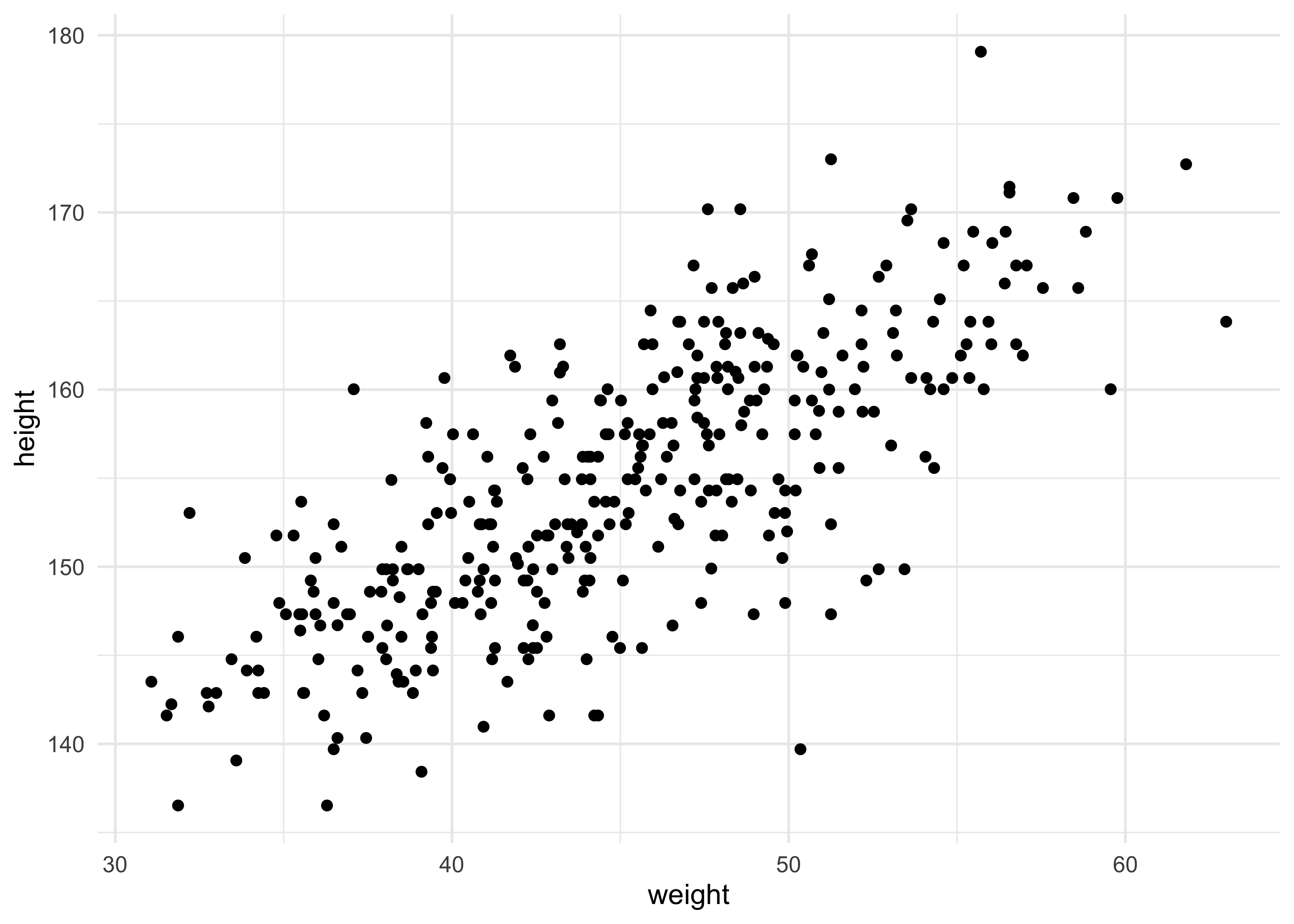
d2 %>%
    ggplot(aes(x = weight, y = height)) +
    geom_point()
4.4.1 The linear model strategy
- the strategy is to make the parameter for the mean of a Gaussian dist., $\mu$, into a linear function of the predictor variable and other, new parameters we make
- some of the parameters of the linear model indicate the strength of
association between the mean of the outcome and the value of the
predictor
- the posterior provides relative plausibilities of the different possible strengths of association
- here is the formula for the linear model
- let $x$ be the mathematical name for the weight measurements
- we model the mean $\mu$ as a function of $x$
$$ h_i \sim \text{Normal}(\mu_i, \sigma) $$ $$ \mu_i = \alpha + \beta x_i $$ $$ \alpha \sim \text{Normal}(178, 100) $$ $$ \beta \sim \text{Normal}(0, 10) $$ $$ \sigma \sim \text{Uniform}(0, 50) $$ $$ $$
4.4.2 Fitting the model
m4_3 <- quap(
    alist(
        height ~ dnorm(mu, sigma),
        mu <- a + b*weight,
        a ~ dnorm(178, 100),
        b ~ dnorm(0, 10),
        sigma ~ dunif(0, 50)
    ),
    data = d2
)
summary(m4_3)
#>              mean         sd        5.5%       94.5%
#> a     113.9033852 1.90526701 110.8584005 116.9483699
#> b       0.9045063 0.04192009   0.8375099   0.9715027
#> sigma   5.0718671 0.19115324   4.7663673   5.3773669
4.4.3 Interpreting the model fit
- we can inspect fit models using tables and plots
- the following questions can be answered by plotting posterior
distribution and posterior predictions
- whether or not the model fitting procedure worked correctly
- the absolute magnitude, rather than just relative magnitude, of a relationship between outcome and predictor
- the uncertainty around an average relationship
- the uncertainty surrounding the implied predictions of the model
4.4.3.1 Tables of estimate
- models cannot in general be understood by tables of estimates
- only the simplest of models (such as our current example) can be
- here is how to understand the summary results of our
weight-to-height model:
- $\beta$ is a slope of 0.90: “a person 1 kg heavier is expected
to be 0.90 cm taller”
- 89% of the posterior probability lies between 0.84 and 0.97
- this suggests strong evidence for a positive relationship between weight and height
- $\alpha$ (intercept) indicates that a person of weight 0 should be 114 cm tall
- $\sigma$ informs us of the width of the distribution of heights around the mean
- $\beta$ is a slope of 0.90: “a person 1 kg heavier is expected
to be 0.90 cm taller”
precis(m4_3)
#>              mean         sd        5.5%       94.5%
#> a     113.9033852 1.90526701 110.8584005 116.9483699
#> b       0.9045063 0.04192009   0.8375099   0.9715027
#> sigma   5.0718671 0.19115324   4.7663673   5.3773669
- we can also inspect the correlation of parameters
- there is strong correlation between
aandbbecause this is such a simple model: changing the slope would also change the intercept in the opposite direction - in more complex models, this can hinder fitting the model
- there is strong correlation between
cov2cor(vcov(m4_3))
#>                   a             b         sigma
#> a      1.0000000000 -0.9898830254  0.0009488233
#> b     -0.9898830254  1.0000000000 -0.0009398017
#> sigma  0.0009488233 -0.0009398017  1.0000000000
- one way to avoid correlation is by centering the data
- subtracting the mean of the variable from each value
- this removes the correlation between
aandbin our model - but also $\alpha$ (
a, the y-intercept) became the value of the mean of the heights- this is because the intercept is the value when the predictors are 0 and now the mean of the predictor is 0
d2$weight_c <- d2$weight - mean(d2$weight)

m4_4 <- quap(
    alist(
        height ~ dnorm(mu, sigma),
        mu <- a + b*weight_c,
        a ~ dnorm(178, 100),
        b ~ dnorm(0, 10),
        sigma ~ dunif(0, 50)
    ),
    data = d2
)
summary(m4_4)
#>              mean         sd        5.5%       94.5%
#> a     154.5974770 0.27030258 154.1654813 155.0294727
#> b       0.9050075 0.04192321   0.8380061   0.9720089
#> sigma   5.0713444 0.19110397   4.7659234   5.3767655
cov2cor(vcov(m4_4))
#>                   a             b         sigma
#> a      1.000000e+00 -4.169566e-09  1.071719e-04
#> b     -4.169566e-09  1.000000e+00 -3.890539e-05
#> sigma  1.071719e-04 -3.890539e-05  1.000000e+00
4.4.3.2 Plotting posterior inference against the data
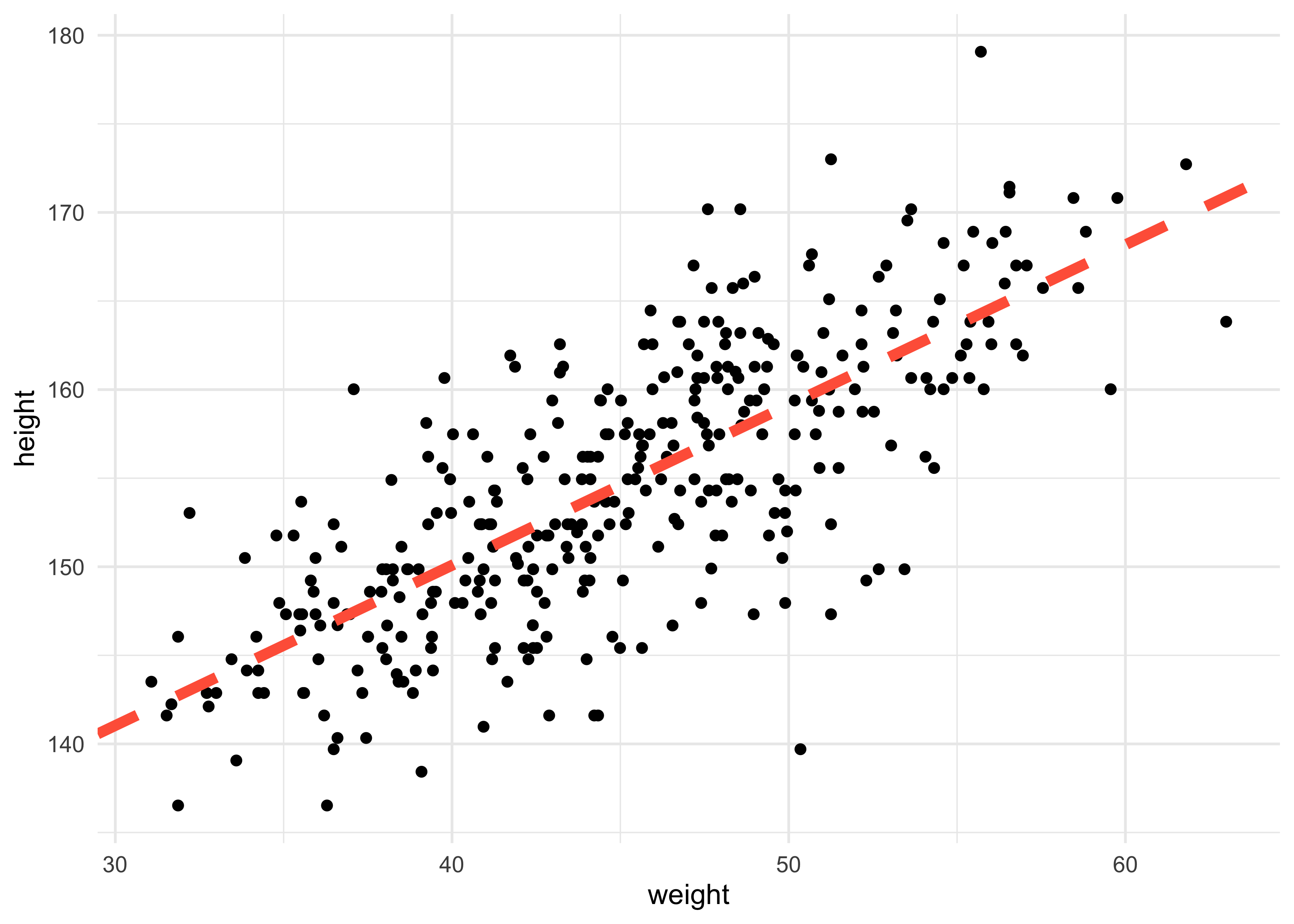
- we can start by adding the MAP values for the mean height over the actual data
a_map <- coef(m4_3)["a"]
b_map <- coef(m4_3)["b"]

d2 %>%
    ggplot(aes(x = weight, y = height)) +
    geom_point() +
    geom_abline(slope = b_map, intercept = a_map, lty = 2, size = 2, color = "tomato")
4.4.3.3 Adding uncertainty around the mean
- we could display uncertainty of the model by plotting many lines on the data
post <- extract.samples(m4_3)
head(post)
#>          a         b    sigma
#> 1 116.4236 0.8412152 5.041186
#> 2 114.0396 0.9071210 4.853101
#> 3 115.1166 0.8780719 5.232571
#> 4 118.4739 0.7949162 5.231642
#> 5 113.7912 0.9102064 5.199805
#> 6 116.0722 0.8559793 5.161445
d2 %>%
    ggplot(aes(x = weight, y = height)) +
    geom_point(color = "grey30") +
    geom_abline(data = post,
                aes(slope = b, intercept = a),
                alpha = 0.1, size = 0.1, color = "grey70") +
    geom_abline(slope = b_map, intercept = a_map,
                lty = 2, size = 1.3, color = "tomato")
4.4.3.4 Plotting regression intervals and contours
- we can compute any interval using this cloud of regression lines and plot a shaded region around the MAP line
- lets begin by focusing just on a single weight value, 50
- we can make a list of 10,000 values of $\mu$ for an individual who weights 50 kg
# mu = a + b * x
mu_at_50 <- post$a + post$b * 50
plot(density(mu_at_50), xlab = "mu | weight=50")
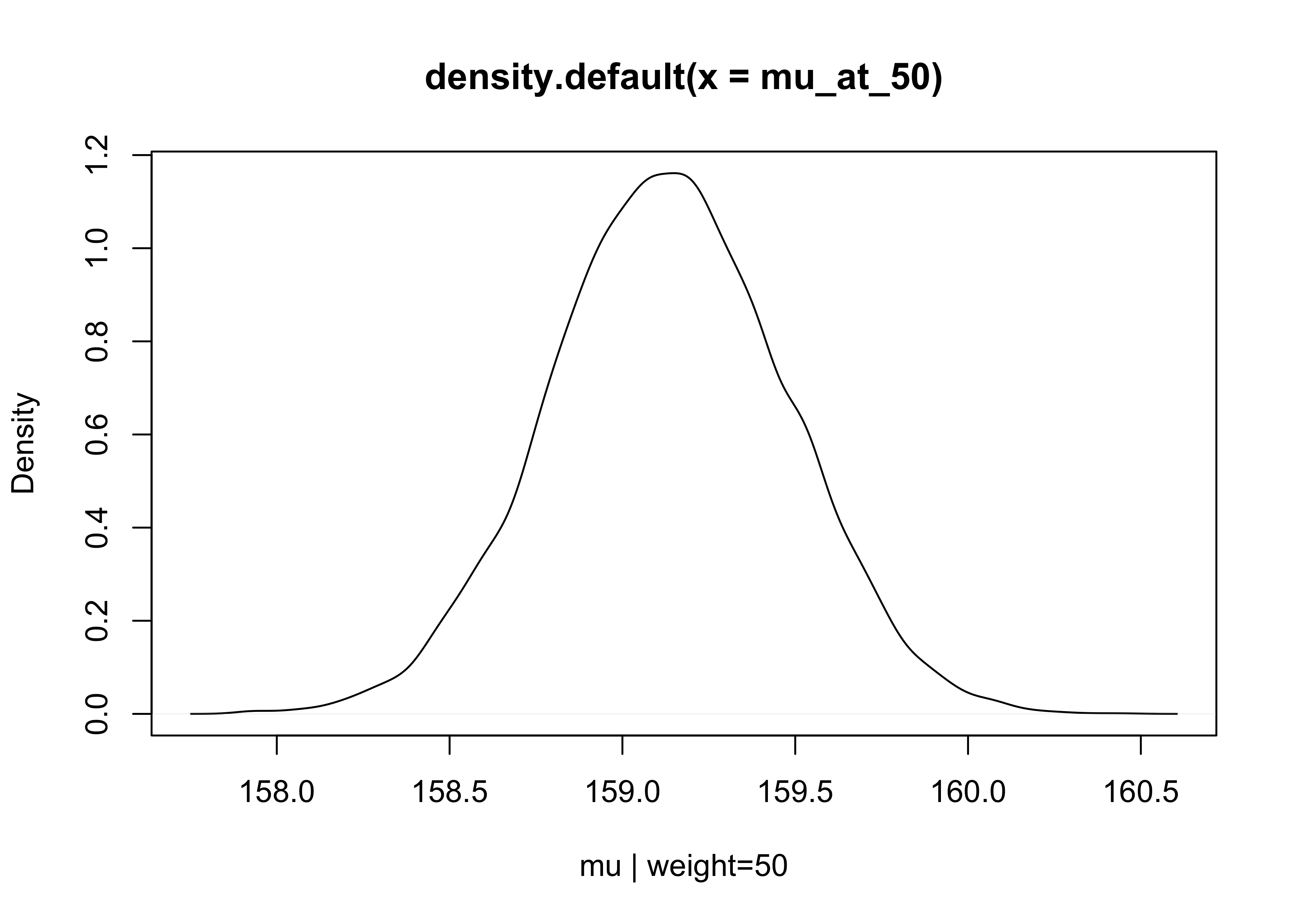
- since the posterior for $\mu$ is a distribution, we can calculate the HDPI intervals to find the 89% highest posterior density intervals
HPDI(mu_at_50)
#>    |0.89    0.89|
#> 158.5909 159.6806
- we can use the
link()function from ‘rethinking’ to sample from the posterior and compute $\mu$ for each case in the data and sample from the posterior
mu <- link(m4_3)

# row: sample from the posterior; column: each individual in the data
dim(mu)
#> [1] 1000 352
mu[1:5, 1:5]
#>          [,1]     [,2]     [,3]     [,4]     [,5]
#> [1,] 157.2735 146.5395 142.1654 162.2111 151.0746
#> [2,] 156.8582 145.7179 141.1782 161.9828 150.4247
#> [3,] 156.9177 145.9155 141.4321 161.9787 150.5639
#> [4,] 157.5256 146.8543 142.5057 162.4343 151.3629
#> [5,] 157.1968 146.7853 142.5426 161.9861 151.1841
- however, we want something slightly different, so we must pass
link()each value from the x-axis (weight)
weight_seq <- seq(25, 70, by = 1)
mu <- link(m4_3, data = data.frame(weight = weight_seq))

dim(mu)
#> [1] 1000 46
as_tibble(as.data.frame(mu)) %>%
    set_names(as.character(weight_seq)) %>%
    pivot_longer(tidyselect::everything(),
                 names_to = "weight",
                 values_to = "height") %>%
    mutate(weight = as.numeric(weight)) %>%
    ggplot(aes(weight, height)) +
    geom_point(size = 0.5, alpha = 0.2)
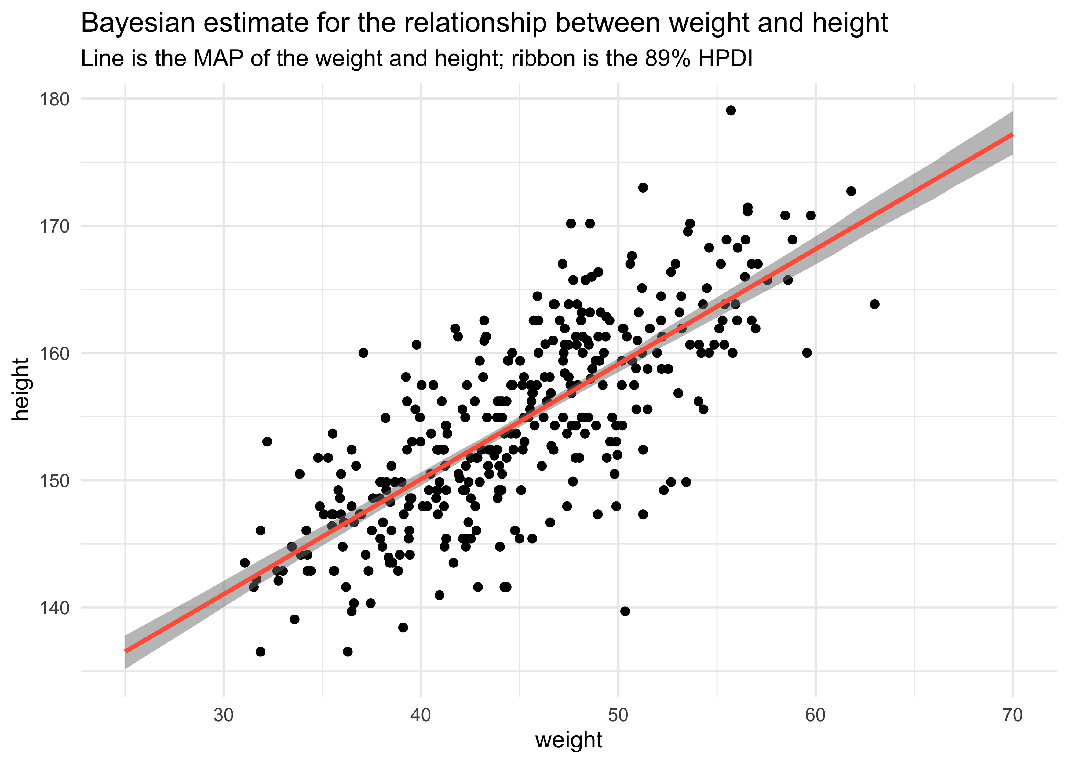
- finally, we can get the HPDI at each value of weight
mu_mean <- apply(mu, 2, mean)
mu_hpdi <- apply(mu, 2, HPDI, prob = 0.89)
mu_data <- tibble(weight = weight_seq,
mu = mu_mean) %>%
bind_cols(as.data.frame(t(mu_hpdi))) %>%
set_names(c("weight", "height", "hpdi_low", "hpdi_high"))
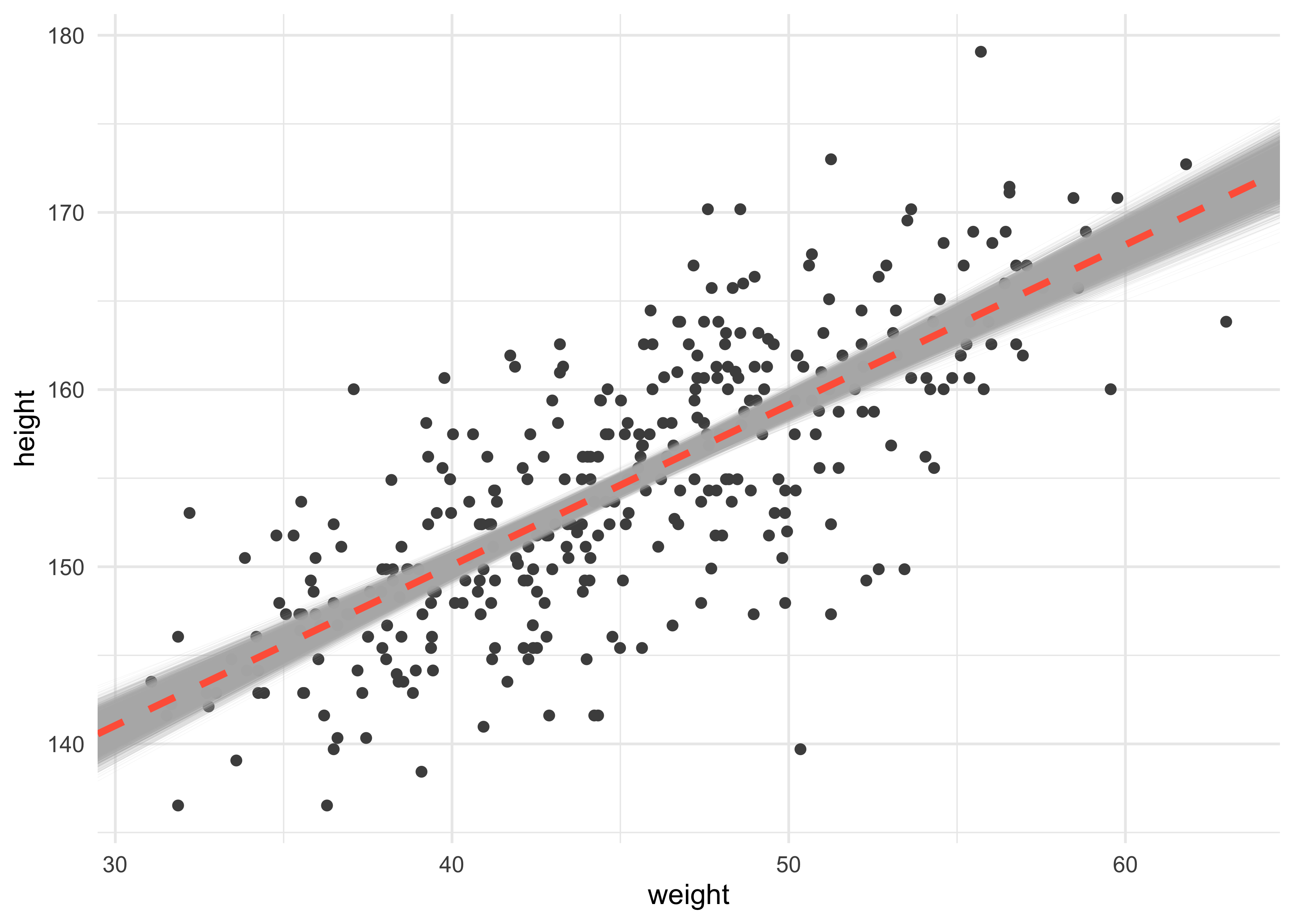
d2 %>%
ggplot(aes(x = weight, y = height)) +
geom_point() +
geom_ribbon(data = mu_data,
aes(x = weight, ymin = hpdi_low, ymax = hpdi_high),
alpha = 0.5, color = NA, fill = "grey50") +
geom_line(data = mu_data,
aes(weight, height),
color = "tomato", size = 1) +
labs(title = "Bayesian estimate for the relationship between weight and height",
subtitle = "Line is the MAP of the weight and height; ribbon is the 89% HPDI")
4.4.3.5 Prediction intervals
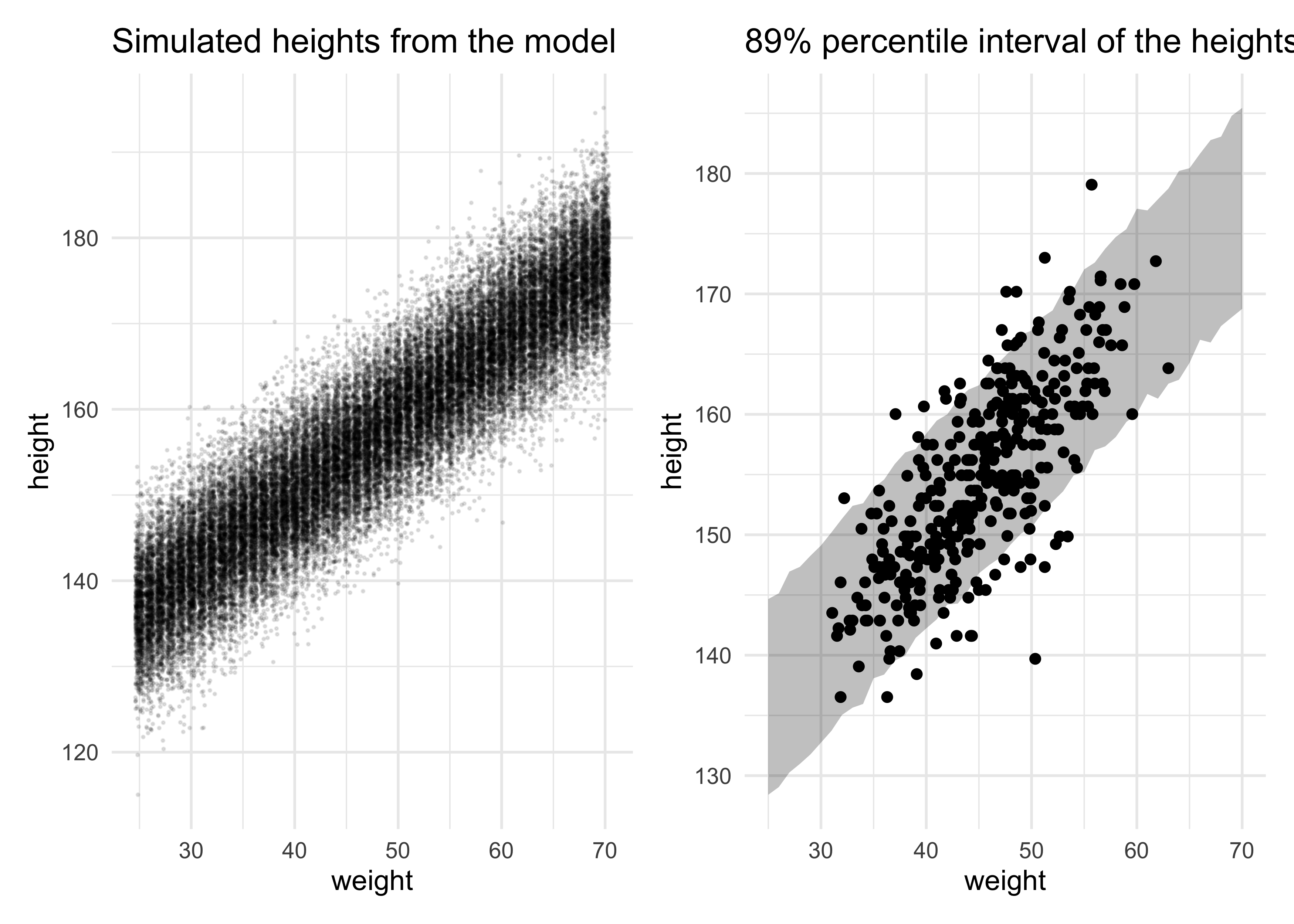
- now we can generate an 89% prediction interval for actual heights
- so far we have been looking at the uncertainty in $\mu$ which is the mean for the heights
- there is also $\sigma$ in the equation for heights $h_i \sim \mathcal{N}(\mu_i, \sigma)$
- we can simulate height values for a given weight by sampling from a
Gaussian with some mean and standard deviation sampled from the
posterior
- this will provide a collection of simulated heights with the uncertainty in the posterior distribution and the Gaussian likelihood of the heights
- we can plot the 89% percentile interval on the simulated data which represents where the model thinks 89% of actual heights in the population at each weight
sim_height <- sim(m4_3, data = list(weight = weight_seq))
str(sim_height)
#> num [1:1000, 1:46] 143 134 133 142 140 ...
height_pi <- apply(sim_height, 2, PI, prob = 0.89)
height_pi_data <- height_pi %>%
    t() %>%
    as.data.frame() %>%
    as_tibble() %>%
    set_names(c("low_pi", "high_pi")) %>%
    mutate(weight = weight_seq)

simulated_heights <- as.data.frame(sim_height) %>%
    as_tibble() %>%
    set_names(as.character(weight_seq)) %>%
    pivot_longer(tidyselect::everything(),
                 names_to = "weight",
                 values_to = "sim_height") %>%
    mutate(weight = as.numeric(weight)) %>%
    ggplot() +
    geom_jitter(aes(x = weight, y = sim_height),
                size = 0.2, alpha = 0.1) +
    labs(x = "weight",
         y = "height",
         title = "Simulated heights from the model")

height_pi_ribbon <- d2 %>%
    ggplot() +
    geom_point(aes(x = weight, y = height)) +
    geom_ribbon(data = height_pi_data,
                aes(x = weight, ymin = low_pi, ymax = high_pi),
                color = NA, fill = "black", alpha = 0.25) +
    labs(x = "weight",
         y = "height",
         title = "89% percentile interval of the heights")

simulated_heights | height_pi_ribbon
4.5 Polynomial regression
- we can build a model using a curved function of a single predictor
- in the following example, we will use all of the height and weight
data in
Howell1, not just that of adults
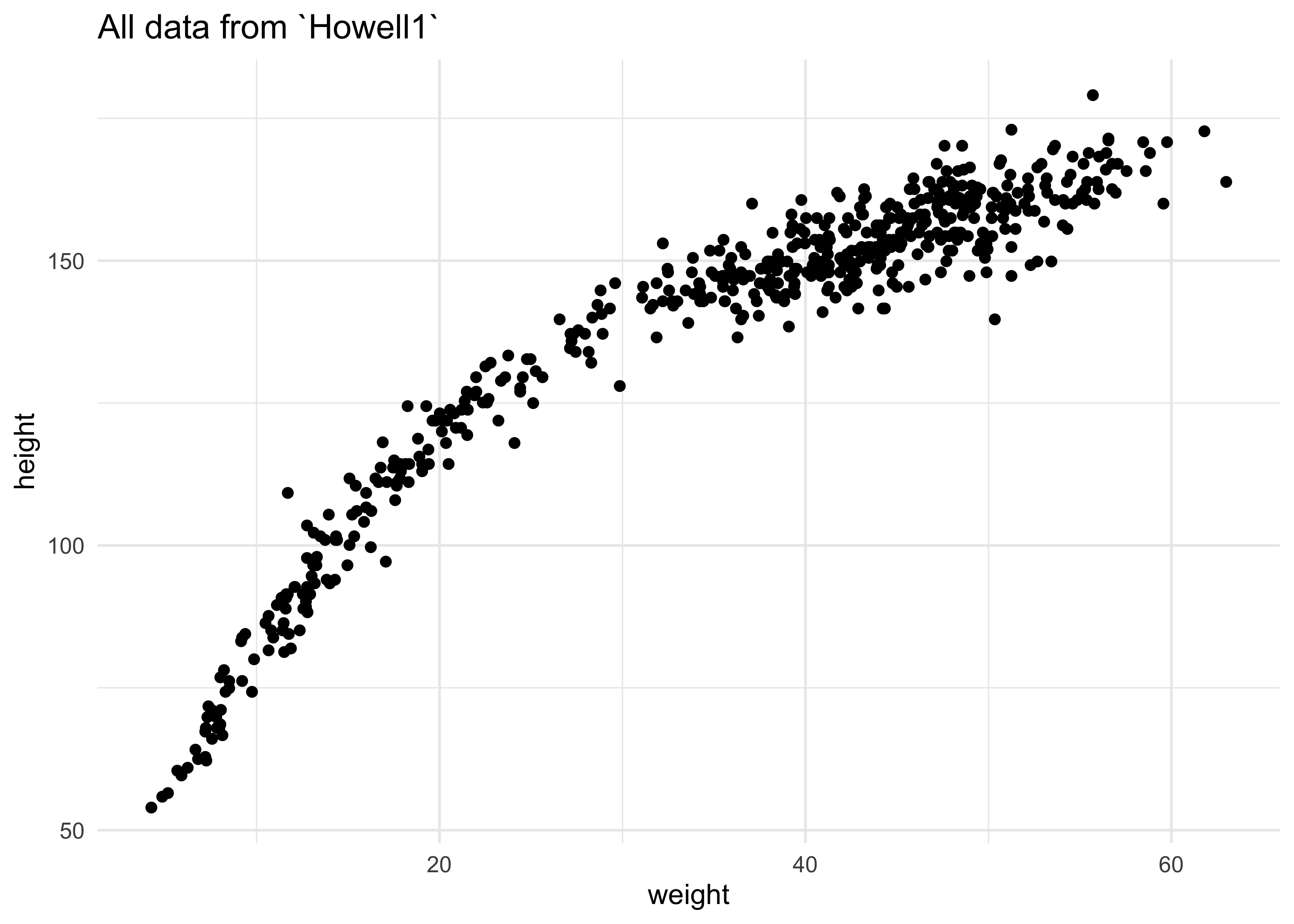
d %>%
    ggplot(aes(x = weight, y = height)) +
    geom_point() +
    labs(title = "All data from `Howell1`")
- polynomials are often discouraged because they are hard to interpret
- it can be better to instead “build the non-linear relationship up from a principled beginning”
- this is explored in the practice problems
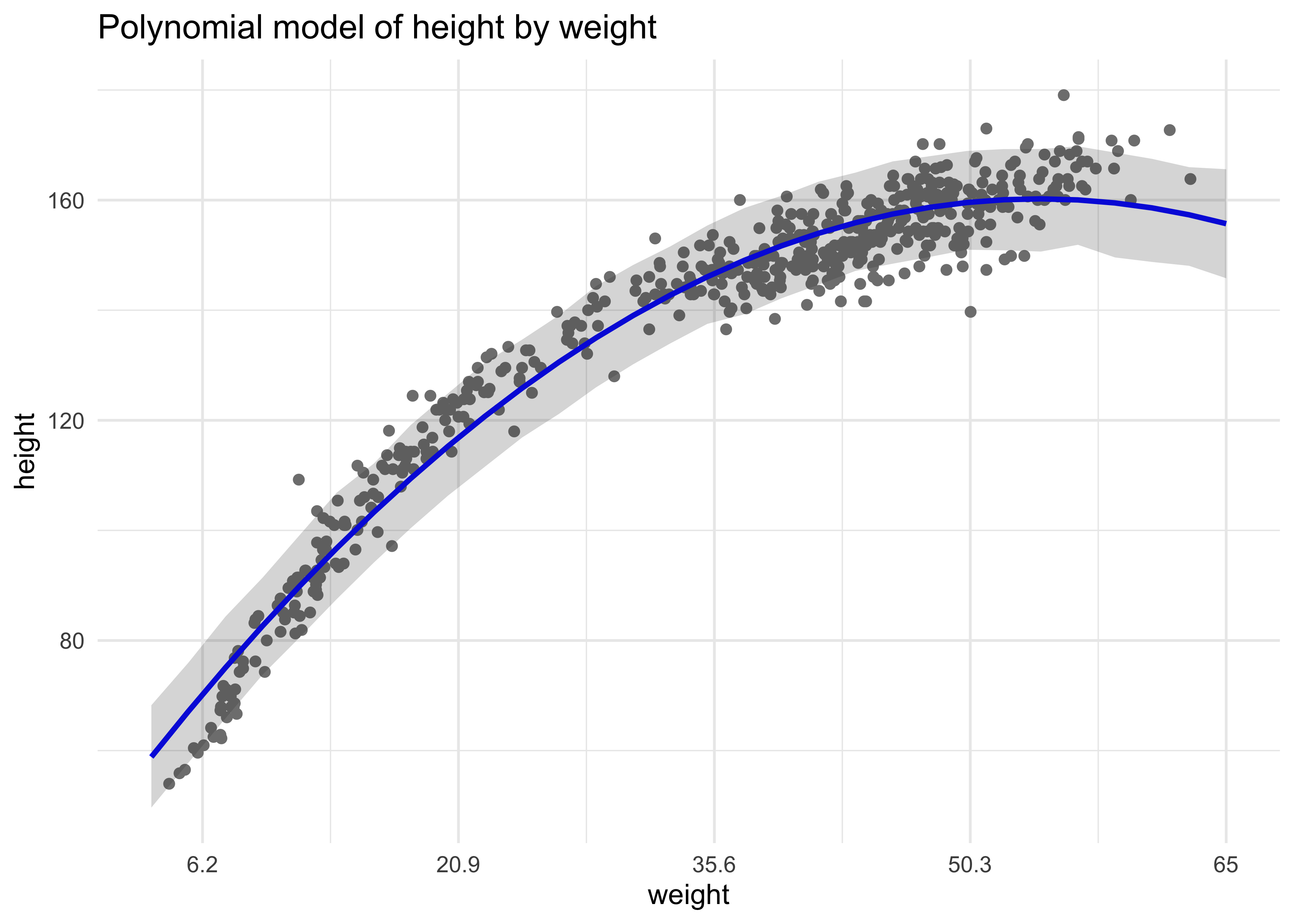
- here is the common polynomial regression
- a parabolic model of the mean
$$ \mu_i = \alpha + \beta_1 x_i + \beta_2 x_i^2 $$
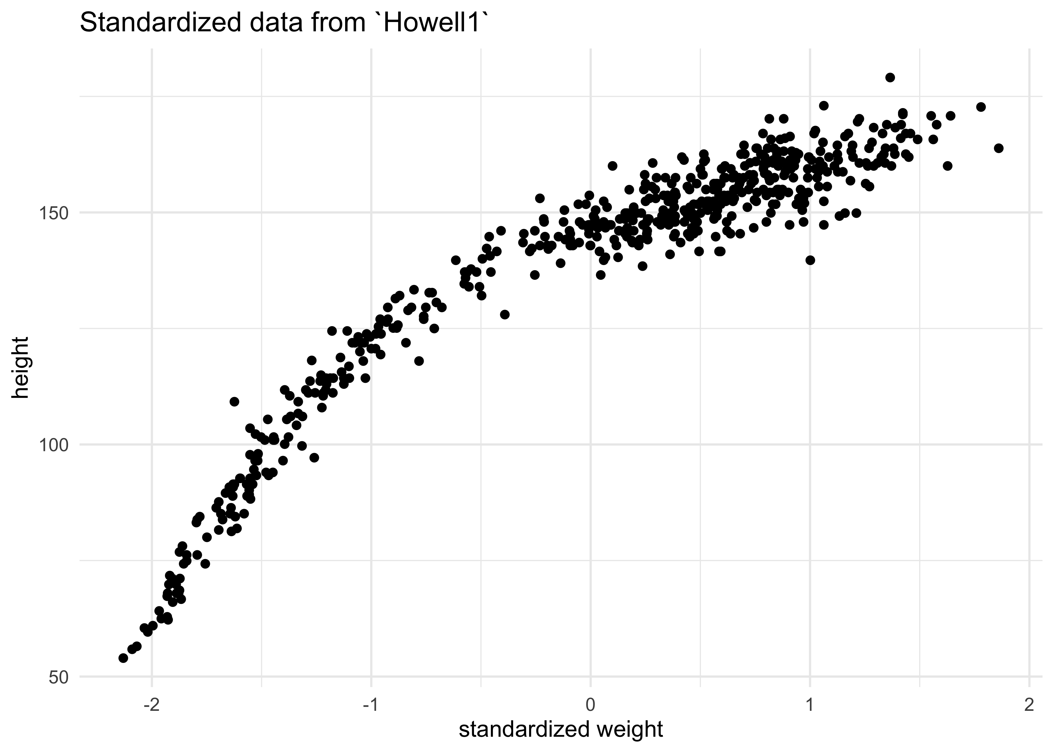
- before fitting, we must standardize the predictor variable
- center and divide by std. dev.
- this helps with interpretation because one unit is equivalent to a change of one std. dev.
- this also helps the software fit the model
d$weight_std <- (d$weight - mean(d$weight)) / sd(d$weight)
d %>%
    ggplot(aes(x = weight_std, y = height)) +
    geom_point() +
    labs(title = "Standardized data from `Howell1`",
         x = "standardized weight")
- here is the model we will fit
- it has very weak priors
$$ h_i \sim \text{Normal}(\mu_i, \sigma) $$ $$ \mu_i = \alpha + \beta_1 x_i + \beta_2 x_i^2 $$ $$ \alpha \sim \text{Normal}(178, 100) $$ $$ \beta_1 \sim \text{Normal}(0, 10) $$ $$ \beta_2 \sim \text{Normal}(0, 10) $$ $$ \sigma \sim \text{Uniform}(0, 50) $$
d$weight_std2 <- d$weight_std^2

m4_5 <- quap(
    alist(
        height ~ dnorm(mu, sigma),
        mu <- a + b1*weight_std + b2*weight_std2,
        a ~ dnorm(178, 100),
        b1 ~ dnorm(0, 10),
        b2 ~ dnorm(0, 10),
        sigma ~ dunif(0, 50)
    ),
    data = d
)

summary(m4_5)
#>             mean        sd       5.5%      94.5%
#> a     146.663373 0.3736588 146.066194 147.260552
#> b1     21.400351 0.2898512  20.937113  21.863590
#> b2     -8.415056 0.2813197  -8.864659  -7.965453
#> sigma   5.749786 0.1743169   5.471194   6.028378
- we have to plot the fit of the model to make sense of these values
weight_seq <- seq(from = -2.2, to = 2.0, length.out = 30)
pred_dat <- list(weight_std = weight_seq, weight_std2 = weight_seq^2)
mu <- link(m4_5, data = pred_dat)
mu_mean <- apply(mu, 2, mean)
mu_pi <- apply(mu, 2, PI, prob = 0.89)
sim_height <- sim(m4_5, data = pred_dat)
height_pi <- apply(sim_height, 2, PI, prob = 0.89)
sim_height_data <- t(height_pi) %>%
    as.data.frame() %>%
    as_tibble() %>%
    set_names(c("pi5", "pi94")) %>%
    mutate(weight = weight_seq,
           mu = mu_mean)


d %>%
    ggplot() +
    geom_point(aes(x = weight_std, y = height), color = "grey50") +
    geom_line(data = sim_height_data,
              aes(x = weight, y = mu),
              size = 1, color = "blue") +
    geom_ribbon(data = sim_height_data,
                aes(x = weight, ymin = pi5, ymax = pi94),
                alpha = 0.2, color = NA) +
    scale_x_continuous(
        labels = function(x) { round(x * sd(d$weight) + mean(d$weight), 1) }
    ) +
    labs(title = "Polynomial model of height by weight",
         x = "weight")
4.7 Practice
Easy
4E1. In the model definition below, which line is the likelihood?
$$ y_i \sim \text{Normal}(\mu, \sigma) \quad \text{(likelihood)}$$ $$ \mu \sim \text{Normal}(0, 10) $$ $$ \sigma \sim \text{Uniform}(0, 10) $$
4E2. In the model definition just above, how many parameters are in the posterior distribution?
2
4E3. Using the model definition above, write down the appropriate form of Bayes’ theorem that includes the proper likelihood and priors.
$$ \Pr(y|\mu, \sigma) = \frac{\Pr(\mu, \sigma | y) \Pr(y)}{\Pr(\mu, \sigma)} $$
4E4. In the model definition below, which line is the linear model?
$$ y_i \sim \text{Normal}(\mu, \sigma) $$ $$ \mu = \alpha + \beta x_i \quad \text{(linear model)} $$ $$ \alpha \sim \text{Normal}(0, 10) $$ $$ \beta \sim \text{Normal(0, 1)} $$ $$ \sigma \sim \text{Uniform}(0, 10) $$
4E5. In the model definition just above, how many parameters are in the posterior distribution?
3
Medium
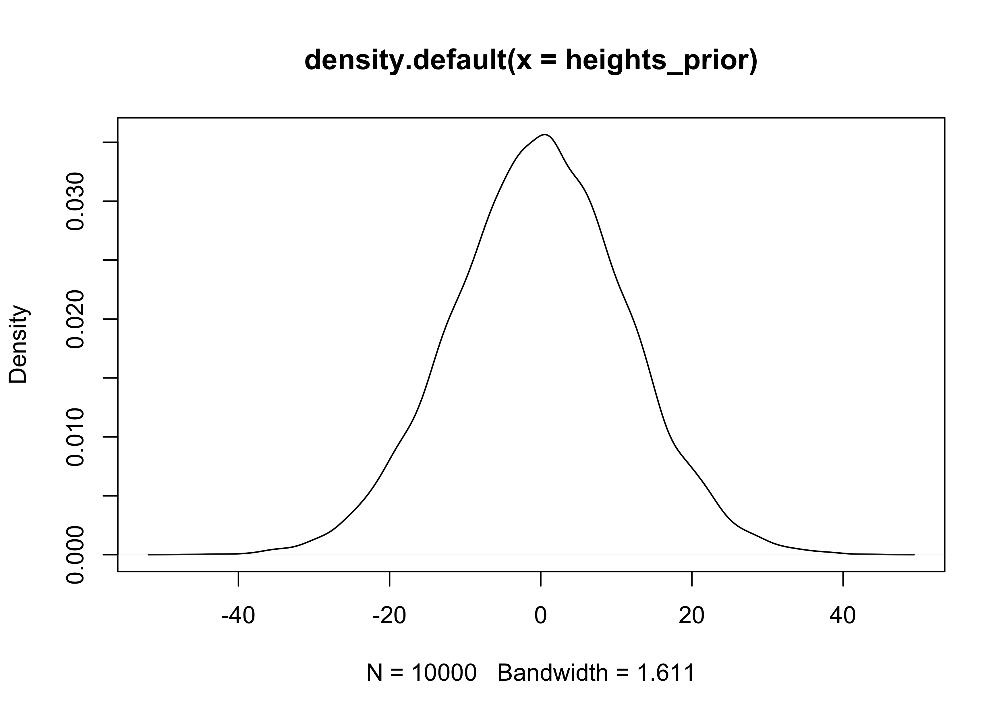
4M1. For the model definition below, simulate observed heights from the prior (not the posterior).
$$ y_i \sim \text{Normal}(\mu, \sigma) $$ $$ \mu \sim \text{Normal}(0, 10) $$ $$ \sigma \sim \text{Uniform}(0, 10) $$ $$ $$
mu_prior <- rnorm(1e4, 0, 10)
sigma_prior <- runif(1e4, 0, 10)
heights_prior <- rnorm(1e4, mu_prior, sigma_prior)

plot(density(heights_prior))
4M2. Translate the model just above into a map formula.
alist(
    y ~ dnorm(mu, sigma),
    mu ~ dnorm(0, 10),
    sigma ~ dunif(0, 10)
)
#> [[1]]
#> y ~ dnorm(mu, sigma)
#>
#> [[2]]
#> mu ~ dnorm(0, 10)
#>
#> [[3]]
#> sigma ~ dunif(0, 10)
4M3. Translate the map model formula below into a mathematical model definition.
flist <- alist(
    y ~ dnorm(mu, sigma),
    mu <- a + b*x,
    a ~ dnorm(0, 50),
    b ~ dunif(0, 10),
    sigma ~ dunif(0, 50)
)
$$ y_i \sim \text{Normal}(\mu, \sigma) $$ $$ \mu = \alpha + \beta x_i $$ $$ \alpha \sim \text{Normal}(0, 50) $$ $$ \beta \sim \text{Uniform}(0, 10) $$ $$ \sigma \sim \text{Uniform}(0, 50) $$
4M4. A sample of students is measured for height each year for 3 years. After the third year, you want to fit a linear regression predicting height using year as a predictor. Write down the mathematical model definition for this regression, using any variable names and priors you choose. Be prepared to defend your choice of priors.
$$ y_i \sim \text{Normal}(\mu, \sigma) $$ $$ \mu = \alpha + \beta x_i $$ $$ \alpha \sim \text{Normal}(0, 100) $$ $$ \beta \sim \text{Normal}(0, 10) $$ $$ \sigma \sim \text{Uniform}(0, 50) $$
4M5. Now suppose I tell you that the average height in the first year was 120 cm and that every student got taller each year. Does this information lead you to change your choice of priors? How?
I would make the prior for $\beta$ have a positive mean.
$$ \beta \sim \text{Normal}(1, 10) $$
4M6. Now suppose I tell you that the variance among heights for students of the same age is never more than 64cm. How does this lead you to revise your priors?
I would reduce the standard deviation for the prior distribution of $alpha$.
$$ \alpha \sim \text{Normal}(0, 20) $$
Hard
4H1. The weights listed below were recorded in the !Kung census, but heights were not recorded for these individuals. Provide predicted heights and 89% intervals (either HPDI or PI) for each of these individuals. That is, fill in the table below, using model-based predictions.
# Model created and fit in the notes above.
m4_5 <- quap(
    alist(
        height ~ dnorm(mu, sigma),
        mu <- a + b1*weight_std + b2*weight_std2,
        a ~ dnorm(178, 100),
        b1 ~ dnorm(0, 10),
        b2 ~ dnorm(0, 10),
        sigma ~ dunif(0, 50)
    ),
    data = d
)

new_data <- tibble(weight = c(46.95, 43.72, 64.78, 32.59, 54.63)) %>%
    mutate(individual = 1:n(),
           weight_std = (weight - mean(d$weight)) / sd(d$weight),
           weight_std2 = weight_std^2)
new_pred <- link(m4_5, new_data, n = 1e3)

new_data %>%
    mutate(expected_height = apply(new_pred, 2, chainmode),
           hpdi = apply(new_pred, 2, function(x) {
               pi <- round(HPDI(x), 2)
               glue("{pi[[1]]} - {pi[[2]]}")
           })) %>%
    select(individual, weight, expected_height, hpdi)
#> # A tibble: 5 x 4
#>   individual weight expected_height hpdi
#>        <int>  <dbl>           <dbl> <chr>
#> 1          1   47.0            158. 157.68 - 158.71
#> 2          2   43.7            156. 155.42 - 156.4
#> 3          3   64.8            156. 154.15 - 158.01
#> 4          4   32.6            142. 141.33 - 142.5
#> 5          5   54.6            160. 159.41 - 161.12
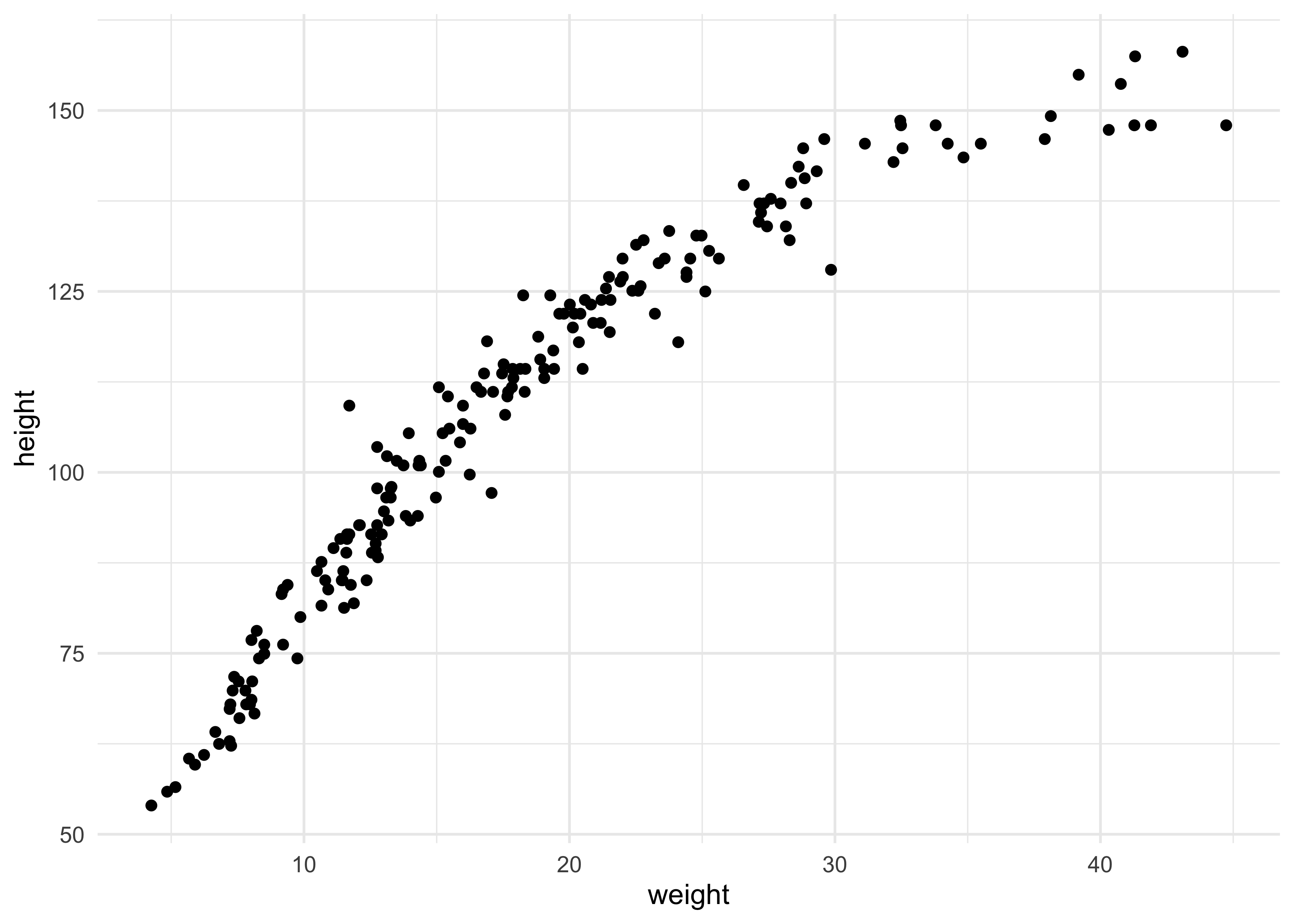
4H2. Select out all the rows in the Howelll data with ages below 18 years of age. If you do it right, you should end up with a new data frame with 192 rows in it.
qh2_data <- Howell1[Howell1$age < 18, ]
dim(qh2_data)
#> [1] 192 4
qh2_data %>%
    ggplot(aes(x = weight, y = height)) +
    geom_point()
(a) Fit a linear regression to these data, using map. Present and interpret the estimates. For every 10 units of increase in weight, how much taller does the model predict a child gets?
qh2_data$weight_std <- (qh2_data$weight - mean(qh2_data$weight)) / sd(qh2_data$weight)

qh2_model <- quap(
    alist(
        height ~ dnorm(mu, sigma),
        mu <- a + b * weight_std,
        a ~ dnorm(100, 20),
        b ~ dnorm(10, 20),
        sigma ~ dunif(0, 10)
    ),
    data = qh2_data
)

summary(qh2_model)
#>            mean        sd       5.5%      94.5%
#> a     108.31112 0.6086166 107.338436 109.283810
#> b      24.30242 0.6102073  23.327195  25.277653
#> sigma   8.43714 0.4305592   7.749023   9.125257
# Change in 10 original units of weight.
weight_seq <- c(10, 20)
weight_seq_std <- (weight_seq - mean(qh2_data$weight)) / sd(qh2_data$weight)
diff(coef(qh2_model)["a"] +  weight_seq_std * coef(qh2_model)["b"])
#> [1] 27.18601
(b) Plot the raw data, with height on the vertical axis and weight on the horizontal axis. Superimpose the MAP regression line and 89% HPDI for the mean. Also superimpose the 89% HPDI for predicted heights.
weight_seq <- seq(range(qh2_data$weight_std)[[1]],
                  range(qh2_data$weight_std)[[2]],
                  length.out = 100)

mu_est <- link(qh2_model, data = data.frame(weight_std = weight_seq))
mu_mean <- apply(mu_est, 2, mean)
mu_hpdi <- apply(mu_est, 2, function(x) {
    y <- HPDI(x)
    tibble(hpdi_low = y[[1]], hpdi_high = y[[2]])
}) %>%
    bind_rows()

mu_pred <- tibble(weight_std = weight_seq,
                  mu = mu_mean) %>%
    bind_cols(mu_hpdi) %>%
    mutate(weight = weight_std * sd(qh2_data$weight) + mean(qh2_data$weight))


qh2_data %>%
    ggplot() +
    geom_point(aes(x = weight, y = height)) +
    geom_ribbon(data = mu_pred,
                aes(x = weight, ymin = hpdi_low, ymax = hpdi_high),
                fill = "black", alpha = 0.2, color = NA) +
    geom_line(data = mu_pred,
              aes(x = weight, y = mu),
              color = "dodgerblue", lty = 2, size = 1.2)
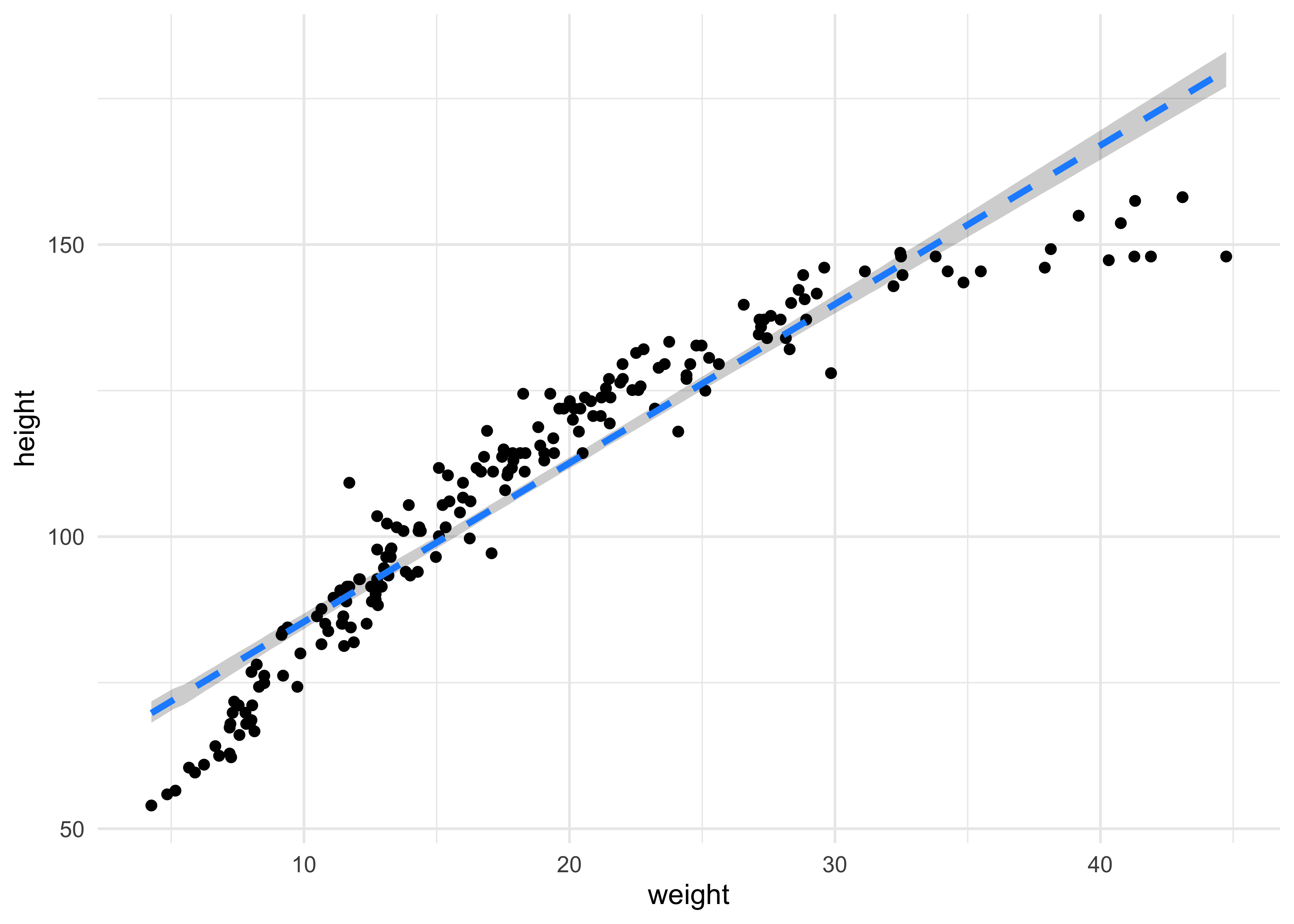
(c) What aspects of the model fit concern you? Describe the kinds of assumptions you would change, if any, to improve the model. You don’t have to write any new code. Just explain what the model appears to be doing a bad job of, and what you hypothesize would be a better model.
I really don’t like how confident the model is in its predictions of height. It does not appear to be a very good fit for this data. I would change the model by maybe adding a polynomial or other predictors such as age.
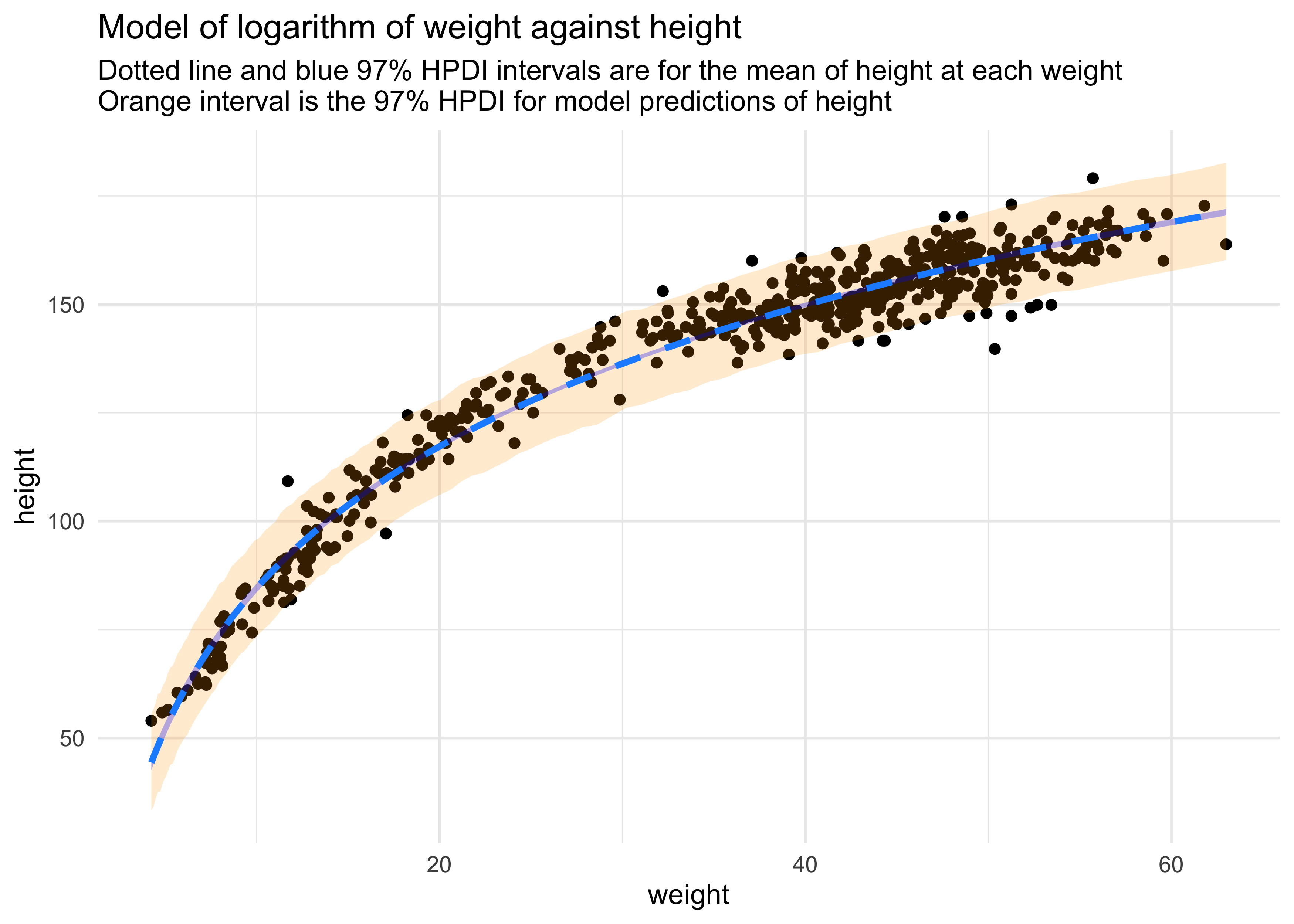
4H3. Suppose a colleague of yours, who works on allometry, glances at the practice problems just above. Your colleague exclaims, “That’s silly. Everyone knows that it’s only the logarithm of body weight that scales with height!” Let’s take your colleague’s advice and see what happens.
(a) Model the relationship between height (cm) and the natural logarithm of weight (log-kg). Use the entire Howelll data frame, all 544 rows, adults and non-adults. Fit this model, using quadratic approximation:
$$ h_i \sim \text{Normal}(\mu_i, \sigma) $$ $$ \mu_i = \alpha + \beta \log(w_i) $$ $$ \alpha \sim \text{Normal}(178, 100) $$ $$ \beta \sim \text{Normal}(0, 100) $$ $$ \sigma \sim \text{Uniform}(0, 50) $$
where $h_i$ is the height of individual $i$ and $w_i$ is the
weight (in kg) of individual $i$. The function for computing a natural
log in R is just log. Can you interpret the resulting estimates?
qh3_data <- Howell1 %>%
    mutate(weight_ln = log(weight),
           weight_ln_std = (weight_ln - mean(weight_ln)) / sd(weight_ln))

qh3_model <- quap(
    alist(
        height ~ dnorm(mu, sigma),
        mu <- a + b * weight_ln_std,
        a ~ dnorm(178, 100),
        b ~ dnorm(0, 100),
        sigma ~ dunif(0, 50)
    ),
    data = qh3_data
)

summary(qh3_model)
#>             mean        sd       5.5%      94.5%
#> a     138.265117 0.2201783 137.913230 138.617004
#> b      27.119402 0.2203809  26.767191  27.471614
#> sigma   5.135408 0.1557218   4.886535   5.384282
(b) Begin with this plot:
plot(height ~ weight , data = Howell1, col = col.alpha(rangi2, 0.4))
Then use samples from the quadratic approximate posterior of the model in (a) to superimpose on the plot: (1) the predicted mean height as a function of weight, (2) the 97% HPDI for the mean, and (3) the 97% HPDI for predicted heights.
weight_seq <- seq(range(qh3_data$weight_ln_std)[[1]],
                  range(qh3_data$weight_ln_std)[[2]],
                  length.out = 100)

mu_est <- link(qh3_model, data = data.frame(weight_ln_std = weight_seq))
mu_mean <- apply(mu_est, 2, mean)
mu_hpdi <- apply(mu_est, 2, function(x) {
    y <- HPDI(x, prob = 0.97)
    tibble(hpdi_low = y[[1]], hpdi_high = y[[2]])
}) %>%
    bind_rows()

sim_height <- sim(qh3_model, data = list(weight_ln_std = weight_seq), n = 1e4)
height_pi <- apply(sim_height, 2, function(x) {
    y <- HPDI(x, prob = 0.97)
    tibble(h_hpdi_low = y[[1]], h_hpdi_high = y[[2]])
}) %>%
    bind_rows()

mu_pred <- tibble(weight_ln_std = weight_seq,
                  mu = mu_mean) %>%
    bind_cols(mu_hpdi) %>%
    bind_cols(height_pi) %>%
    mutate(weight_ln = weight_ln_std * sd(qh3_data$weight_ln) + mean(qh3_data$weight_ln),
           weight = exp(weight_ln))

qh3_data %>%
    ggplot() +
    geom_point(aes(x = weight, y = height)) +
    geom_ribbon(data = mu_pred,
                aes(x = weight, ymin = h_hpdi_low, ymax = h_hpdi_high),
                fill = "orange", alpha = 0.2, color = NA) +
    geom_ribbon(data = mu_pred,
                aes(x = weight, ymin = hpdi_low, ymax = hpdi_high),
                fill = "blue", alpha = 0.3, color = NA) +
    geom_line(data = mu_pred,
              aes(x = weight, y = mu),
              color = "dodgerblue", lty = 2, size = 1.2) +
    labs(title = "Model of logarithm of weight against height",
         subtitle = "Dotted line and blue 97% HPDI intervals are for the mean of height at each weight\nOrange interval is the 97% HPDI for model predictions of height")
Joshua Cook
Graduate Student
My research interests include cancer genetics and evolution. I also learning about programming and computer science in general.