Chapter 03. Sampling The Imaginary
- this chapter teaches the basic skills for working with samples from the posterior distribution
3.1 Sampling from a grid-approximate posterior
- the following code generates a posterior distribution using grid approximation using the globe-tossing model from the previous chapter
p_grid <- seq(from = 0, to = 1, length.out = 1e3)
prior <- rep(1, 1e3)
likelihood <- dbinom(6, size = 9, prob = p_grid)
posterior <- likelihood * prior
posterior <- posterior / sum(posterior)
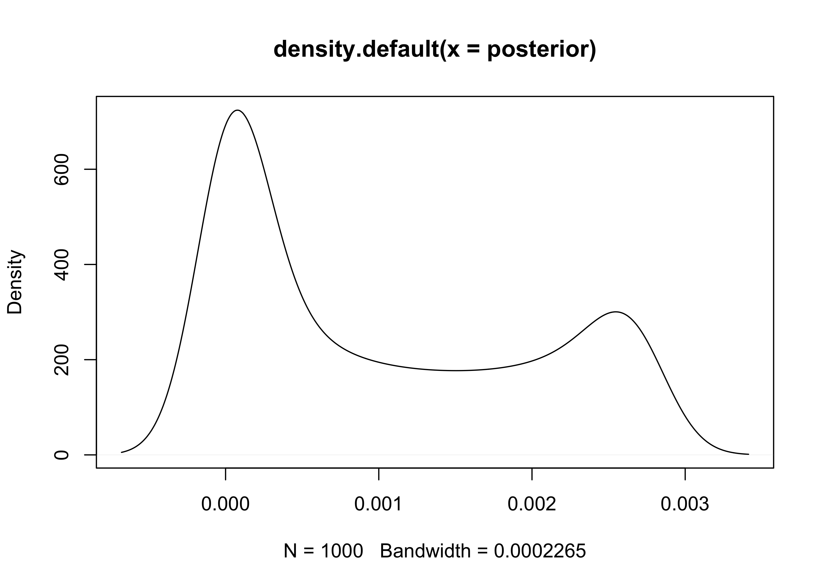
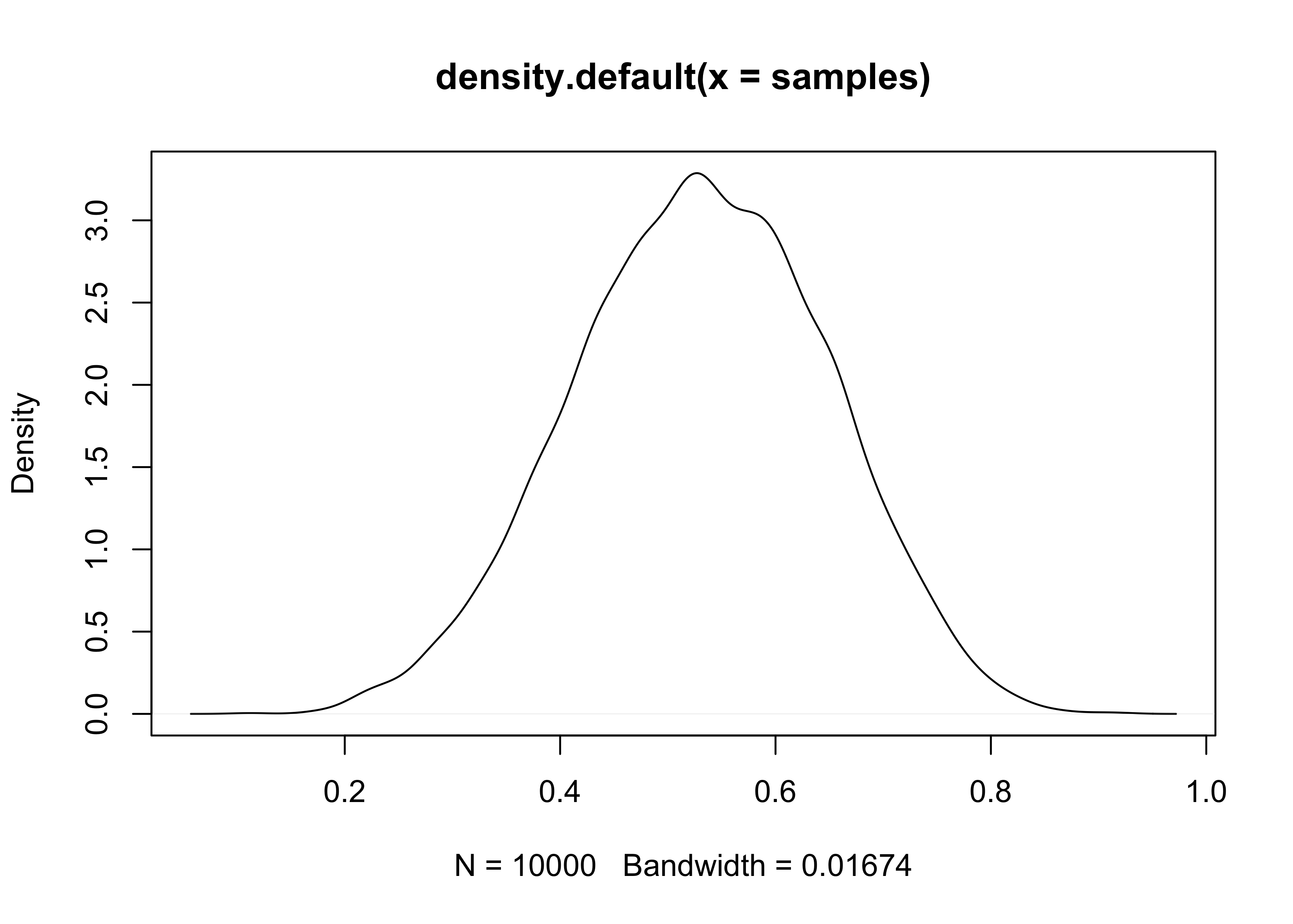
plot(density(posterior))
- we can think of the posterior as a bucket full of parameter values
- each value is present in proportion to its posterior probability
- is we scoop out a bunch of parameters, we will scoop out more of the parameter values that are more likely by the posterior
- parameter values are samples from
p_gridwith the probability of sampling each parameter given by its posterior
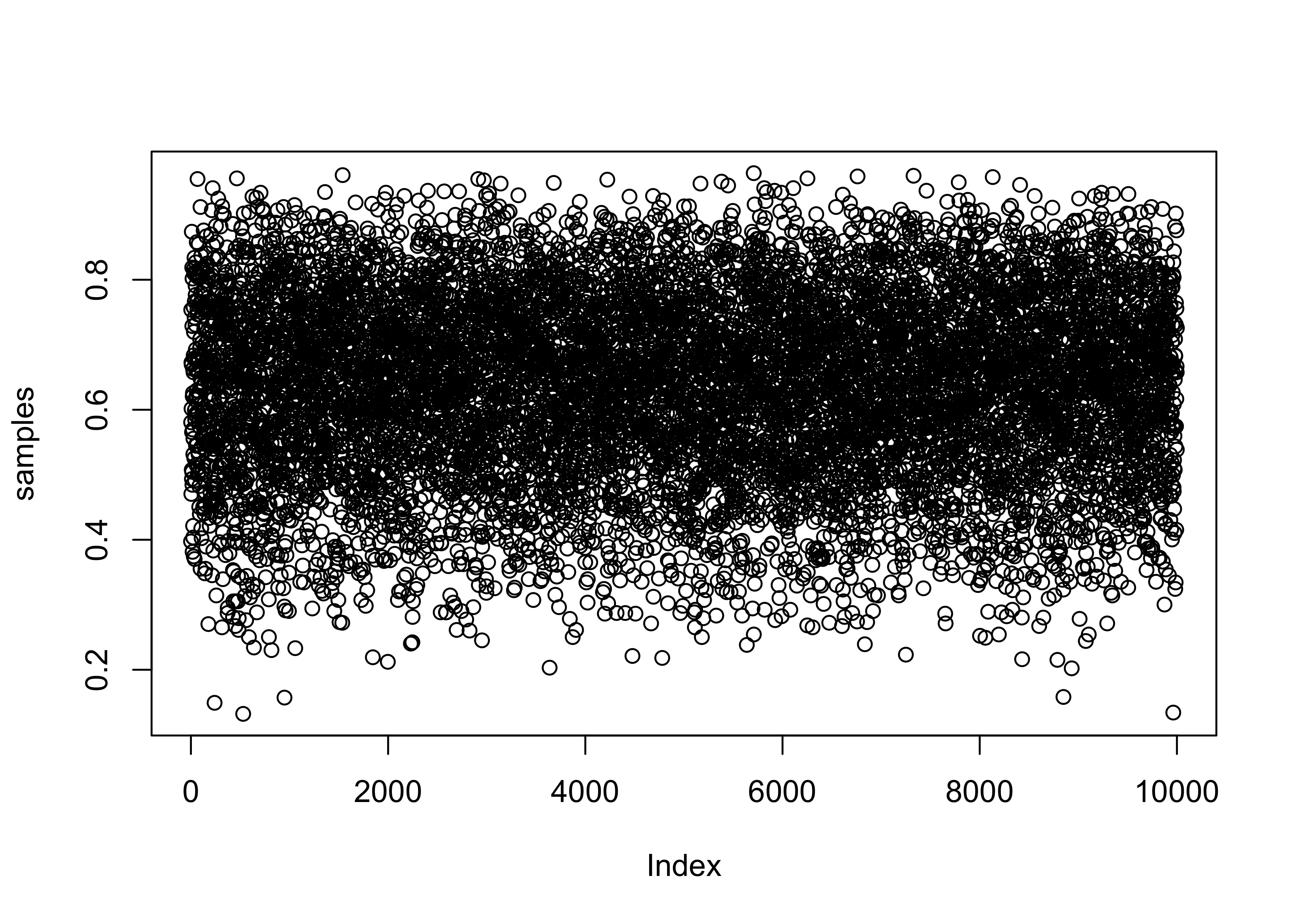
samples <- sample(p_grid, prob = posterior, size = 1e4, replace = TRUE)
plot(samples)
plot(density(samples))
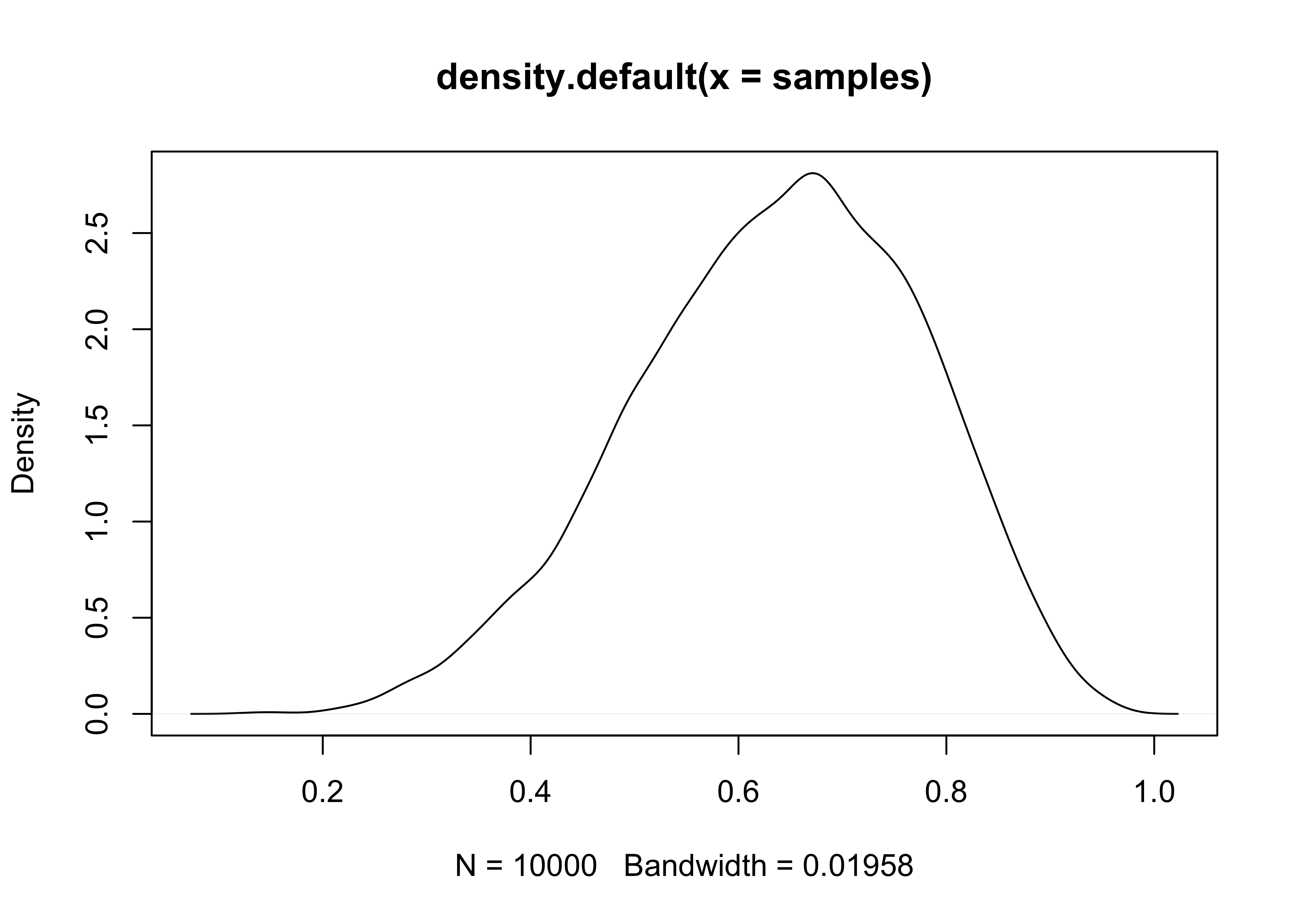
- the estimated density (above) is very similar to the posterior
computed via grid approximation
- therefore we can use these samples to describe and understand the posterior
3.2 Sampling to summarize
- here are some common questions to ask about the posterior:
- how much posterior probability lies below some parameter value?
- how much posterior probability lies between two parameter values?
- which parameter value marks the lower 5% of the posterior probability?
- which range of the parameter values contains 90% of the posterior probability?
- which parameter value has the highest posterior probability?
- these questions can be separated into 3 categories: defined boundaries, defined probability mass, and point estimates
3.2.1 Intervals of defined boundaries
- we can be asked: What is the posterior probability that the
proportion of water is less than 0.5?
- this can be done by adding up the probabilities that correspond to a parameter value less than 0.5
sum(posterior[p_grid < 0.5])
#> [1] 0.1718746
- however, this calculation using the grid approximation becomes far more complicated when there is more than one parameter
- we can also find it using the samples from the posterior
- we basically find the frequency of samples below 0.5
sum(samples < 0.5) / length(samples)
#> [1] 0.1696
- we can also ask: How much of the posterior lies between 0.5 and 0.75?
sum(samples > 0.5 & samples < 0.75) / length(samples)
#> [1] 0.6071
3.2.2 Intervals of defined mass
- the “confidence interval” is an interval of defined mass
- the interval of the posterior probability is called the credible
interval
- this is often referred to as a percentile interval (PI)
- we can calculate the middle 80% of a posterior distribution using
the
quantile()function
quantile(samples, c(0.1, 0.9))
#>       10%       90%
#> 0.4514515 0.8098098
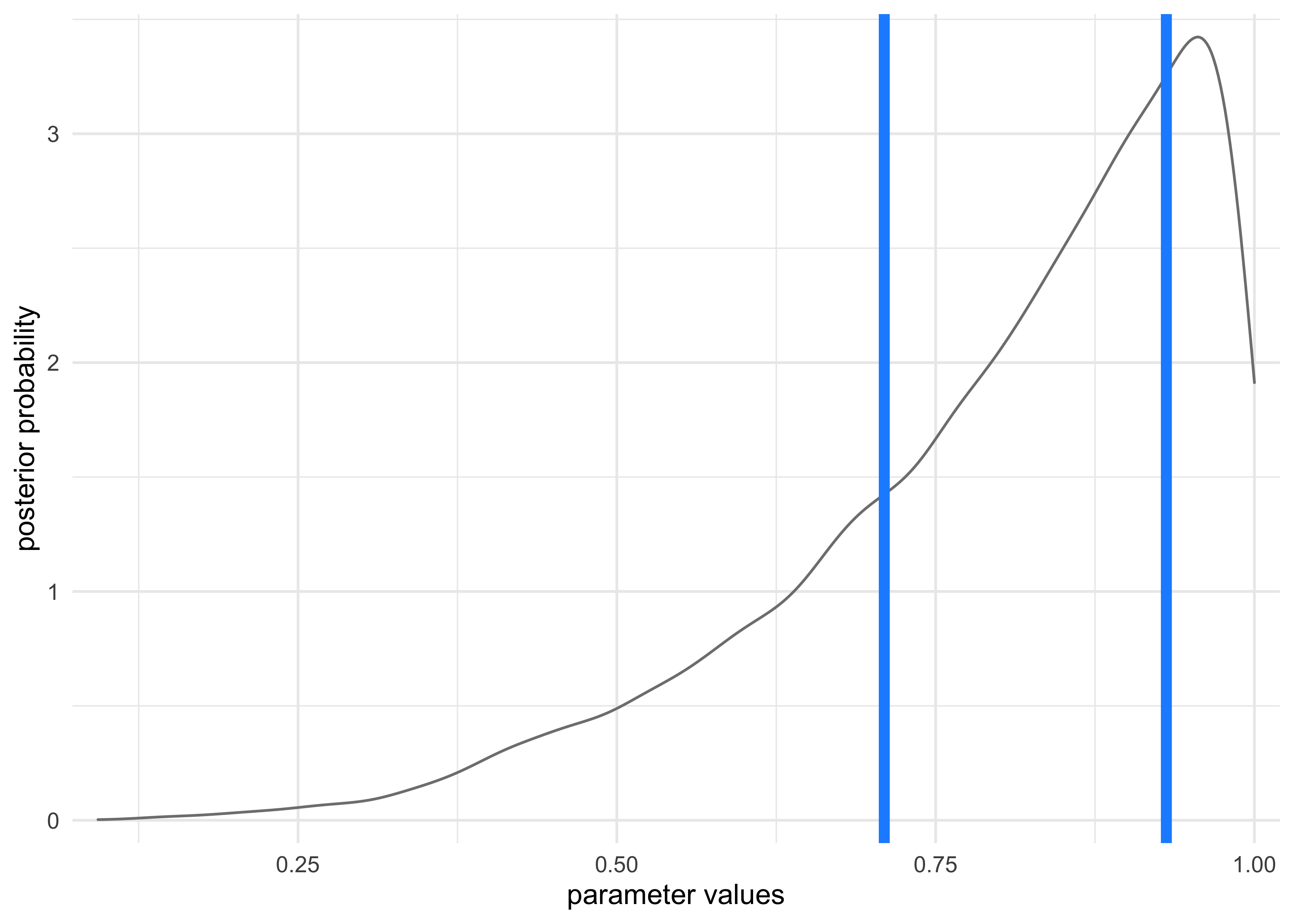
- however, a credible interval can be misleading if the sampled
posterior is too asymmetric
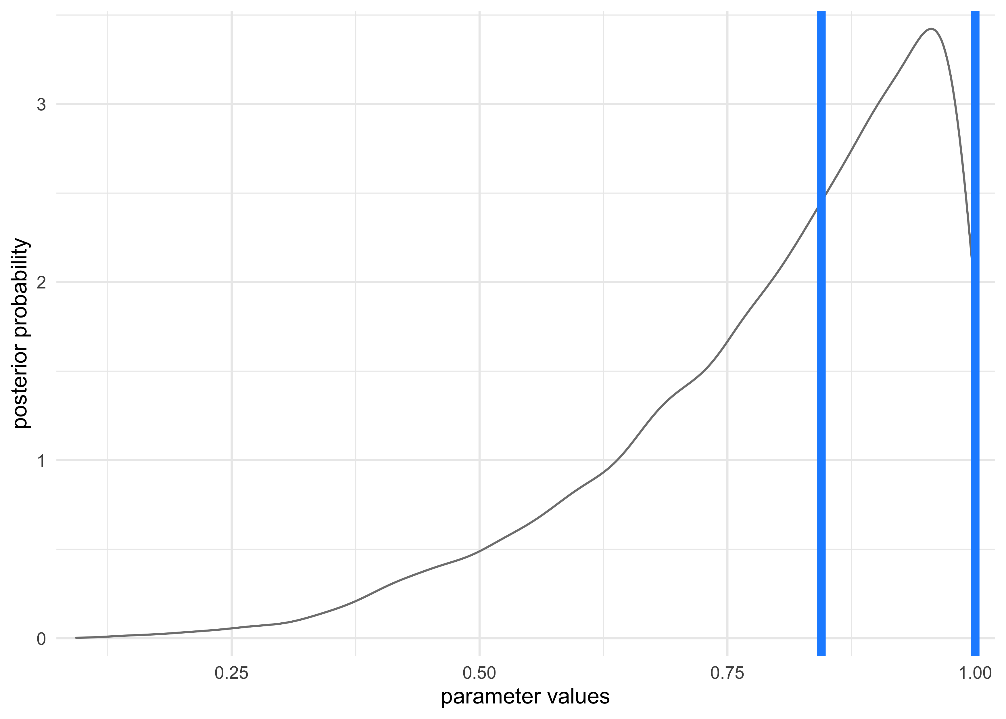
- this is shown in the following example of the globe tossing
where the data is only 3
W(waters) in 3 tosses - the 50% credible interval misses the most probable value, near $p=1$
- this is shown in the following example of the globe tossing
where the data is only 3
# Grid approximation of the posterior probabilities.
p_grid <- seq(from = 0, to = 1, length.out = 1e3)
prior <- rep(1, 1e3)
likelihood <- dbinom(3, size = 3, prob = p_grid)
posterior <- likelihood * prior
posterior <- posterior / sum(posterior)

# Sample the posterior.
samples <- sample(p_grid, prob = posterior, size = 1e4, replace = TRUE)

ci <- quantile(samples, c(0.25, 0.75))

tibble(x = samples) %>%
    ggplot(aes(x = x)) +
    geom_density(color = "grey50") +
    geom_vline(xintercept = as.numeric(ci),
               lty = 1, size = 2, color = "dodgerblue") +
    scale_x_continuous(expand = c(0, 0.02)) +
    scale_y_continuous(expand = c(0, 0.1)) +
    labs(x = "parameter values",
         y = "posterior probability")
- alternatively, the highest posterior density interval (HPDI) is
the narrowest interval containing the specified probability mass
- there are many intervals that can contain some percent of the mass, but the narrowest interval represents the most “dense” part of the posterior distribution
- the ‘rethinking’ package has the
HPDI()function for calculating this value
HPDI(samples, prob = 0.5)
#>      |0.5      0.5|
#> 0.8448448 1.0000000
tibble(x = samples) %>%
    ggplot(aes(x = x)) +
    geom_density(color = "grey50") +
    geom_vline(xintercept = as.numeric(HPDI(samples, prob = 0.5)),
               lty = 1, size = 2, color = "dodgerblue") +
    scale_x_continuous(expand = c(0, 0.02)) +
    scale_y_continuous(expand = c(0, 0.1)) +
    labs(x = "parameter values",
         y = "posterior probability")
- usually the PI and HPDI are quite similar
- HDPI can be more computationally expensive to compute and have more simulation variance than the PI
3.2.2 Point estimates
- the entire posterior distribution is the Bayesian parameter
estimate
- summarizing it with a single value is difficult and often unnecessary
- the maximum a posteriori (MAP) estimate is the highest posterior
probability
- this is really just he mode of the sampled distribution
p_grid[which.max(posterior)]
#> [1] 1
- when we only have samples from the posterior, it must be approximated
chainmode(samples, adj = 0.01)
#> [1] 0.9953597
- we can also report the mean or median, but they all have different values in this example
mean(samples)
#> [1] 0.802544
median(samples)
#> [1] 0.8448448
- we can use a loss function to provide a cost to use any particular
point estimate
- one common loss function is the absolute loss function $d-p$
which reports the loss as the absolute difference between the
real and predicted
- this results with the optimal choice as the median because it splits the density of the posterior distribution in half
- the quadratic loss $(d-p)^2$ leads to the posterior mean being the best point estimate
- one common loss function is the absolute loss function $d-p$
which reports the loss as the absolute difference between the
real and predicted
3.3 Sampling to simulate prediction
- the samples from the posterior allow for simulation of the model’s implied observations
- this is useful for:
- model checking: simulating implied observations to check for model fit and model behavior
- software validation: check the model fitting procedure worked
- research design: simulating observations from the hypothesis to evaluate whether the research design ca be effective (including “power analysis”)
- forecasting: simulate new predictions from new cases and future observations
- this chapter looks into model checking
Dummy data
- the globe-tossing model:
- there is a fixed proportion of water $p$ that we are trying to infer
- tossing and catching the globe produces observations of “water” and “land” that appear in proportion to $p$ and $1-p$
- likelihood functions “work in both directions”:
- given a realized observation, the likelihood function says how plausible the observation is
- given the parameters, the likelihood defines a distribution of
possible observations to sample from
- Bayesian models are always generative
- we will call the simulated data “dummy data”
- it comes from a binomial likelihood where $w$ is water and $n$ is the number of tosses:
$$ \Pr(w | n,p) = \frac{n!}{w! (n-w)!} p^w (1-p)^{n-w} $$
- if we use $p=0.7$, then we can sample from the binomial by
sampling from the posterior we have from the modeling, or just use
the
rbinom()function- the following samples represent the number of waters expected
from
sizetosses with a $p=0.7$
- the following samples represent the number of waters expected
from
rbinom(1, size = 2, prob = 0.7)
#> [1] 1
rbinom(10, size = 2, prob = 0.7)
#> [1] 1 2 0 1 2 2 1 1 1 1
dummy_w <- rbinom(1e5, size = 2, prob = 0.7)
table(dummy_w) / length(dummy_w)
#> dummy_w
#>       0       1       2
#> 0.08910 0.42262 0.48828
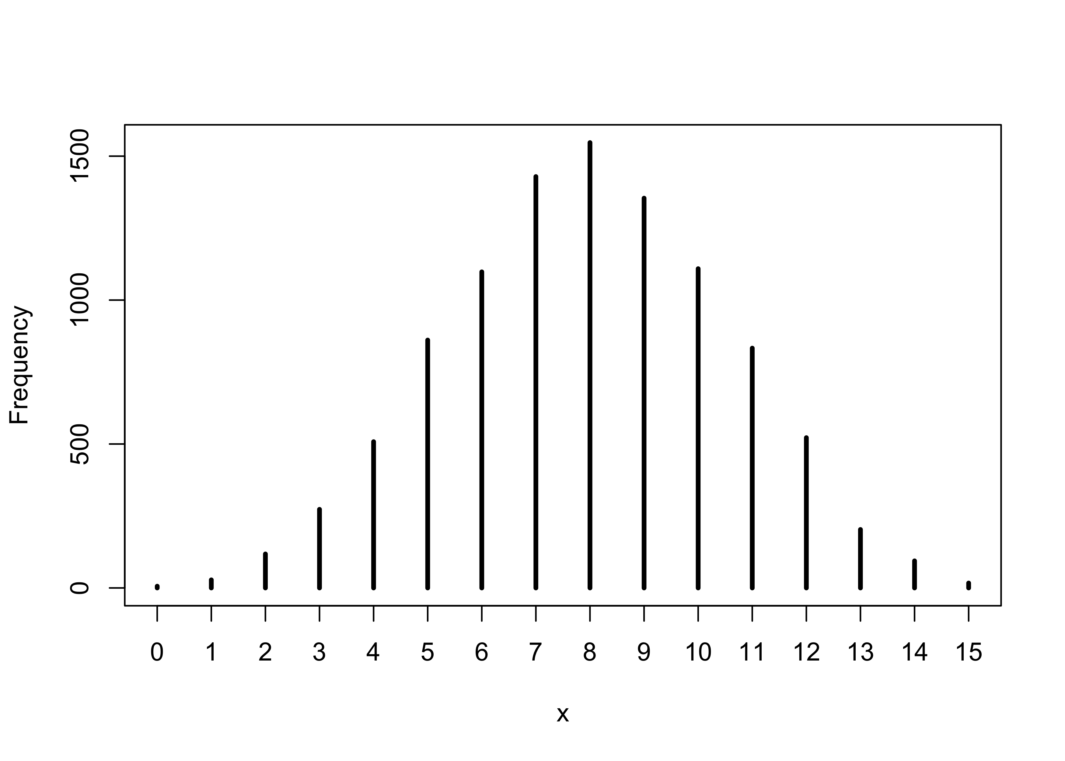
- the following samples 9 tosses and counts the number of waters expected given $p=0.7$
dummy_w <- rbinom(1e5, size = 9, prob = 0.7)
simplehist(dummy_w, xlab = "dummy water count")

3.3.2 Model checking
- this is:
- ensuring the model fitting worked correctly
- evaluating the adequacy of the model for some purpose
3.3.2.1 Did the software work?
- there is no perfect method for doing this
- the globe-tossing example is so simple we cannot do much here, but this will be revisited in later chapters
3.3.2.2 Is the model adequate?
- the goal is to assess exactly how the model fails to describe the
data
- this is a path towards model comprehension, revision, and improvement
- all models fail (they are not perfect representations), so we have to decide whether the failures are important or not
- we will do some basic model checking using the simulated observations of the globe-tossing model
- there are two types of uncertainty in the model predictions:
- observation uncertainty is the uncertainty in the pattern of observations; even if we know $p$, we do not know the next result of tossing the globe
- uncertainty about $p$ is embodied by the posterior distribution
- we want to propagate the parameter uncertainty as we evaluate the
implied predictions
- this means averaging over the posterior density for $p$ when computing predictions
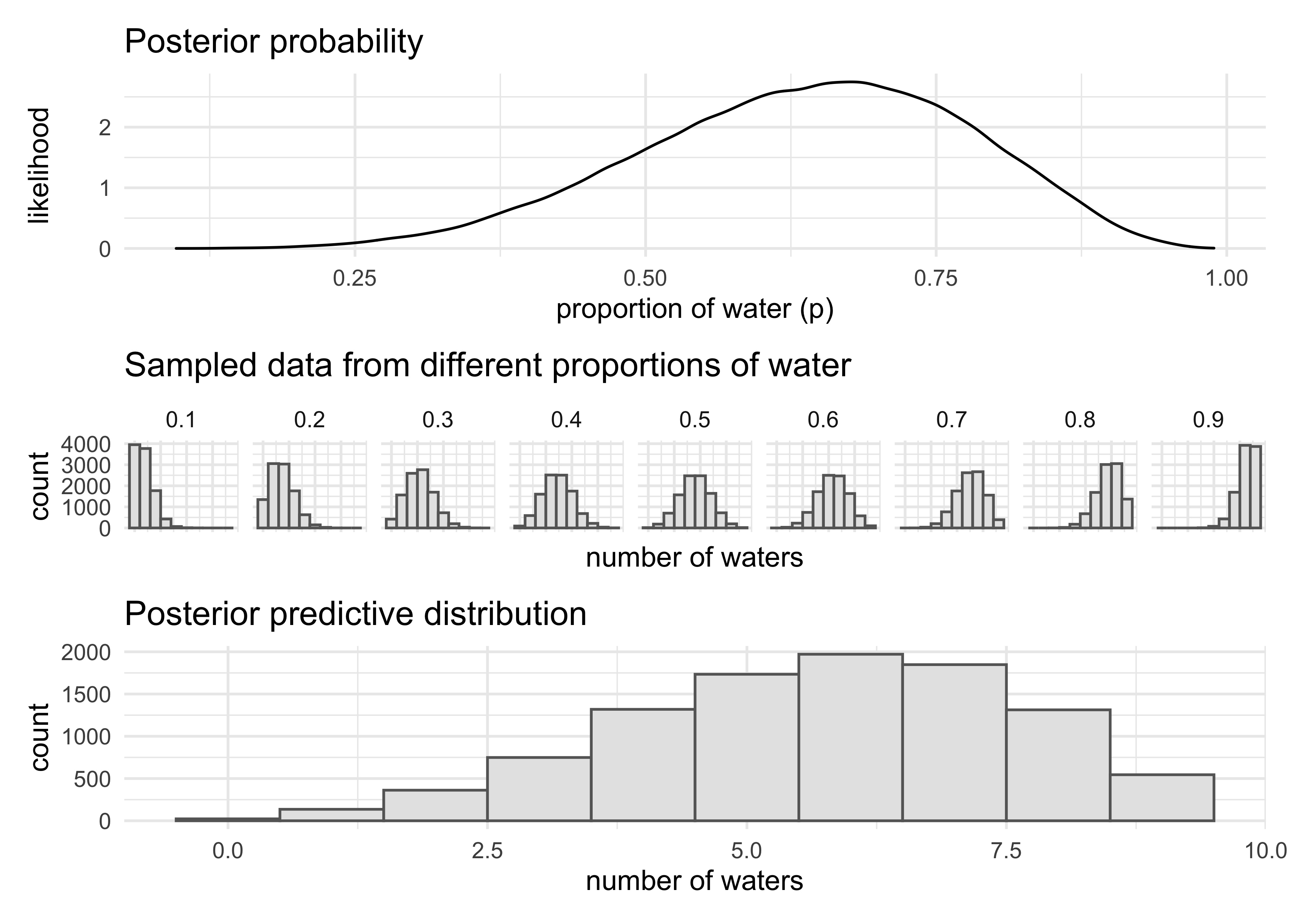
- compute the sampling distribution of outcomes at each $p$ and average those distributions to make the posterior predictive distribution
- this method provides a better idea of the uncertainty in the model
by using the entire posterior distribution instead of a single point
estimate
- the following code shows the process of making the posterior predictive distribution
- we can use the
samplesvariable because it has draws of $p$ in proportion to their posterior probabilities
# Globe tossing model with 6 waters from 9 tosses
p_grid <- seq(from = 0, to = 1, length.out = 1e3)
prior <- rep(1, 1e3)
likelihood <- dbinom(6, size = 9, prob = p_grid)
posterior <- likelihood * prior
posterior <- posterior / sum(posterior)

# Sample from the posterior
samples <- sample(p_grid, prob = posterior, size = 1e5, replace = TRUE)
posterior_dist <- tibble(x = samples) %>%
    ggplot(aes(x = x)) +
    geom_density() +
    labs(x = "proportion of water (p)",
         y = "likelihood",
         title = "Posterior probability")

small_grid <- seq(0.1, 0.9, 0.1)
sampled_dists <- tibble(p = small_grid) %>%
    mutate(sampled_dists = purrr::map(p, ~ rbinom(1e4, size = 9, prob = .x))) %>%
    unnest(sampled_dists) %>%
    ggplot(aes(x = sampled_dists)) +
    facet_wrap(~ p, nrow = 1) +
    geom_histogram(binwidth = 1, fill = "grey90", color = "grey40") +
    theme(axis.text.x = element_blank()) +
    labs(x = "number of waters",
         y = "count",
         title = "Sampled data from different proportions of water")

w <- rbinom(1e4, size = 9, prob = samples)
posterior_predictive_dist <- tibble(x = w) %>%
    ggplot(aes(x = x)) +
    geom_histogram(binwidth = 1, fill = "grey90", color = "grey40") +
    labs(x = "number of waters",
         y = "count",
         title = "Posterior predictive distribution")


(posterior_dist / sampled_dists /posterior_predictive_dist) +
    plot_layout(heights = c(2, 1, 2))
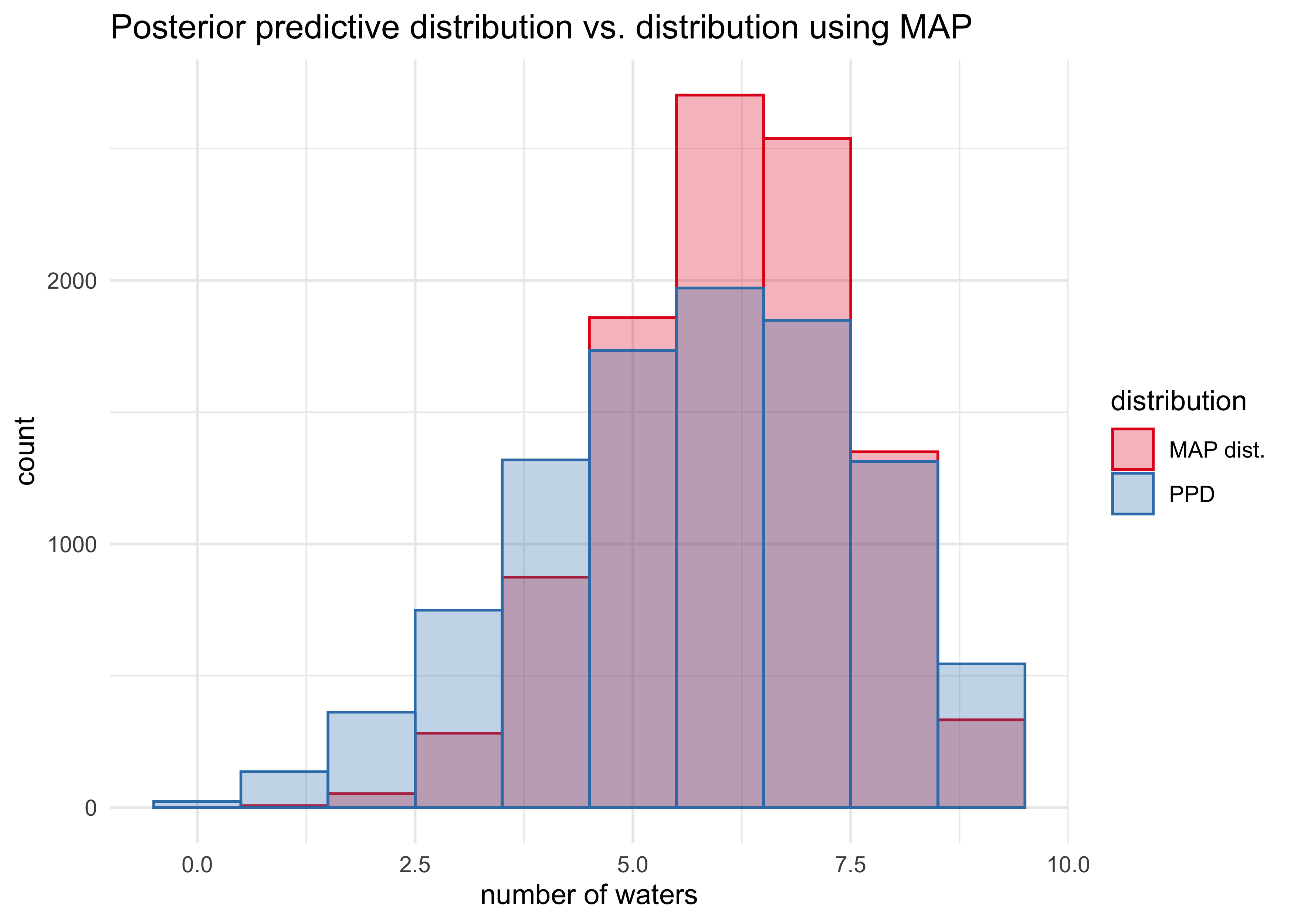
- we can compare the posterior predictive distribution to the distribution if we only took samples from the MAP of the posterior
posteior_map <- chainmode(samples, adj = 0.01)

map_samples <- rbinom(1e4, size = 9, prob = posteior_map)

tibble(ppd = list(w),
                         map_dist = list(map_samples)) %>%
    pivot_longer(ppd:map_dist, names_to = "distribution", values_to = "sampled_vals") %>%
    unnest(sampled_vals) %>%
    ggplot(aes(x = sampled_vals)) +
    geom_histogram(aes(fill = distribution,
                       color = distribution), position = "identity",
                   alpha = 0.3, binwidth = 1) +
    scale_fill_brewer(type = "qual", palette = "Set1",
                      labels = c("MAP dist.", "PPD")) +
    scale_color_brewer(type = "qual", palette = "Set1",
                      labels = c("MAP dist.", "PPD")) +
    labs(x = "number of waters",
         y = "count",
         title = "Posterior predictive distribution vs. distribution using MAP")
- we can also look at the actual sequences of data
- how long are the stretches of repeated “waters” when tossing the globe?
- how many “switches” are there from “water” to “land”
- these test how well the assumptions that the observed samples are
independent from each other
- inconsistencies here may or may not be important depending on the cause
- for example:
- the number of switches from “water” to “land” was higher in the observed data than predicted if the tosses were independent
- this just means that each toss provides less information about the true coverage of the globe, but the model will still converge on the correct proportion
- however, it will converge more slowly than the posterior distribution may lead us to believe
3.5 Practice
Easy
“These problems use the samples from the posterior distribution for the globe tossing example. This code will give you a specific set of samples, so that you can check your answers exactly.”
p_grid <- seq(from = 0, to = 1, length.out = 1000)
prior <- rep(1, 1000)
likelihood <- dbinom(6, size=9, prob = p_grid)
posterior <- likelihood * prior
posterior <- posterior / sum(posterior)
set.seed(100)
samples <- sample(p_grid, prob = posterior, size=1e4, replace = TRUE)
3E1. How much posterior probability lies below p = 0.2?
sum(samples < 0.2) / length(samples)
#> [1] 4e-04
3E2. How much posterior probability lies above p = 0.8?
sum(samples > 0.8) / length(samples)
#> [1] 0.1116
3E3. How much posterior probability lies between p = 0.2 and p = 0.8?
sum(samples > 0.2 & samples < 0.8) / length(samples)
#> [1] 0.888
3E4. 20% of the posterior probability lies below which value of p?
quantile(samples, 0.2)
#>       20%
#> 0.5185185
3E5. 20% of the posterior probability lies above which value of p?
quantile(samples, 0.8)
#>       80%
#> 0.7557558
3E6. Which values of p contain the narrowest interval equal to 66% of the posterior probability?
HPDI(samples, prob = 0.66)
#>     |0.66     0.66|
#> 0.5085085 0.7737738
3E7. Which values of p contain 66% of the posterior probability, assuming equal posterior probability both below and above the interval?
PI(samples, prob = 0.66)
#>       17%       83%
#> 0.5025025 0.7697698
Medium
3M1. Suppose the globe tossing data had turned out to be 8 water in 15 tosses. Construct the posterior distribution, using grid approximation. Use the same flat prior as before.
set.seed(0)

p_grid <- seq(0, 1, length.out = 1e4)
prior <- rep(1, 1e4)
likelihood <- dbinom(x = 8, size = 15, prob = p_grid)
posterior <- prior * likelihood
posterior <- posterior / sum(posterior)

plot(density(posterior))
3M2. Draw 10,000 samples from the grid approximation from above. Then use the samples to calculate the 90% HPDI for p.
set.seed(0)
samples <- sample(p_grid, size = 1e4, prob = posterior, replace = TRUE)

HPDI(samples, prob = 0.90)
#>      |0.9      0.9|
#> 0.3304330 0.7166717
plot(density(samples))
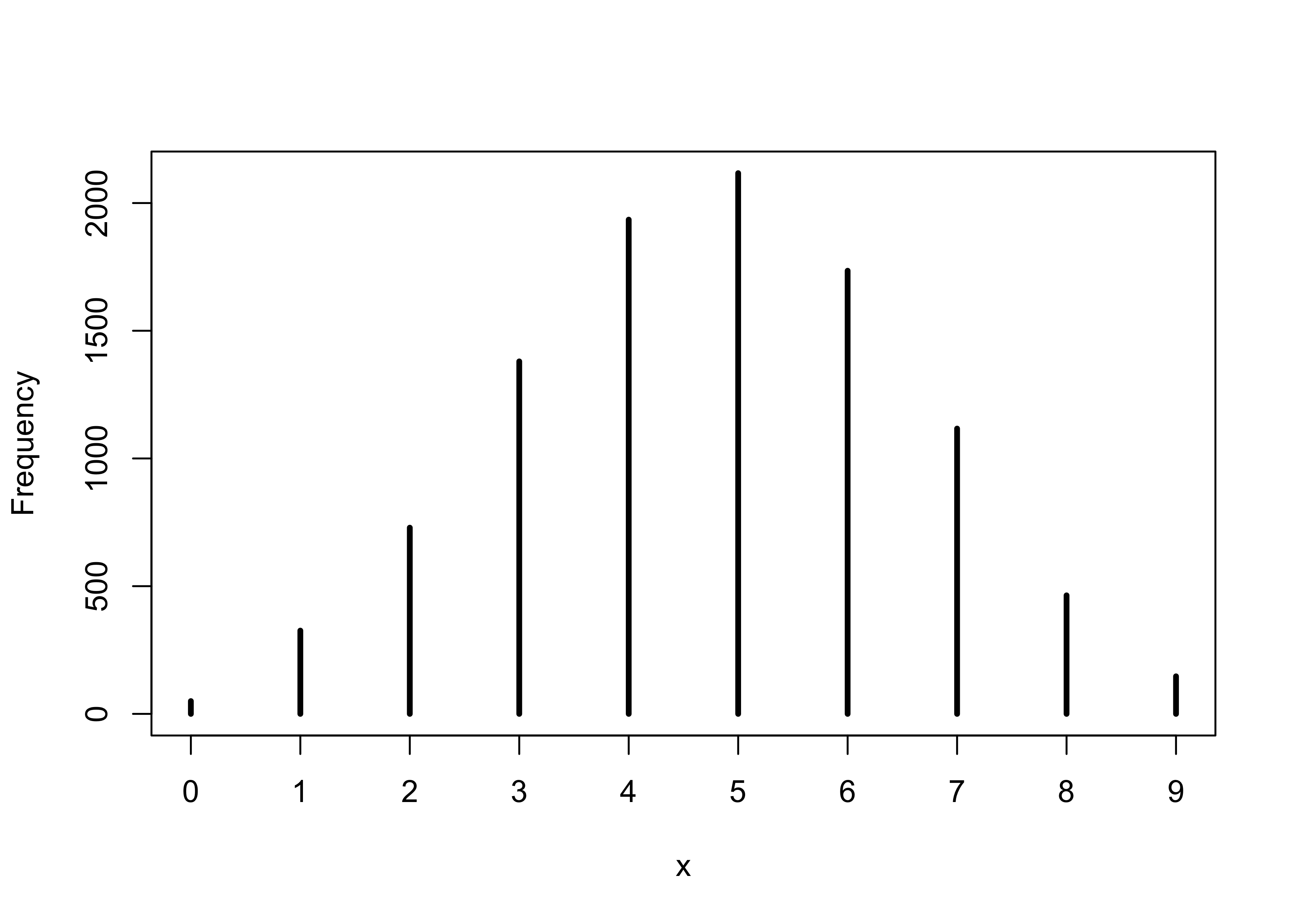
3M3. Construct a posterior predictive check for this model and data. This means simulate the distribution of samples, averaging over the posterior uncertainty in p. What is the probability of observing 8 water in 15 tosses?
ppd <- rbinom(1e4, size = 15, prob = samples)
sum(ppd == 8) / length(ppd)
#> [1] 0.1547
simplehist(ppd)
3M4. Using the posterior distribution constructed from the new (8/15) data, now calculate the probability of observing 6 water in 9 tosses.
ppd <- rbinom(1e4, size = 9, prob = samples)
sum(ppd == 6) / length(ppd)
#> [1] 0.1735
simplehist(ppd)
3M5. Start over at 3M1, but now use a prior that is zero below p = 0.5 and a constant above p = 0.5. This corresponds to prior information that a majority of the Earth’s surface is water. Repeat each problem above and compare the inferences. What difference does the better prior make? If it helps, compare inferences (using both priors) to the true value p = 0.7.
set.seed(0)

p_grid <- seq(0, 1, length.out = 1e4)
prior <- ifelse(p_grid < 0.5, 0, 1)
likelihood <- dbinom(x = 8, size = 15, prob = p_grid)
posterior <- prior * likelihood
posterior <- posterior / sum(posterior)

samples <- sample(p_grid, size = 1e4, prob = posterior, replace = TRUE)
cat("HPDI:\n")
#> HPDI:
HPDI(samples, prob = 0.90)
#>      |0.9      0.9|
#> 0.5000500 0.7119712
cat("\n")
ppd <- rbinom(1e4, size = 15, prob = samples)
glue("Prob of 8 waters of 15 tosses: {sum(ppd == 8) / length(ppd)}")
#> Prob of 8 waters of 15 tosses: 0.1632
ppd <- rbinom(1e4, size = 9, prob = samples)
glue("Prob of 6 waters of 9 tosses: {sum(ppd == 6) / length(ppd)}")
#> Prob of 6 waters of 9 tosses: 0.2266
Hard
Introduction. The practice problems here all use the data below. These data indicate the gender (male=1, female=0) of officially reported first and second born children in 100 two-child families. So for example, the first family in the data reported a boy (1) and then a girl (0). The second family reported a girl (0) and then a boy (1). The third family reported two girls. You can load these two vectors into R’s memory by typing:
data(homeworkch3)

head(birth1)
#> [1] 1 0 0 0 1 1
head(birth2)
#> [1] 0 1 0 1 0 1
3H1. Using grid approximation, compute the posterior distribution for the probability of a birth being a boy. Assume a uniform prior probability. Which parameter value maximizes the posterior probability?
set.seed(0)

all_births <- c(birth1, birth2)
num_boys <- sum(all_births == 1)
num_births <- length(all_births)

p_grid <- seq(0, 1, length.out = 1e4)
prior <- rep(1, 1e4)
likelihood <- dbinom(num_boys, size = num_births, prob = p_grid)
posterior <- prior * likelihood
posterior <- posterior / sum(posterior)

glue("MAP of prob of getting a boy: {round(p_grid[which.max(posterior)], 5)}")
#> MAP of prob of getting a boy: 0.55496
3H2. Using the sample function, draw 10,000 random parameter values from the posterior distribution you calculated above. Use these samples to estimate the 50%, 89%, and 97% highest posterior density intervals.
birth_samples <- sample(p_grid, size = 1e4, replace = TRUE, prob = posterior)
plot(density(birth_samples))
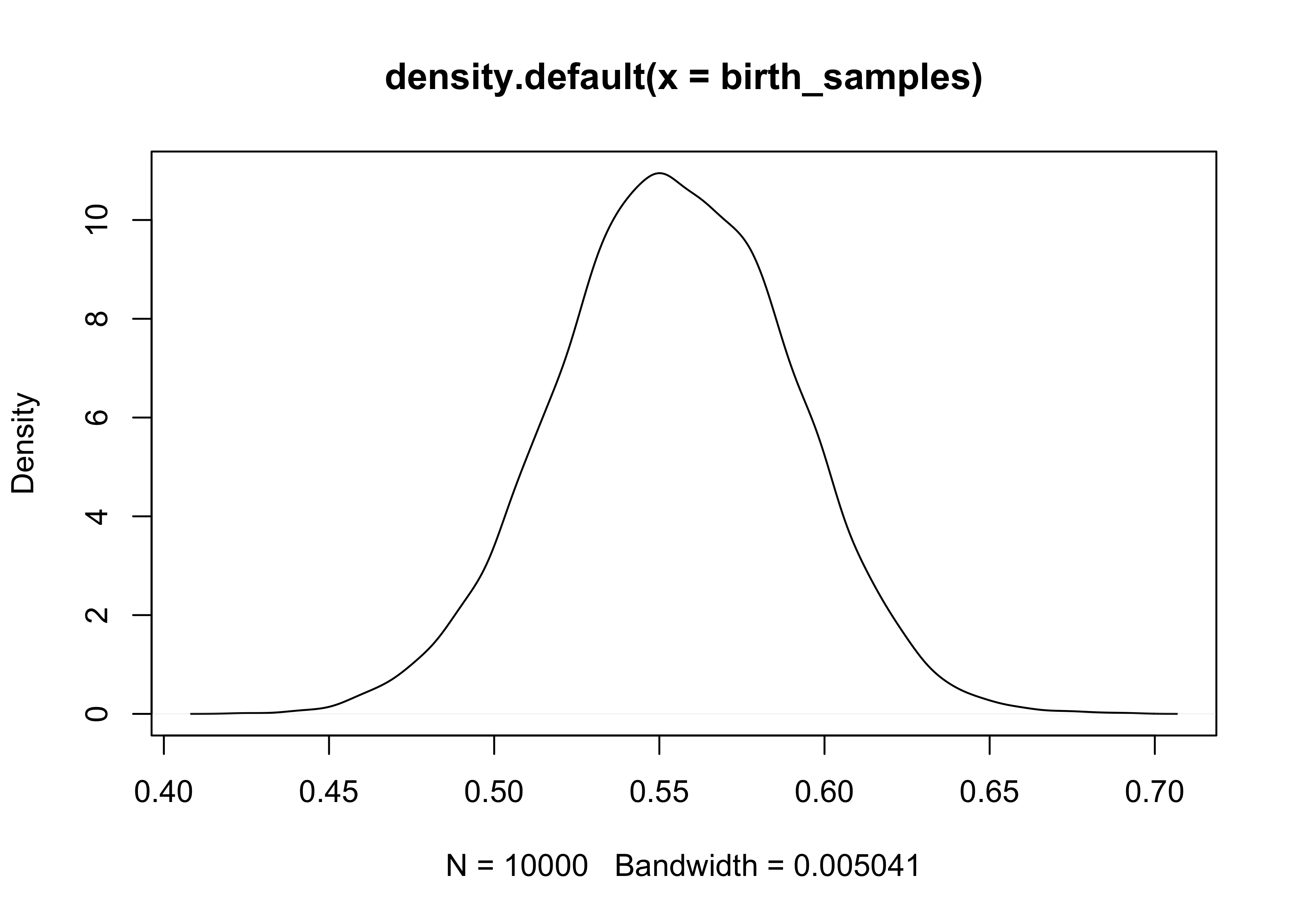
purrr::map(c(0.5, 0.89, 0.97), ~ HPDI(birth_samples, prob = .x))
#> [[1]]
#>      |0.5      0.5|
#> 0.5298530 0.5778578
#>
#> [[2]]
#>     |0.89     0.89|
#> 0.5012501 0.6131613
#>
#> [[3]]
#>     |0.97     0.97|
#> 0.4750475 0.6271627
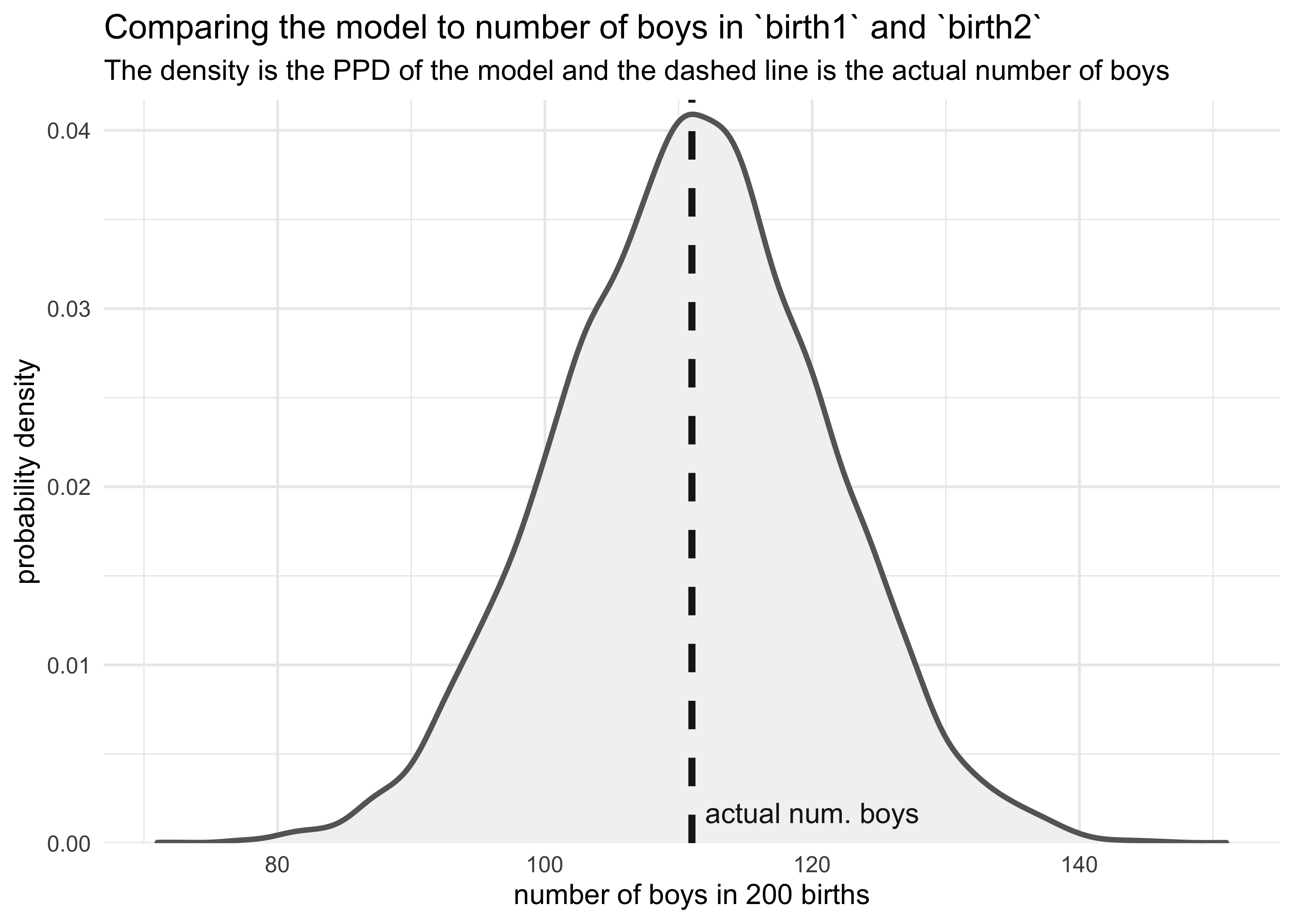
3H3. Use rbinom to simulate 10,000 replicates of 200 births. You should end up with 10,000 numbers, each one a count of boys out of 200 births. Compare the distribution of predicted numbers of boys to the actual count in the data (111 boys out of 200 births). There are many good ways to visualize the simulations, but the dens command (part of the rethinking package) is probably the easiest way in this case. Does it look like the model fits the data well? That is, does the distribution of predictions include the actual observation as a central, likely outcome?
boy_counts <- rbinom(1e4, 200, prob = birth_samples)
tibble(x = boy_counts) %>%
    ggplot(aes(x = x)) +
    geom_density(color = "grey40", fill = "grey95", size = 1) +
    geom_vline(xintercept = num_boys, color = "grey10", size = 1.3, lty = 2) +
    geom_text(data = tibble(x = num_boys + 1, y = 0, label = "actual num. boys"),
              aes(x = x, y = y, label = label),
              hjust = 0, vjust = -1, color = "grey10") +
    scale_y_continuous(expand = expansion(mult = c(0, 0.02))) +
    labs(x = "number of boys in 200 births",
         y = "probability density",
         title = "Comparing the model to number of boys in `birth1` and `birth2`",
         subtitle = "The density is the PPD of the model and the dashed line is the actual number of boys")
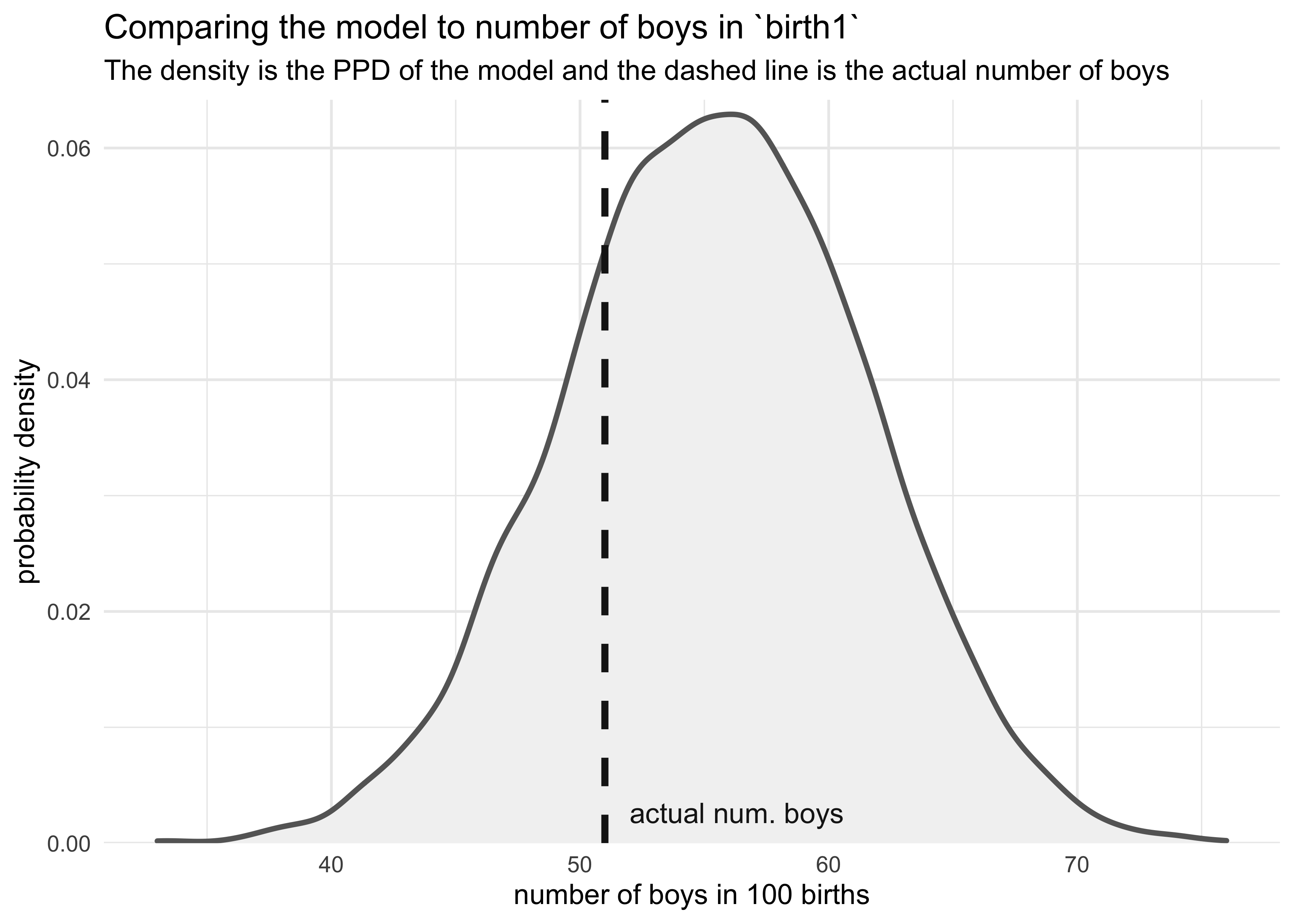
3H4. Now compare 10,000 counts of boys from 100 simulated first borns only to the number of boys in the first births, birth1. How does the model look in this light?
boy_counts <- rbinom(1e4, 100, prob = birth_samples)
tibble(x = boy_counts) %>%
    ggplot(aes(x = x)) +
    geom_density(color = "grey40", fill = "grey95", size = 1) +
    geom_vline(xintercept = sum(birth1), color = "grey10", size = 1.3, lty = 2) +
    geom_text(data = tibble(x = sum(birth1) + 1,
                            y = 0,
                            label = "actual num. boys"),
              aes(x = x, y = y, label = label),
              hjust = 0, vjust = -1, color = "grey10") +
    scale_y_continuous(expand = expansion(mult = c(0, 0.02))) +
    labs(x = "number of boys in 100 births",
         y = "probability density",
         title = "Comparing the model to number of boys in `birth1`",
         subtitle = "The density is the PPD of the model and the dashed line is the actual number of boys")
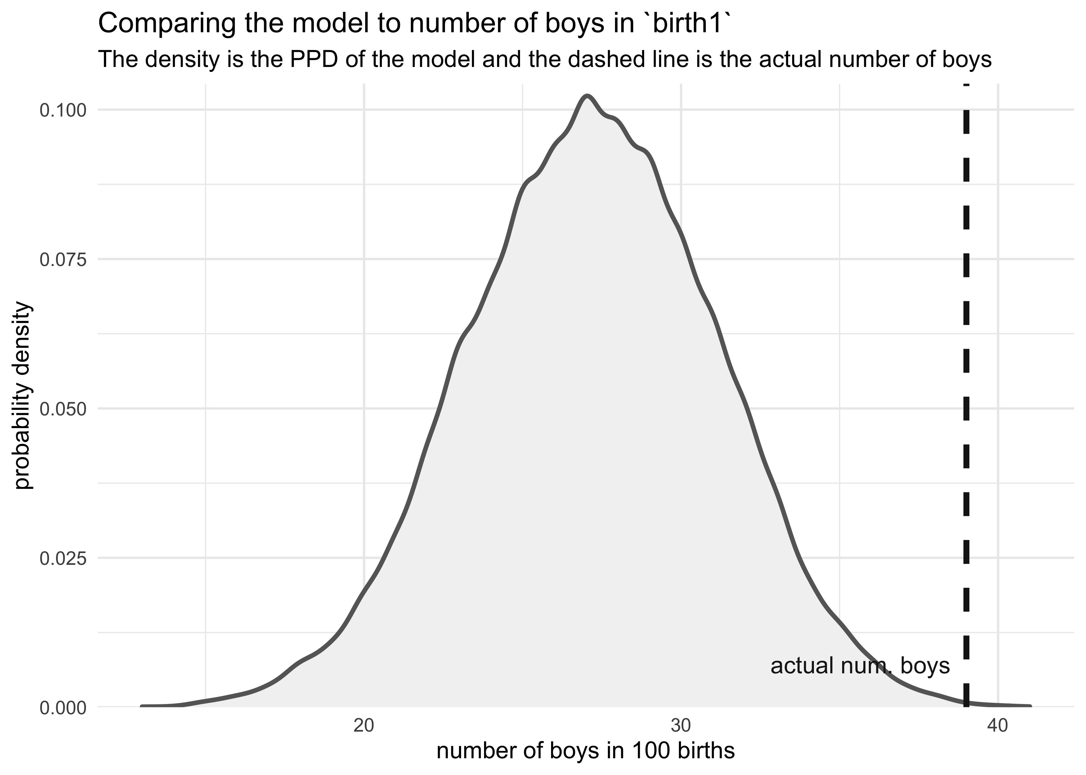
3H5. The model assumes that sex of first and second births are independent. To check this assumption, focus now on second births that followed female first borns. Compare 10,000 simulated counts of boys to only those second births that followed girls. To do this correctly, you need to count the number of first borns who were girls and simulate that many births, 10,000 times. Compare the counts of boys in your simulations to the actual observed count of boys following girls. How does the model look in this light? Any guesses what is going on in these data?
num_girls_first <- sum(birth1 == 0)
birth2_after_girl <- birth2[birth1 == 0]

glue("There were {num_girls_first} girls in `birth1`")
#> There were 49 girls in `birth1`
glue("There were {sum(birth2_after_girl)} boys that followed girls.")
#> There were 39 boys that followed girls.
boy_counts <- rbinom(1e4, num_girls_first, prob = birth_samples)
tibble(x = boy_counts) %>%
    ggplot(aes(x = x)) +
    geom_density(color = "grey40", fill = "grey95", size = 1) +
    geom_vline(xintercept = sum(birth2_after_girl), color = "grey10", size = 1.3, lty = 2) +
    geom_text(data = tibble(x = sum(birth2_after_girl) - 0.5,
                            y = 0,
                            label = "actual num. boys"),
              aes(x = x, y = y, label = label),
              hjust = 1, vjust = -2, color = "grey10") +
    scale_y_continuous(expand = expansion(mult = c(0, 0.02))) +
    labs(x = "number of boys in 100 births",
         y = "probability density",
         title = "Comparing the model to number of boys in `birth1`",
         subtitle = "The density is the PPD of the model and the dashed line is the actual number of boys")
Joshua Cook
Graduate Student
My research interests include cancer genetics and evolution. I also learning about programming and computer science in general.