Chapter 10. Counting And Classification
- information if often thrown away by using ratios of counts instead
of the counts themselves
- 10/20 and 1/2 are the same ratio, but the first has more information
- there is friction in using the count data instead of the proportions
- interpretation is less intuitive
- this chapter covers the two most popular count distributions:
- binomial regression: model a binary classification
- dead/alive, accept/reject 2 Poisson regression: models outcome without a known maximum
- a binomial models with a very large maximum and small probability per trial
- number of elephants in Kenya, number of people who apply to graduate school
- binomial regression: model a binary classification
10.1 Binomial regression
the following formula where $y$ is a count, $p$ is the probability of success in a trial, $n$ is the number of trials $$ y \sim \text{Binomial}(n, p) $$
the two most common GLMs that use binomial likelihood functions:
- logistic regression: data are in single-trial cases and the outcome is only 0 or 1
- aggregated binomial regression: when individual trials with
the same covariate values are aggregated together
- the outcome can take a value of 0 or any positive integer up to $n$ number of trials
both GLMs use the same logit link function
- so both are sometimes called logistic regression and they can be converted between each other
10.1.1 Logistic regression: Prosocial chimpanzees
- example experimental data
- measure the prosocial behavior of chimps
- a focal chimp has the option to pull two levers where the first only gives the focal chimp food and the other gives the focal chimp food, but not the other chimp
- therefore, the focal chimp always gets food and decides if the other chimp gets food
- the control condition is to not have another chimp and the partner condition is to have the second chimp
- the two choices are swapped from the left and right hand sides to detect any handedness of the focal chimps
data("chimpanzees")
d <- as_tibble(chimpanzees) %>% janitor::clean_names()
d
#> # A tibble: 504 x 8
#>    actor recipient condition block trial prosoc_left chose_prosoc pulled_left
#>    <int>     <int>     <int> <int> <int>       <int>        <int>       <int>
#>  1     1        NA         0     1     2           0            1           0
#>  2     1        NA         0     1     4           0            0           1
#>  3     1        NA         0     1     6           1            0           0
#>  4     1        NA         0     1     8           0            1           0
#>  5     1        NA         0     1    10           1            1           1
#>  6     1        NA         0     1    12           1            1           1
#>  7     1        NA         0     2    14           1            0           0
#>  8     1        NA         0     2    16           1            0           0
#>  9     1        NA         0     2    18           0            1           0
#> 10     1        NA         0     2    20           0            1           0
#> # … with 494 more rows
- we will focus on the columns:
pulled_left: the outcome to predictprosoc_left: a predictor for if the left-hand lever was the prosocial optioncondition: contains a 1 for when there was a second partner chimp
- the model we will fit:
- $L$: indicates if the left-hand lever was pulled
- $P$: indicates if the left-hand option was pro-social
- $C$: indicates whether or not the condition was with the partner
$$ L_i \sim \text{Binomial}(1, p_i) $$ $$ \text{logit}(p_i) = \alpha + (\beta_P + \beta_{PC} C_i)P_i $$ $$ \alpha \sim \text{Normal}(0, 10) $$ $$ \beta_P \sim \text{Normal}(0, 10) $$ $$ \beta_PC \sim \text{Normal}(0, 10) $$
- this model includes an interaction term for the left-hand option
being pro-social and whether or not there is a second chimp
- also there is no main effect of the
condition$C_i$ because we do not expect the presence of a second chimp on its own to predict whether the focal chimp pulls the left lever
- also there is no main effect of the
- the priors are gently regularizing
- as comparative measures of overfitting, fit two other models with
fewer parameters
- one with just an intercept
- one without only the
prosoc_leftpredictor (no predictor forconditionwhether there is a second chimp)
$$ L_i \sim \text{Binomial}(1, p_i) $$ $$ \text{logit}(p_i) = \alpha $$ $$ \alpha \sim \text{Normal}(0, 10) $$
$$ L_i \sim \text{Binomial}(1, p_i) $$ $$ \text{logit}(p_i) = \alpha + \beta_P P_i $$ $$ \alpha \sim \text{Normal}(0, 10) $$ $$ \beta_P \sim \text{Normal}(0, 10) $$
- first we will inspect the simplest model, the one with only an intercept
m10_1 <- quap(
    alist(
        pulled_left ~ dbinom(1, p),
        logit(p) <- a,
        a ~ dnorm(0, 10)
    ),
    data = d
)

precis(m10_1)
#>        mean         sd     5.5%    94.5%
#> a 0.3201415 0.09022718 0.175941 0.464342
- $\alpha$ is on the scale of log-odds
- to get it to probability scale, must use the inverse link function, the logistic
- the ‘rethinking’ package offers the function
logisitic()to do this, but below I just show the calculation for education reasons
# MAP
1 / (1 + exp(-0.32))
#> [1] 0.5793243
# 89% interval
c(1 / (1 + exp(-0.18)), 1 / (1 + exp(-0.46)))
#> [1] 0.5448789 0.6130142
logistic
#> function (x)
#> {
#>     p <- 1/(1 + exp(-x))
#>     p <- ifelse(x == Inf, 1, p)
#>     p
#> }
#> <bytecode: 0x7f92807be410>
#> <environment: namespace:rethinking>
- $\text{logistic}(0.32) \approx 0.58$ means that the probability of
pulling the left-hand lever was 0.58 with an 89% interval of 0.54 to
0.61
- the chimps had a tendency to favor the left without any other information
- the following two code chunks fit the other two models proposed above
m10_2 <- quap(
    alist(
        pulled_left ~ dbinom(1, p),
        logit(p) <- a + bp*prosoc_left,
        a ~ dnorm(0, 10),
        bp ~ dnorm(0, 10)
    ),
    data = d
)

precis(m10_2)
#>         mean        sd       5.5%     94.5%
#> a  0.0477090 0.1260040 -0.1536697 0.2490877
#> bp 0.5573081 0.1823154  0.2659328 0.8486833
m10_3 <- quap(
    alist(
        pulled_left ~ dbinom(1, p),
        logit(p) <- a + (bp + bpc*condition)*prosoc_left,
        a ~ dnorm(0, 10),
        bp ~ dnorm(0, 10),
        bpc ~ dnorm(0, 10)
    ),
    data = d
)

precis(m10_3)
#>            mean        sd       5.5%     94.5%
#> a    0.04771766 0.1260040 -0.1536611 0.2490964
#> bp   0.60967089 0.2261462  0.2482456 0.9710962
#> bpc -0.10396684 0.2635904 -0.5252352 0.3173015
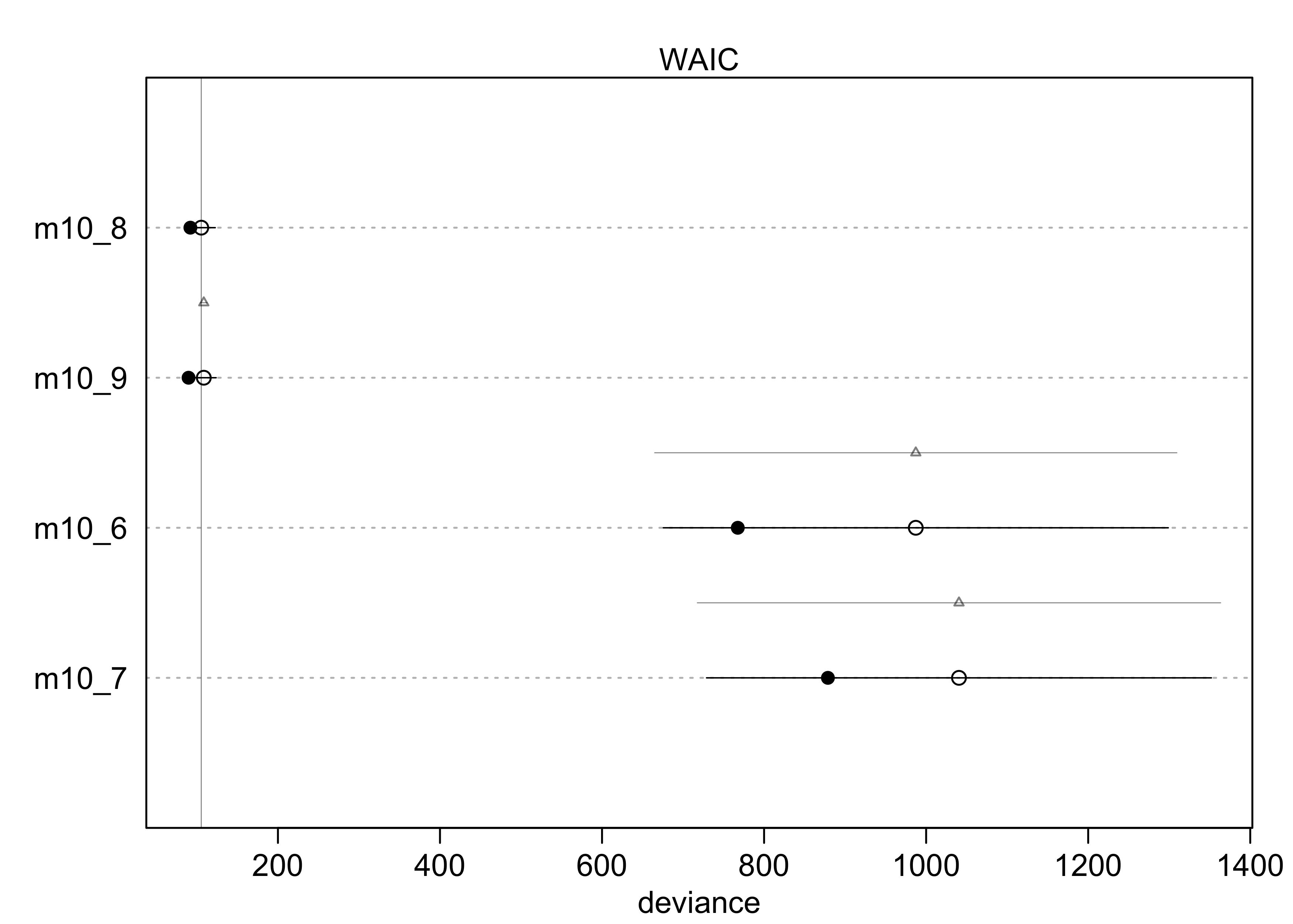
compare(m10_1, m10_2, m10_3)
#>           WAIC       SE    dWAIC       dSE     pWAIC    weight
#> m10_2 680.4648 9.165323 0.000000        NA 1.9807109 0.7106338
#> m10_3 682.3826 9.403175 1.917804 0.8137132 3.0213904 0.2723955
#> m10_1 687.9341 7.070955 7.469337 6.0718121 0.9966656 0.0169707
plot(compare(m10_1, m10_2, m10_3))
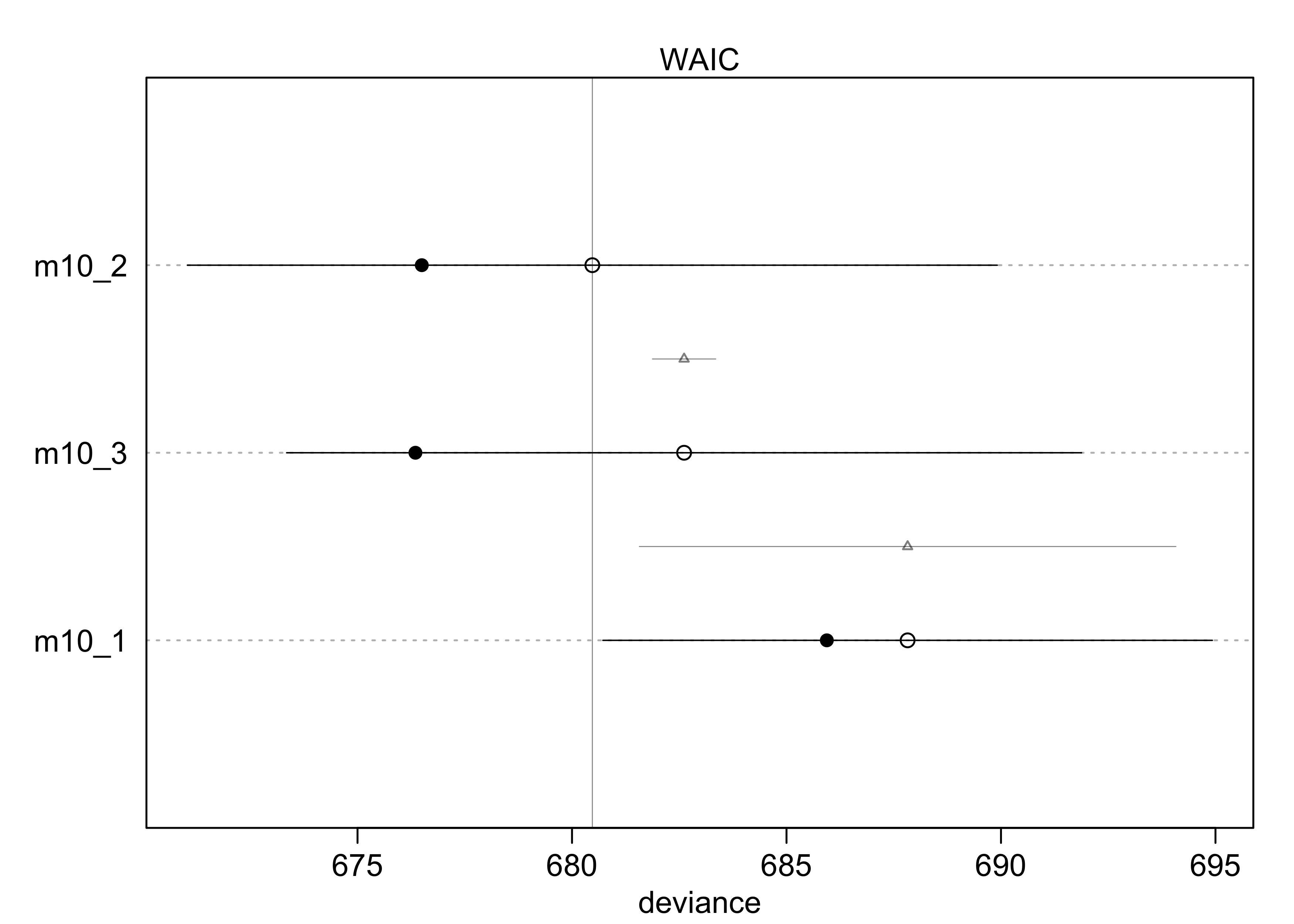
- from the WAIC, we can see that
m10_3likely overfits a bit because its WAIC is greater thanm10_2- though the difference in WAIC is small, the difference standard
error
dSEis very small and suggests it is a real difference
- though the difference in WAIC is small, the difference standard
error
- but
m10_3should not just be rejected, it still reflects the structure of the experiment- we do want to see why
m10_3performs worse thanm10_2
- we do want to see why
- the estimates for
m10_3show a negative interaction term with a large 89% interval- suggests the chimps don’t care too much about the presence of another chimp
- they do prefer to pull the prosocial option, though, because that estimate is 0.61 with an 89% interval well above 0
- to understand the impact of the estimate 0.61 for
bp, must distinguish between the absolute effect and the relative effect- absolute effect: the change in the probability of the outcome,
depending on all of the parameters
- tells us the practical impact of a change in a predictor
- relative effect: the proportional changes induced by a change
in the predictor
- the author claims that this effect can be misleading because they ignore the other parameters
- absolute effect: the change in the probability of the outcome,
depending on all of the parameters
- the relative effect:
- consider the relative effect size of
prosoc_leftand its parameterbp - the customary measure of relative effect for logistic model is
the proportional change in odds
- just the exponent of the parameter estimate
- it is $\exp(0.61) \approx 1.84$ for
bp - odds are the ratio of the probability an even happens to the probability that it does not
- for
bp, the log-odds of pulling the left-hand level (the outcome variable) is increased by 0.61- alternatively, the odds are multiplied by 1.84
- the difficulty with proportional odds is that the actual change
in probability depends on the intercept and the other predictor
variables
- for example, consider that the intercept $\alpha = 4$, then the probability of pulling the left-lever, ignoring all else, is $\text{logistic}(4) = 0.98$
- then the increase from
bpwould be $\text{logistic}(4 + 0.61) = 0.99$ - the difference from
bpis really not very much on the absolute scale
- consider the relative effect size of
- the absolute effect:
- consider the model-average posterior predictive check to get a
sense of the absolute effect of each treatment on the
probability of pulling the left-hand lever
- use the
ensemble()function to take a weighted average (by WAIC) over the three models - in the following plot, this is compared to the proportion of times the left-hand lever was pull by each chimp in all four conditions
- use the
- interpreting the plot
- the chimps, on average, tended to pull the prosocial option on the left (“1,0” and “1,1”)
- the partner condition did not seem to matter because the heights of the lines did not tend to move when the condition was changed and hand of the lever was held constant
- consider the model-average posterior predictive check to get a
sense of the absolute effect of each treatment on the
probability of pulling the left-hand lever
d_pred <- tibble(
    prosoc_left = c(0, 1, 0, 1),
    condition = c(0, 0, 1, 1)
)

# Build an ensemble from all three models weighted by WAIC.
chimp_ensemble <- ensemble(m10_1, m10_2, m10_3, data = d_pred)

# Summarize the predictions.
pred_p <- apply(chimp_ensemble$link, 2, mean)
pred_p_pi <- apply(chimp_ensemble$link, 2, PI)

pred_tibble <- d_pred %>%
    mutate(pred_p = pred_p) %>%
    bind_cols(pi_to_df(pred_p_pi)) %>%
    mutate(group = paste(prosoc_left, condition, sep = ","),
           group = factor(group))
chimp_data <- d %>%
    group_by(prosoc_left, condition, actor) %>%
    summarise(p = mean(pulled_left)) %>%
    ungroup() %>%
    mutate(group = paste(prosoc_left, condition, sep = ","),
           group = factor(group))

chimp_data %>%
    ggplot() +
    geom_line(aes(x = group, y = p, group = actor),
              color = "skyblue2") +
    geom_line(data = pred_tibble,
              aes(x = group,  y = pred_p, group = "1"),
              color = "black") +
    geom_ribbon(data = pred_tibble,
              aes(x = group, group = "1",
                  ymin = x5_percent, ymax = x94_percent),
              alpha = 0.2) +
    labs(x = "prosoc_left, condition",
         y = "proportion pulled left",
         title = "",
         subtitle = "Each blue line is a separate chimp in each combination of 'prosoc_left' and 'condition'.")
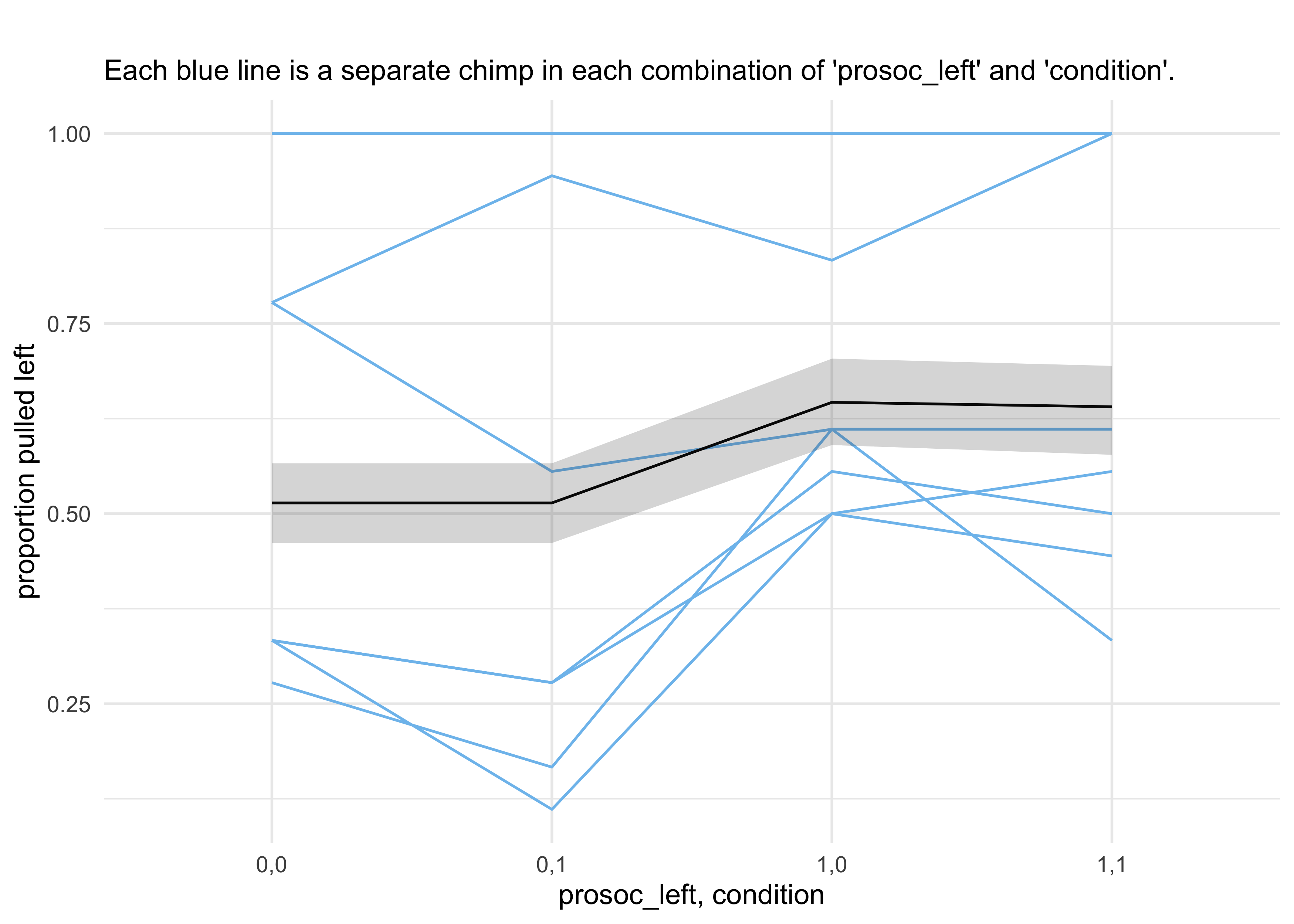
- the predictions are quite poor because they are averages across all
chimps
- a lot of variation among individuals could mask the association of interest
- we can model this variation between individuals
- the chimps showed signs of handedness - some preferred pulling the
left lever and others preferred pulling the right lever
- estimate handedness as a distinct intercept for each chimp
- below is the model to fit
- the intercept $\alpha$ has a subscript, one for each chimp
- $alpha$ is a vector of parameters
$$ L_i \sim \text{Binomial}(1, p_i) $$ $$ \text{logit}(p_i) = \alpha_{\text{ACTOR}[i]} + (\beta_P + \beta_{PC} C_i) P_i $$ $$ \alpha_text{ACTOR} \sim \text{Normal}(0, 10) $$ $$ \beta_P \sim \text{Normal}(0, 10) $$ $$ \beta_PC \sim \text{Normal}(0, 10) $$
- this model is coded and fit using MCMC below
# Clean up data frame for use with `map2stan()`.
d2 <- d %>% select(pulled_left, actor, condition, prosoc_left)

stash("m10_4", depends_on = "d2", {
    m10_4 <- map2stan(
        alist(
            pulled_left ~ dbinom(1, p),
            logit(p) <- a[actor] + (bp + bpc*condition)*prosoc_left,
            a[actor] ~ dnorm(0, 10),
            bp ~ dnorm(0, 10),
            bpc ~ dnorm(0, 10)
        ),
        data = d2, chains = 2, iter = 2500, warmup = 500
    )
})
#> Loading stashed object.
precis(m10_4, depth = 2)
#>            mean        sd       5.5%      94.5%    n_eff     Rhat4
#> a[1] -0.7366683 0.2712491 -1.1710162 -0.3075729 3649.712 0.9996477
#> a[2] 10.8842654 5.3959957  4.4191227 20.9936577 1263.201 1.0021457
#> a[3] -1.0519842 0.2796649 -1.4932984 -0.6025021 3778.823 1.0000896
#> a[4] -1.0486000 0.2852542 -1.5153380 -0.6104066 3715.073 0.9997516
#> a[5] -0.7400692 0.2758792 -1.1794915 -0.2941442 3548.078 1.0004204
#> a[6]  0.2251357 0.2670588 -0.2007725  0.6625168 3733.206 0.9999222
#> a[7]  1.8192916 0.3816515  1.2359523  2.4514860 4009.508 1.0001734
#> bp    0.8330853 0.2650125  0.4210950  1.2630915 2200.519 1.0000930
#> bpc  -0.1350464 0.2970094 -0.6115411  0.3353930 3317.273 0.9999492
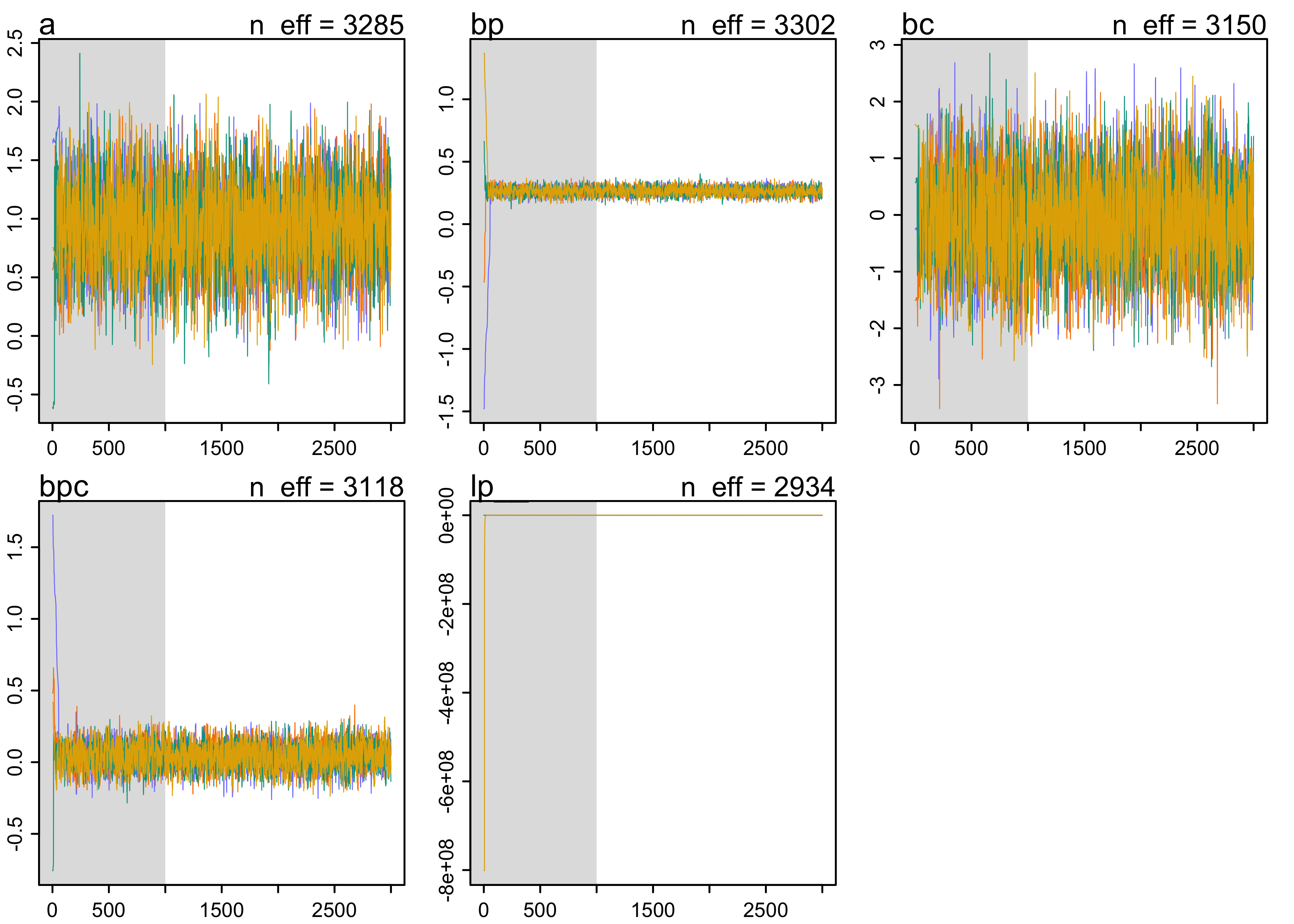
plot(m10_4)
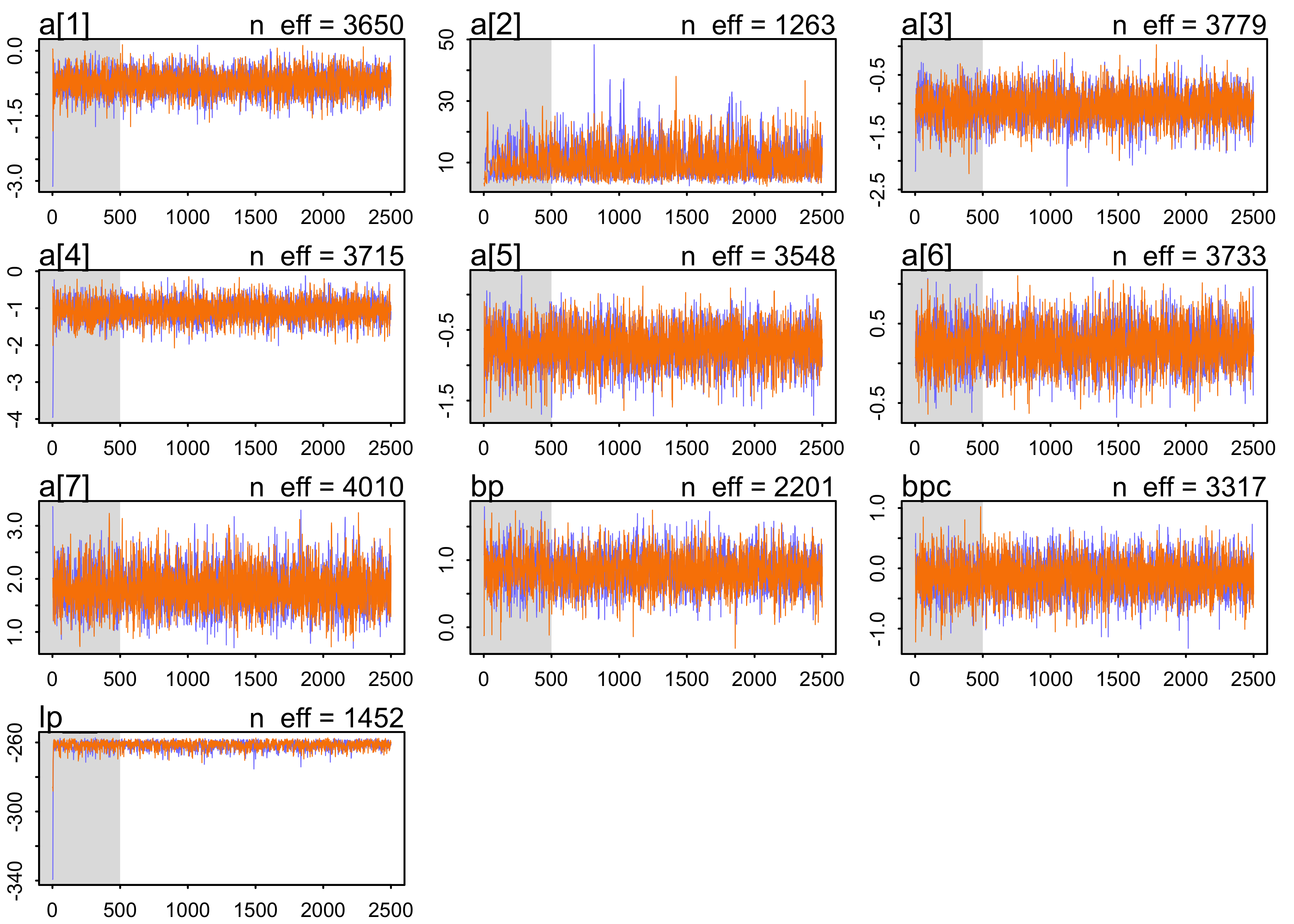
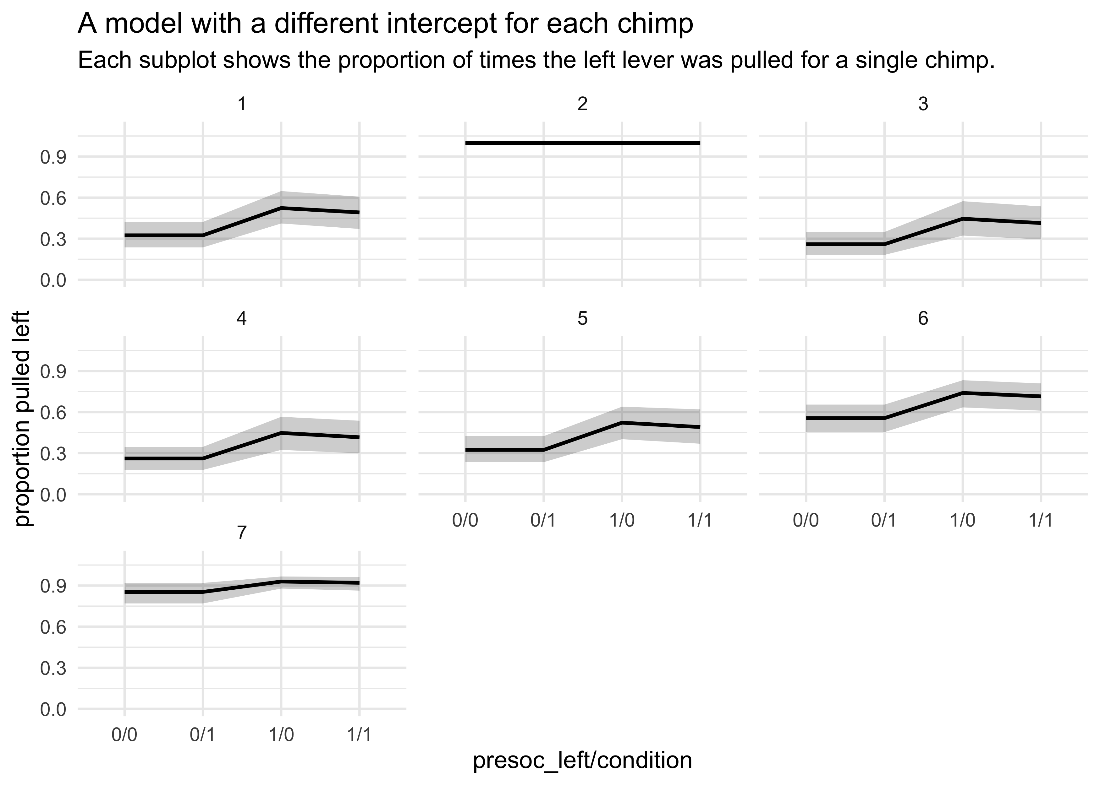
- the posterior is not Gaussian
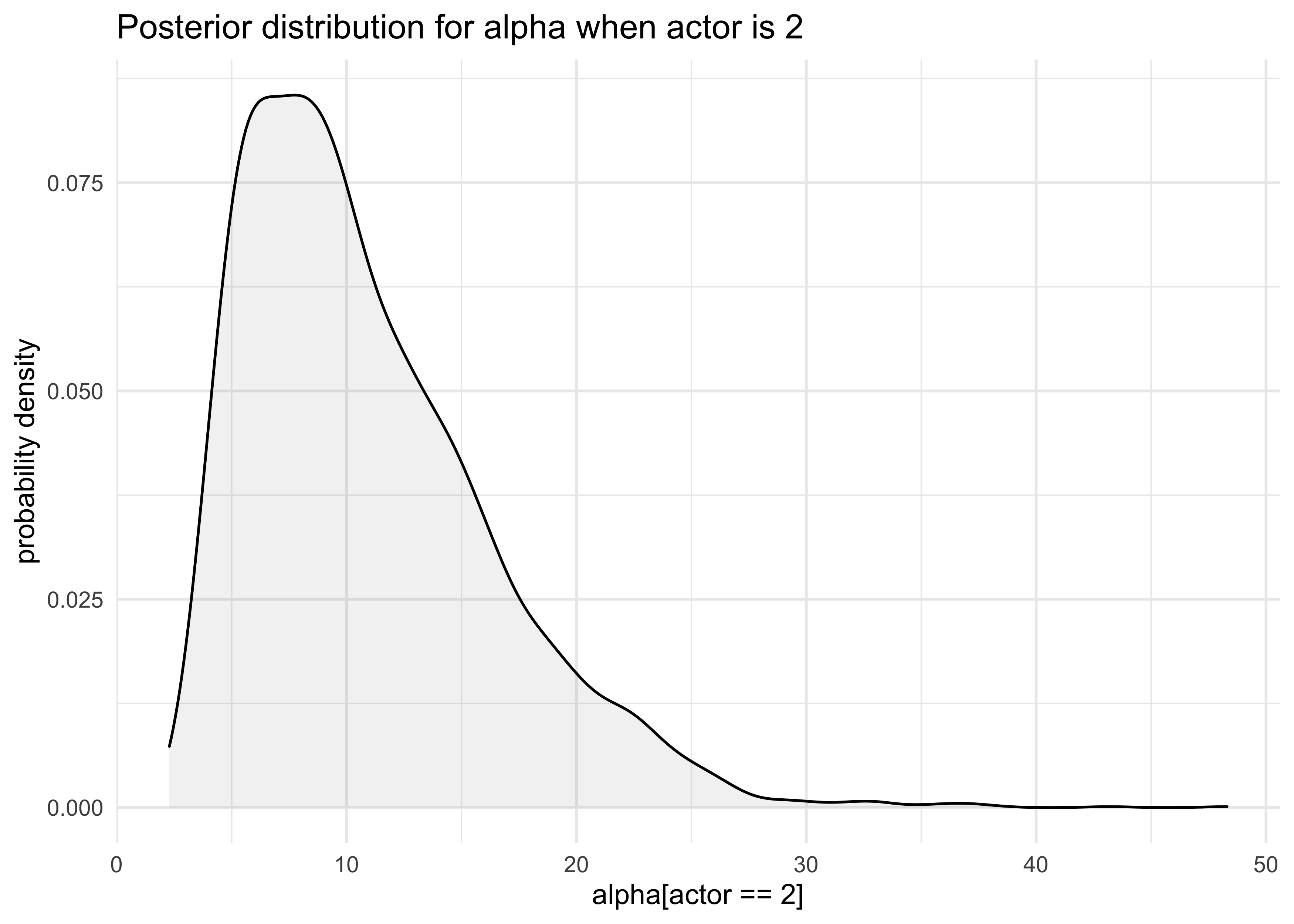
- e.g. the distribution for
a[2]- the values are all positive, indicating a left-hand bias
- e.g. the distribution for
post <- extract.samples(m10_4)

tibble(a_2 = post$a[, 2]) %>%
    ggplot(aes(x = a_2)) +
    geom_density(fill = "grey50", alpha = 0.1) +
    labs(x = "alpha[actor == 2]", y = "probability density",
         title = "Posterior distribution for alpha when actor is 2")
- plotting the posterior predictive plots for each of the chimps shows how the intercept changes for each
chimp <- 1

d_pred <- tibble(
    pulled_left = rep(0, 4),
    prosoc_left = c(0, 1, 0, 1),
    condition = c(0, 0, 1, 1)
)

d_pred_all <- tibble(
    actor = 1:7,
    data = rep(list(d_pred), 7)
) %>%
    unnest(data)

link_m10_4 <- link(m10_4, data = d_pred_all) %>%
    as.data.frame() %>%
    as_tibble()
#> [ 100 / 1000 ][ 200 / 1000 ][ 300 / 1000 ][ 400 / 1000 ][ 500 / 1000 ][ 600 / 1000 ][ 700 / 1000 ][ 800 / 1000 ][ 900 / 1000 ][ 1000 / 1000 ]
link_names <- c("0/0", "1/0", "0/1", "1/1")
link_names <- map(1:7, ~ paste0("chimp", .x, "_", link_names)) %>%
    unlist()
colnames(link_m10_4) <- link_names

link_m10_4 %>%
    mutate(sample_idx = row_number()) %>%
    pivot_longer(-sample_idx, names_to = "name", values_to = "value") %>%
    group_by(name) %>%
    summarise(avg = mean(value),
              pi = list(PI(value) %>% pi_to_df())) %>%
    ungroup() %>%
    unnest(pi) %>%
    mutate(actor = str_extract(name, "(?<=chimp)[:digit:]"),
           actor = as.numeric(actor),
           name = str_remove_all(name, "chimp[:digit:]_"),
           name = factor(name)) %>%
    ggplot() +
    facet_wrap(~ actor) +
    geom_line(aes(x = name, y = avg, group = "1"),
              size = 0.8, color = "black") +
    geom_ribbon(aes(x = as.numeric(name),
                    ymin = x5_percent, ymax = x94_percent),
                alpha = 0.2, fill = "black") +
    scale_y_continuous(limits = c(0, 1.1)) +
    labs(x = "presoc_left/condition",
         y = "proportion pulled left",
         title = "A model with a different intercept for each chimp",
         subtitle = "Each subplot shows the proportion of times the left lever was pulled for a single chimp.")
10.1.2. Aggregated binomial: Chimpanzees again, condensed
- above, we looked at the proportion of times the chimp pulled the
left-hand lever for each set of predictors
- could also just count the number of pulls, as long as we don’t care about the sequence
d <- as_tibble(chimpanzees)
d_aggregated <- d %>%
    group_by(prosoc_left, condition, actor) %>%
    summarise(x = sum(pulled_left)) %>%
    ungroup()
d_aggregated
#> # A tibble: 28 x 4
#>    prosoc_left condition actor     x
#>          <int>     <int> <int> <int>
#>  1           0         0     1     6
#>  2           0         0     2    18
#>  3           0         0     3     5
#>  4           0         0     4     6
#>  5           0         0     5     6
#>  6           0         0     6    14
#>  7           0         0     7    14
#>  8           0         1     1     5
#>  9           0         1     2    18
#> 10           0         1     3     3
#> # … with 18 more rows
- can define the model using these counts
- there were 18 trials for each animal
m10_5 <- quap(
    alist(
        x ~ dbinom(18, p),
        logit(p) <- a + (bp + bpc*condition)*prosoc_left,
        a ~ dnorm(0, 10),
        bp ~ dnorm(0, 10),
        bpc ~ dnorm(0, 10)
    ),
    data = d_aggregated
)

precis(m10_5)
#>           mean        sd       5.5%     94.5%
#> a    0.0477173 0.1260040 -0.1536615 0.2490961
#> bp   0.6096713 0.2261462  0.2482460 0.9710966
#> bpc -0.1039677 0.2635904 -0.5252361 0.3173006
10.1.3 Aggregated binomial: Graduate school admissions
- often, the number of trials per condition is not constant
- in these cases, must use another variable for the first
parameter in
dbinom()
- in these cases, must use another variable for the first
parameter in
- use UC Berkeley admission data as an example
- only 12 rows with information about admissions to 6 departments, separated by male and female applicants
data("UCBadmit")
d <- as_tibble(UCBadmit) %>% janitor::clean_names()
d
#> # A tibble: 12 x 5
#>    dept  applicant_gender admit reject applications
#>    <fct> <fct>            <int>  <int>        <int>
#>  1 A     male               512    313          825
#>  2 A     female              89     19          108
#>  3 B     male               353    207          560
#>  4 B     female              17      8           25
#>  5 C     male               120    205          325
#>  6 C     female             202    391          593
#>  7 D     male               138    279          417
#>  8 D     female             131    244          375
#>  9 E     male                53    138          191
#> 10 E     female              94    299          393
#> 11 F     male                22    351          373
#> 12 F     female              24    317          341
- goal: to estimate if there is gender bias in the admissions
- fit two models:
- a binomial regression that models
admitas a function of each applicant’s gender- estimates the association between gender and probability of admission
- a binomial regression that models
admitas a constant, ignoring gender- this provides a sense of any overfitting in the first model
- a binomial regression that models
- below is the formula for the first model
- $n_{\text{admit},i}$: the applications indexed by row number
- $m_i$: a dummy variable for male (1) vs. female (0)
$$ n_{\text{admit},i} \sim \text{Binomial}(n_i, p_i) $$ $$ \text{logit}(p_i) = \alpha + \beta_m m_i $$ $$ \alpha \sim \text{Normal}(0, 10) $$ $$ \beta_m \sim \text{Normal}(0, 10) $$
d$male <- as.numeric(d$applicant_gender == "male")

m10_6 <- quap(
    alist(
        admit ~ dbinom(applications, p),
        logit(p) <- a + bm*male,
        a ~ dnorm(0, 10),
        bm ~ dnorm(0, 10)
    ),
    data = d
)

m10_7 <- quap(
    alist(
        admit ~ dbinom(applications, p),
        logit(p) <- a,
        a ~ dnorm(0, 10)
    ),
    data = d
)

precis(m10_6)
#>          mean         sd       5.5%      94.5%
#> a  -0.8304493 0.05077041 -0.9115902 -0.7493084
#> bm  0.6103062 0.06389095  0.5081961  0.7124163
precis(m10_7)
#>         mean         sd       5.5%      94.5%
#> a -0.4567351 0.03050691 -0.5054911 -0.4079792
compare(m10_6, m10_7)
#>           WAIC       SE    dWAIC      dSE     pWAIC       weight
#> m10_6 1011.195 320.4589  0.00000       NA 121.89377 9.999999e-01
#> m10_7 1044.399 312.7998 33.20435 167.2944  85.95276 6.162652e-08
plot(compare(m10_6, m10_7))
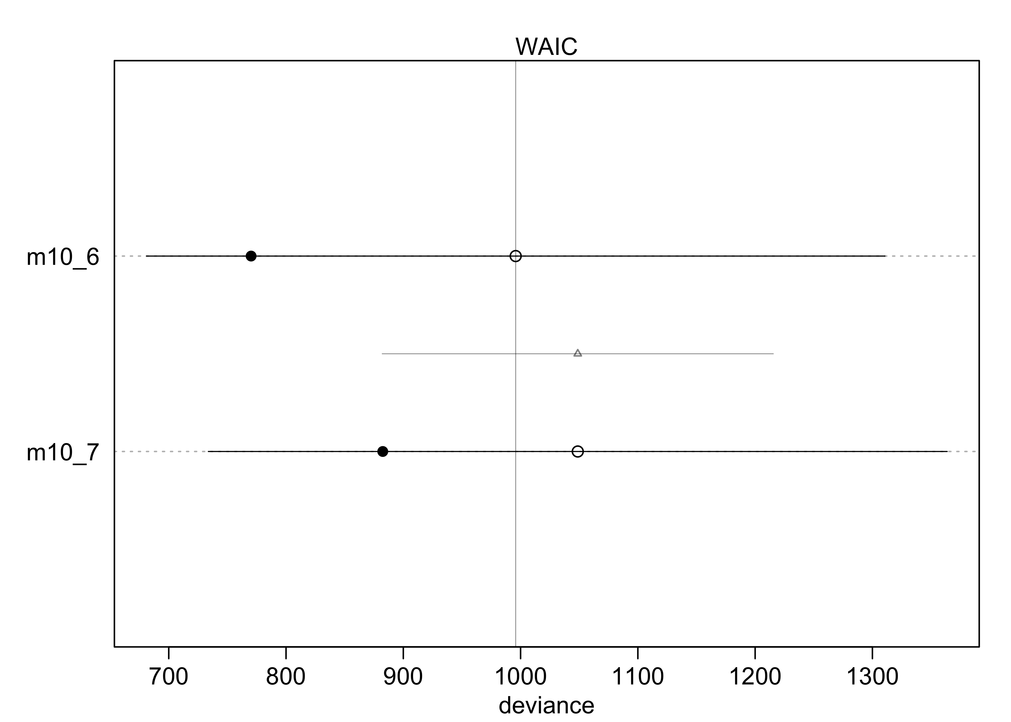
- interpretation of the models:
- the WAIC indicates that including the gender created a better model
- this indicates that the gender matters a lot
- being a male is an advantage: $exp(0.61) \approx 1.84$
- the male applicant’s odds were 184% that of a female’s
- the difference on the absolute scale is shown below
post <- extract.samples(m10_6)
p_admit_male <- logistic(post$a + post$bm)
p_admit_female <- logistic(post$a)

diff_admit <- p_admit_male - p_admit_female
quantile(diff_admit, c(0.025, 0.50, 0.975))
#>      2.5%       50%     97.5%
#> 0.1134044 0.1415553 0.1698697
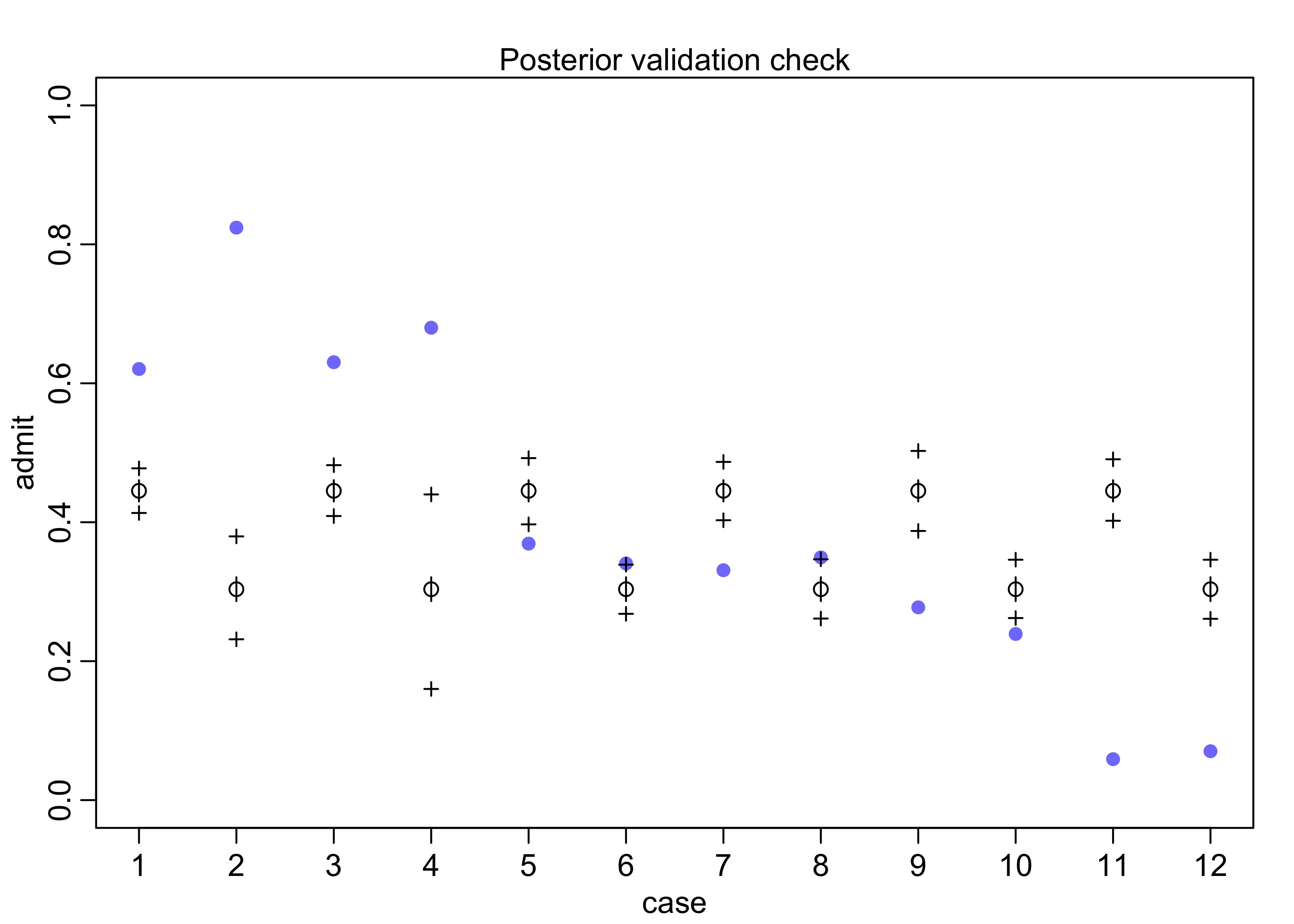
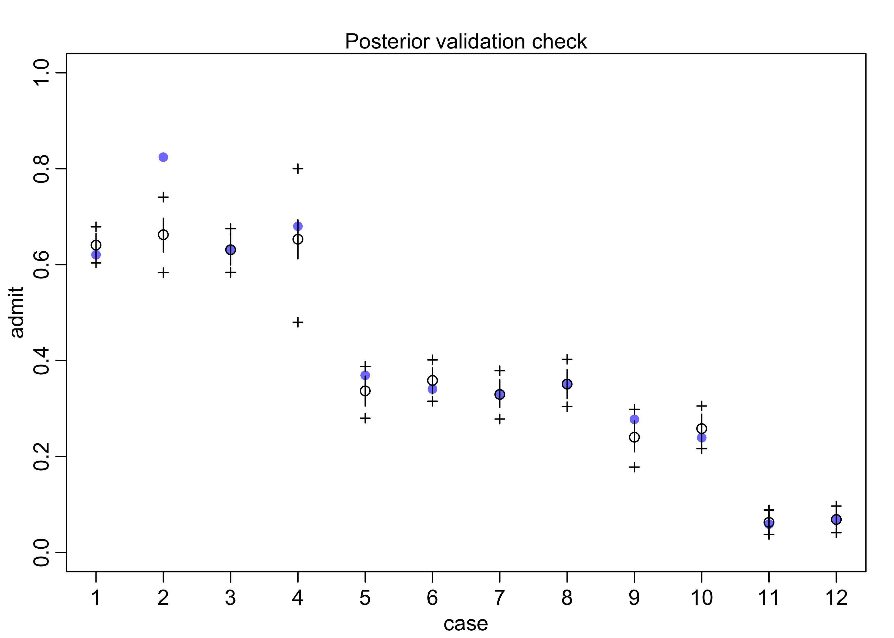
- plot posterior predictions for the model
- can use the function
postcheck(), though I also made a plot of the same data
- can use the function
postcheck(m10_6, n = 1e4)
pred <- link(m10_6)
pred_tib <- tibble(avg = apply(pred, 2, mean)) %>%
bind_cols(apply(pred, 2, PI) %>% pi_to_df())
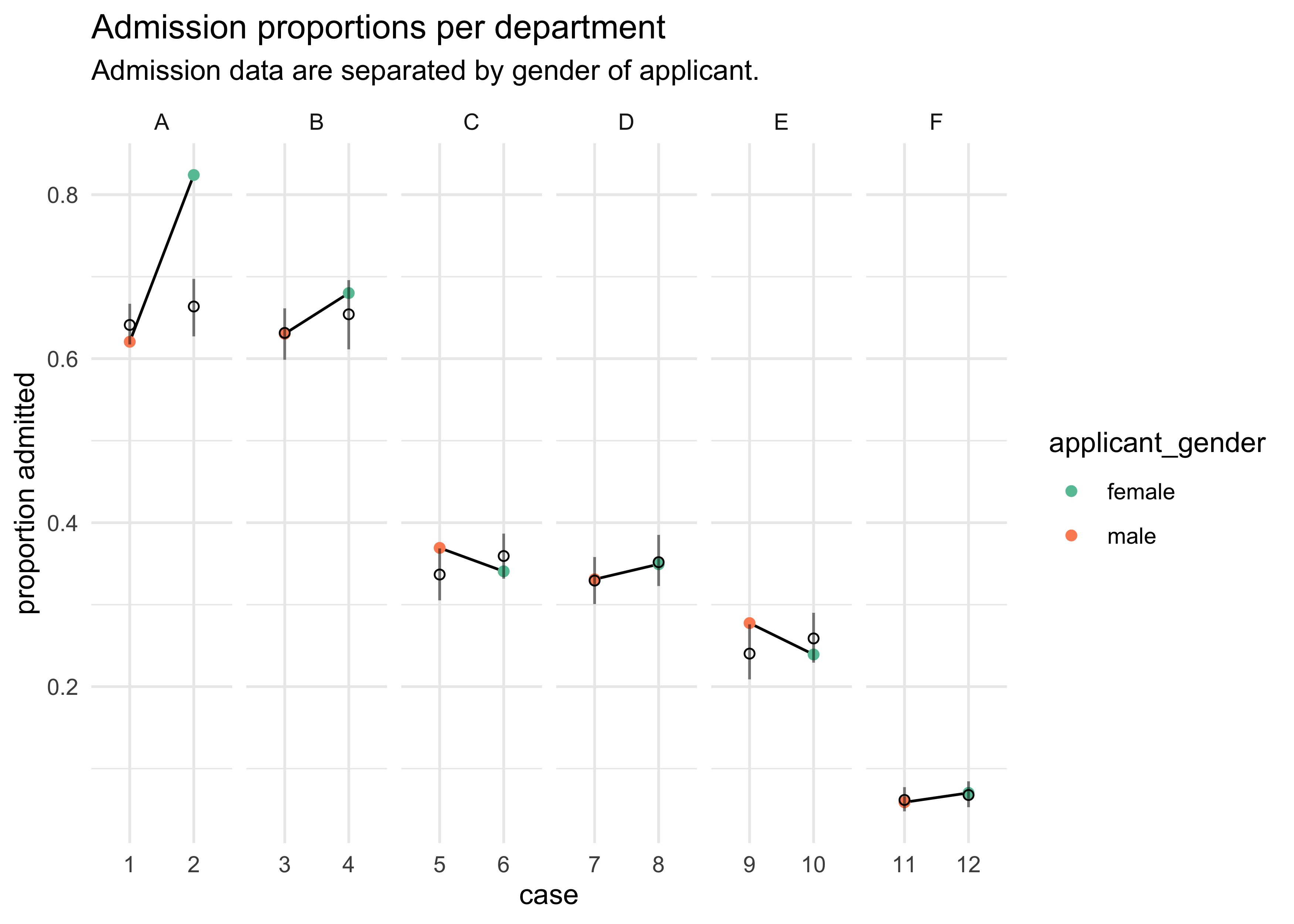
d %>%
mutate(case = factor(row_number()),
prop_admit = admit / applications) %>%
bind_cols(pred_tib) %>%
ggplot(aes(x = case)) +
facet_wrap(~ dept, scales = "free_x", nrow = 1) +
geom_line(aes(y = prop_admit, group = dept)) +
geom_point(aes(y = prop_admit, color = applicant_gender)) +
geom_linerange(aes(ymin = x5_percent, ymax = x94_percent), alpha = 0.5) +
geom_point(aes(y = avg), shape = 1) +
scale_color_brewer(palette = "Set2") +
labs(x = "case", y = "proportion admitted",
title = "Admission proportions per department",
subtitle = "Admission data are separated by gender of applicant.")
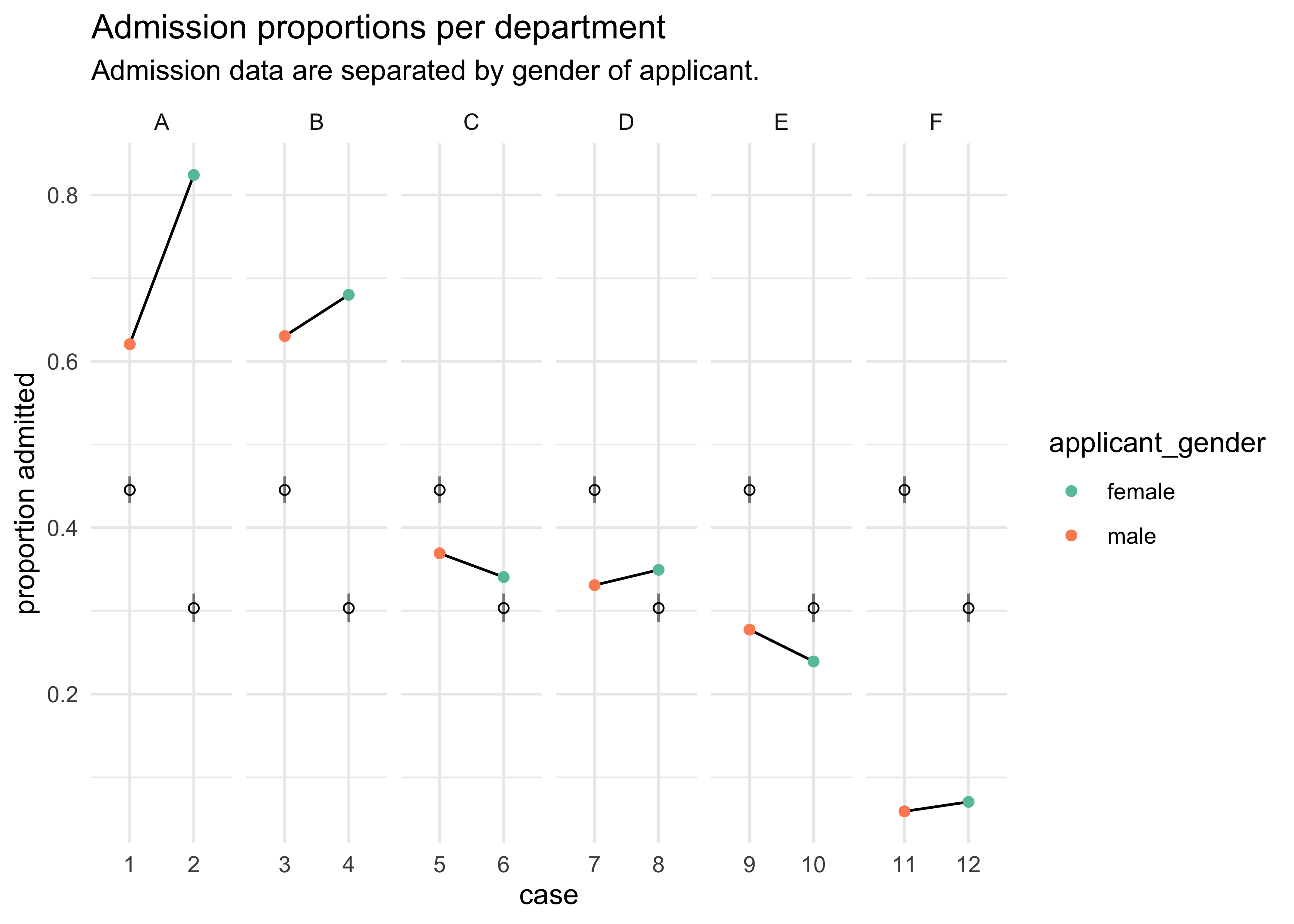
- from this plot we can see that there were only 2 departments with
over admission for females, yet the model says females should have a
14% lower chance of admission
- the problem is that the departments that take the most students had fewer applications from females
- change our question:
- previous question: “What are the average probabilities of admission for females and males across all departments?”
- new question: “What is the average difference in probability
of admission between females and males within departments?”
- fit each department with its own intercept
$$ n_{\text{admit},i} \sim \text{Binomial}(n_i, p_i) $$ $$ \text{logit}(p_i) = \alpha_{\text{DEPT}[i]} + \beta_m m_i $$ $$ \alpha_{\text{DEPT}} \sim \text{Normal}(0, 10) $$ $$ \beta_m \sim \text{Normal}(0, 10) $$ - this model and one without accounting for gender (to check for overfitting) are fit below
d$dept_id <- as.numeric(factor(d$dept))

m10_8 <- quap(
    alist(
        admit ~ dbinom(applications, p),
        logit(p) <- a[dept_id],
        a[dept_id] ~ dnorm(0, 10)
    ),
    data = d
)

m10_9 <- quap(
    alist(
        admit ~ dbinom(applications, p),
        logit(p) <- a[dept_id] + bm*male,
        a[dept_id] ~ dnorm(0, 10),
        bm ~ dnorm(0, 10)
    ),
    data = d
)

precis(m10_8, depth = 2)
#>            mean         sd       5.5%      94.5%
#> a[1]  0.5934323 0.06837899  0.4841495  0.7027152
#> a[2]  0.5428251 0.08575108  0.4057783  0.6798719
#> a[3] -0.6156596 0.06916048 -0.7261914 -0.5051278
#> a[4] -0.6648327 0.07502756 -0.7847412 -0.5449241
#> a[5] -1.0894018 0.09534033 -1.2417740 -0.9370295
#> a[6] -2.6750259 0.15237512 -2.9185508 -2.4315011
precis(m10_9, depth = 2)
#>             mean         sd       5.5%       94.5%
#> a[1]  0.68193893 0.09910200  0.5235548  0.84032307
#> a[2]  0.63852992 0.11556510  0.4538346  0.82322527
#> a[3] -0.58062952 0.07465092 -0.6999361 -0.46132293
#> a[4] -0.61262169 0.08596001 -0.7500024 -0.47524099
#> a[5] -1.05727062 0.09872297 -1.2150490 -0.89949225
#> a[6] -2.62392147 0.15766772 -2.8759049 -2.37193801
#> bm   -0.09992565 0.08083548 -0.2291164  0.02926506
compare(m10_6, m10_7, m10_8, m10_9)
#>            WAIC        SE      dWAIC        dSE      pWAIC        weight
#> m10_8  104.3851  17.06132   0.000000         NA   6.054943  8.753281e-01
#> m10_9  108.2829  15.54875   3.897827   3.717065   9.364827  1.246719e-01
#> m10_6  995.0506 315.18992 890.665509 326.542424 112.848200 3.440432e-194
#> m10_7 1037.7274 310.18375 933.342325 321.810828  83.343856 1.859774e-203
plot(compare(m10_6, m10_7, m10_8, m10_9))
- now the best model is the one with a different intercept for each
department and no male predictor
- still, the one with the different intercepts and male has some of the weight
- now the odds are in favor of female admission with males have about 90% the odds of admission as a female in the same department
exp(m10_9@coef[["bm"]])
#> [1] 0.9049047
postcheck(m10_9)
pred <- link(m10_9)

pred_tib <- tibble(avg = apply(pred, 2, mean)) %>%
    bind_cols(apply(pred, 2, PI) %>% pi_to_df())

d %>%
    mutate(case = factor(row_number()),
           prop_admit = admit / applications) %>%
    bind_cols(pred_tib) %>%
    ggplot(aes(x = case)) +
    facet_wrap(~ dept, scales = "free_x", nrow = 1) +
    geom_line(aes(y = prop_admit, group = dept)) +
    geom_point(aes(y = prop_admit, color = applicant_gender)) +
    geom_linerange(aes(ymin = x5_percent, ymax = x94_percent), alpha = 0.5) +
    geom_point(aes(y = avg), shape = 1) +
    scale_color_brewer(palette = "Set2") +
    labs(x = "case", y = "proportion admitted",
         title = "Admission proportions per department",
         subtitle = "Admission data are separated by gender of applicant.")
10.1.4 Fitting binomial regressions with glm()
m10_9glm <- glm(cbind(admit, reject) ~ male + dept,
                data = d,
                family = binomial)

summary(m10_9glm)
#>
#> Call:
#> glm(formula = cbind(admit, reject) ~ male + dept, family = binomial,
#>     data = d)
#>
#> Deviance Residuals:
#>       1        2        3        4        5        6        7        8
#> -1.2487   3.7189  -0.0560   0.2706   1.2533  -0.9243   0.0826  -0.0858
#>       9       10       11       12
#>  1.2205  -0.8509  -0.2076   0.2052
#>
#> Coefficients:
#>             Estimate Std. Error z value Pr(>|z|)
#> (Intercept)  0.68192    0.09911   6.880 5.97e-12 ***
#> male        -0.09987    0.08085  -1.235    0.217
#> deptB       -0.04340    0.10984  -0.395    0.693
#> deptC       -1.26260    0.10663 -11.841  < 2e-16 ***
#> deptD       -1.29461    0.10582 -12.234  < 2e-16 ***
#> deptE       -1.73931    0.12611 -13.792  < 2e-16 ***
#> deptF       -3.30648    0.16998 -19.452  < 2e-16 ***
#> ---
#> Signif. codes:  0 '***' 0.001 '**' 0.01 '*' 0.05 '.' 0.1 ' ' 1
#>
#> (Dispersion parameter for binomial family taken to be 1)
#>
#>     Null deviance: 877.056  on 11  degrees of freedom
#> Residual deviance:  20.204  on  5  degrees of freedom
#> AIC: 103.14
#>
#> Number of Fisher Scoring iterations: 4
10.2 Poisson regression
- when a binomial has a small probability of an event $p$ and a
large number of trials $n$
- a binomial has an expected value of $np$ and a variance $np(1-p)$
- when $n$ is large and $p$ small, these become about the same
- example:
- employ 1000 monks in a monastery to copy manuscripts (before the printing press)
- on average, one monk finishes a manuscript per day
- but each monk is working independently and the manuscripts vary in length
- so some days 3 manuscripts finish, but many days it is none
- variance: $np(1-p) = 1000(0.001)(1-0.001) \approx 1$
- this is simulated with $1 \time 10^6$ monks below
set.seed(0)
y <- rbinom(1e6, 1000, 1/1000)
c(mean(y), var(y))
#> [1] 0.9995910 0.9979418
- this special binomial is a Poisson distribution
- useful for modeling binomial events with an unknown or very large number of trials $n$
- the model form for a Poisson is even simpler than for a binomial or
Gaussian
- because there is only one parameter
$$ y \sim \text{Poisson}(\lambda_i) $$
- for the GLM, the link function is the log link
- the log link makes $\lambda_i$ always positive
- also implies an exponential relationship between predictors and the expected value
$$ y \sim \text{Poisson}(\lambda_i) $$ $$ \log(\lambda_i) = \alpha + \beta x_i $$
- $\lambda_i$ is the expected value and commonly thought of as a
rate
- allows to make models for the exposure varies across cases
- example:
- one monastery is counting books completed per week, and another is counting per day
- can analyze both in the same models even though the counts are aggregated over different amounts of time
- treat $\lambda_i$ as the number of events $\mu$ per unit time (or distance) $\tau$; $\lambda_i = \mu / \tau$
- the $\tau_i$ values are the different exposures
- when $\tau_i = 1$ (of some unit) then $\log \tau_i = 0$ and the formula is identical to the first
- when there are different values for the exposure (i.e. per day vs per week), this value corrects for that
$$ y_i \sim \text{Poisson}(\lambda_i) $$ $$ \log \lambda_i = \log(\frac{\mu_i}{\tau_i}) = \alpha + \beta x_i $$ $$ \log \lambda_i = \log \mu_i - \log \tau_i = \alpha + \beta x_i $$ $$ \log \mu_i = \log \tau_i + \alpha + \beta x_i $$ $$ $$
10.2.1 Example: Oceanic tool complexity
- setup:
- the old island societies of Oceania provide an example of
technological evolution
- they made fish hooks, axes, boats, hand plows, etc.
- theorize that larger populations develop and sustain more complex tool kits
- contact rates among populations increases population size, too
- the old island societies of Oceania provide an example of
technological evolution
- the data and models:
total_toolsis the outcome predictor- model the number of tools as the log of the
population - the number of tools increases with
contactrate - the impact of
populationcounts is increased by highcontactusing a interaction term
data("Kline")
d <- as_tibble(Kline) %>%
    janitor::clean_names() %>%
    mutate(log_pop = log(population),
           contact_high = as.numeric(contact == "high"))
d
#> # A tibble: 10 x 7
#>    culture    population contact total_tools mean_tu log_pop contact_high
#>    <fct>           <int> <fct>         <int>   <dbl>   <dbl>        <dbl>
#>  1 Malekula         1100 low              13     3.2    7.00            0
#>  2 Tikopia          1500 low              22     4.7    7.31            0
#>  3 Santa Cruz       3600 low              24     4      8.19            0
#>  4 Yap              4791 high             43     5      8.47            1
#>  5 Lau Fiji         7400 high             33     5      8.91            1
#>  6 Trobriand        8000 high             19     4      8.99            1
#>  7 Chuuk            9200 high             40     3.8    9.13            1
#>  8 Manus           13000 low              28     6.6    9.47            0
#>  9 Tonga           17500 high             55     5.4    9.77            1
#> 10 Hawaii         275000 low              71     6.6   12.5             0
- the model formula:
- $P$ is
population, $C$ iscontact_high - the priors are strongly regularizing due to the small amount of data
- $P$ is
$$ T_i \sim \text{Poisson}(\lambda_i) $$ $$ \log \lambda_i = \alpha + \beta+P \log P_i + \beta_C C_i + \beta_{PC} C_i \log P_i $$ $$ \alpha \sim \text{Normal}(0, 100) $$ $$ \beta_P \sim \text{Normal}(0, 1) $$ $$ \beta_C \sim \text{Normal}(0, 1) $$ $$ \beta_{PC} \sim \text{Normal}(0, 1) $$
- fit the model with the quadratic approximation
m10_10 <- quap(
    alist(
        total_tools ~ dpois(lambda),
        log(lambda) <- a + bp*log_pop + bc*contact_high + bpc*contact_high*log_pop,
        a ~ dnorm(0, 100),
        c(bp, bc, bpc) ~ dnorm(0, 1)
    ),
    data = d
)

precis(m10_10, corr = TRUE)
#>            mean         sd       5.5%     94.5%
#> a    0.94356226 0.36009898  0.3680545 1.5190700
#> bp   0.26408201 0.03466757  0.2086765 0.3194875
#> bc  -0.09091811 0.84140385 -1.4356440 1.2538077
#> bpc  0.04264538 0.09227125 -0.1048219 0.1901127
plot(precis(m10_10))
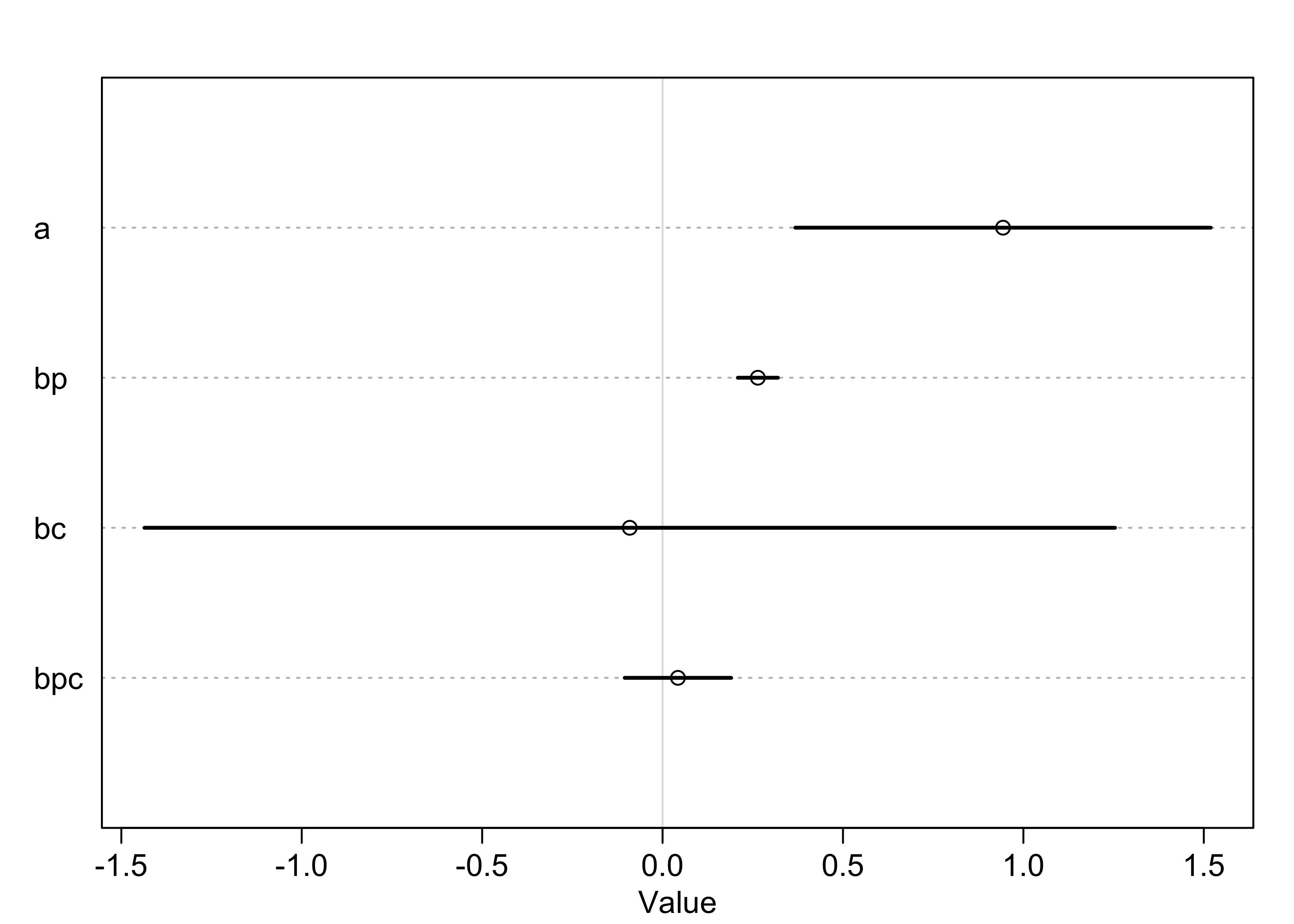
- interpretation:
- the main effect of log-population
bpis positive and bothbcandbpcoverlap zero substantially - could think that log-population is reliably associated with
total tools, but that would be incorrect
- easy to be mislead by tables of estimates, especially with interaction terms
- the main effect of log-population
- analyze the model by plotting counterfactual predictions
- consider two islands with log-population of 8, but one is high contact and the other is low contact
- calculate $\lambda$, the expected tool count, for each
- sample from the posterior, convert with the linear model, take the exponential to reverse the logarithm
- can plot the difference in the number of tools and find the percent of samples where the high contact group had more tools than the low contact group
post <- extract.samples(m10_10)
lambda_high <- exp(post$a + post$bc + (post$bp + post$bpc)*8)
lambda_low <- exp(post$a + post$bp*8)

tibble(diff_vals = lambda_high - lambda_low) %>%
    ggplot(aes(x = diff_vals)) +
    geom_density(color = "skyblue4") +
    geom_vline(xintercept = 0, lty = 2, size = 0.8, color = "grey50") +
    labs(x = "lambda_high - lambda_low",
         y = "density")
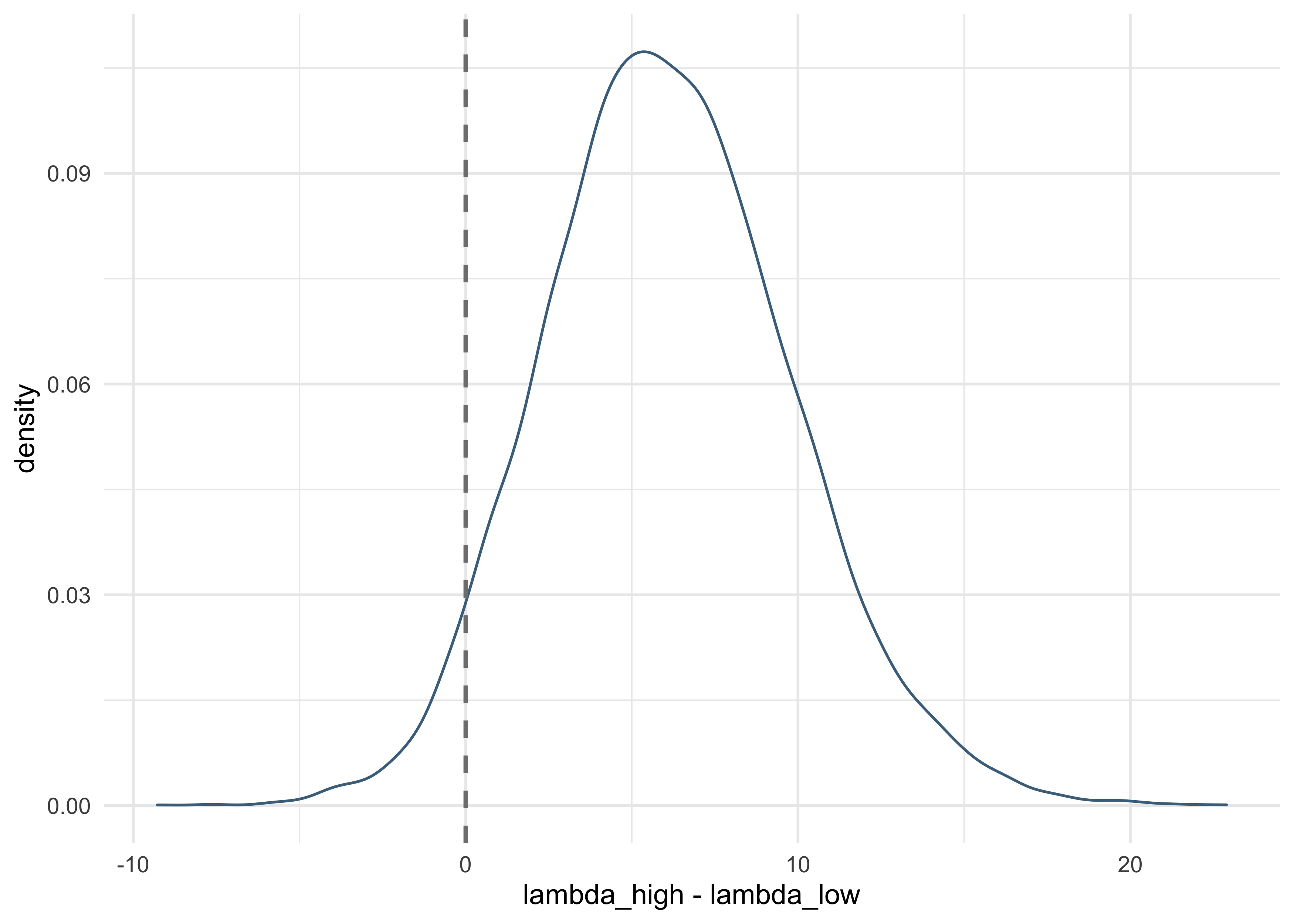
sum(lambda_high - lambda_low > 0) / length(lambda_high)
#> [1] 0.9586
- there is a 95% plausibility that the high-contact island has more
tools than the low-contact island, holding population constant
- suggests that contact is important even though the model estimates are not informative
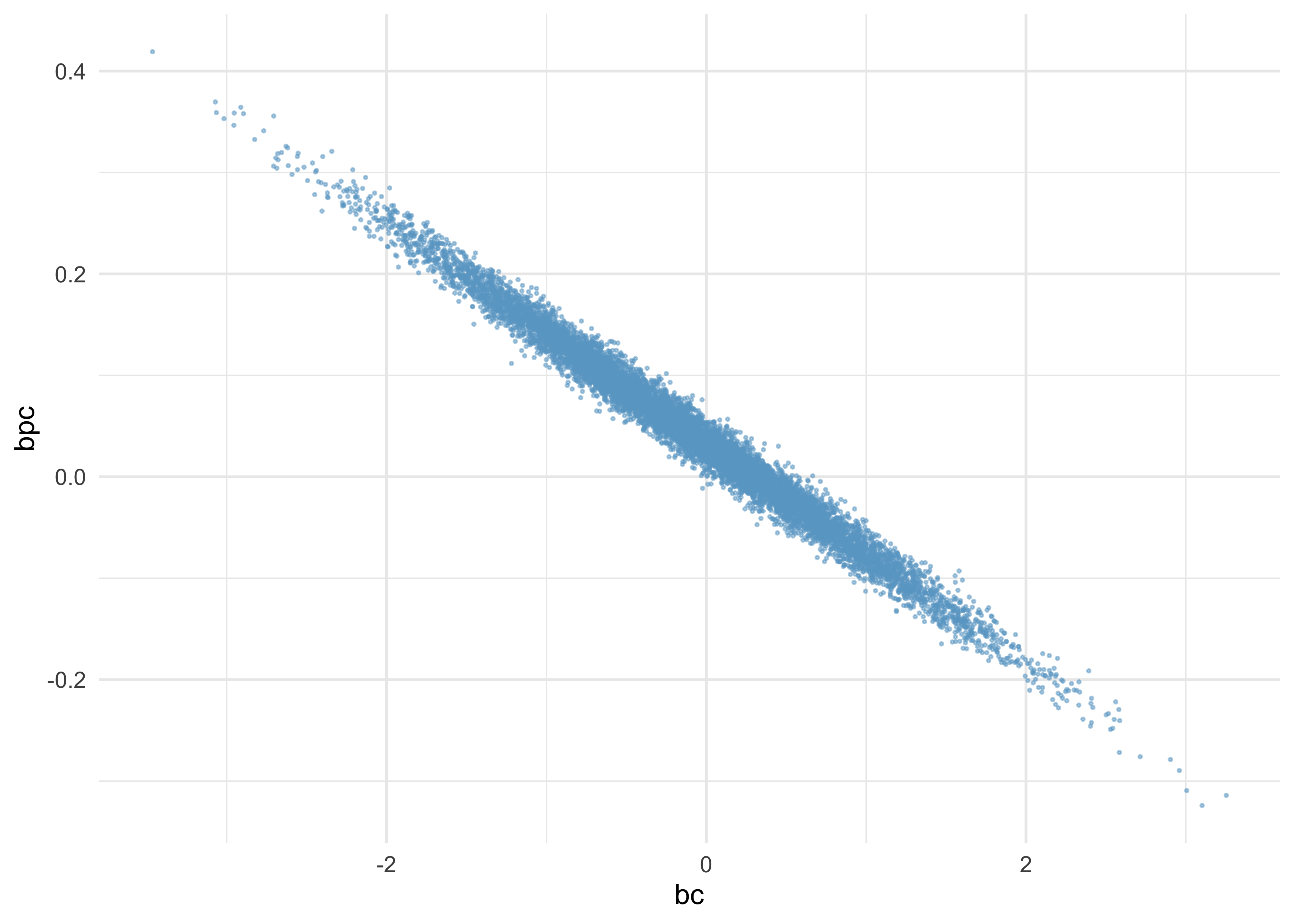
- this is because the uncertainty is
bcandbpcare negatively correlated- when one is high, the other is low
as_tibble(post) %>%
    ggplot(aes(x = bc, y = bpc)) +
    geom_point(alpha = 0.5, size = 0.3, color = "skyblue3")
- a better way to tell if a predictor is expected to improve prediction is to use model comparison
# Without interaction
m10_11 <- quap(
    alist(
        total_tools ~ dpois(lambda),
        log(lambda) <- a + bp*log_pop + bc*contact_high,
        a ~ dnorm(0, 100),
        c(bp, bc) ~ dnorm(0, 1)
    ),
    data = d
)
# With only log-population.
m10_12 <- quap(
    alist(
        total_tools ~ dpois(lambda),
        log(lambda) <- a + bp*log_pop,
        a ~ dnorm(0, 100),
        bp ~ dnorm(0, 1)
    ),
    data = d
)
# With only contact rate.
m10_13 <- quap(
    alist(
        total_tools ~ dpois(lambda),
        log(lambda) <- a + bc*contact_high,
        a ~ dnorm(0, 100),
        bc ~ dnorm(0, 1)
    ),
    data = d
)
# Intercept only.
m10_14 <- quap(
    alist(
        total_tools ~ dpois(lambda),
        log(lambda) <- a,
        a ~ dnorm(0, 100)
    ),
    data = d
)
(islands_compare <- compare(m10_10, m10_11, m10_12, m10_13, m10_14))
#>             WAIC        SE      dWAIC        dSE     pWAIC       weight
#> m10_11  78.96686 10.928225  0.0000000         NA  4.153861 5.660464e-01
#> m10_10  79.64939 11.047835  0.6825349  0.9855065  4.583836 4.023847e-01
#> m10_12  84.73987  8.853414  5.7730089  8.0937951  3.882621 3.156887e-02
#> m10_14 142.03343 31.717655 63.0665718 34.4458805  8.695272 1.143194e-14
#> m10_13 148.54902 43.401936 69.5821609 45.3132300 15.657562 4.398229e-16
plot(islands_compare)
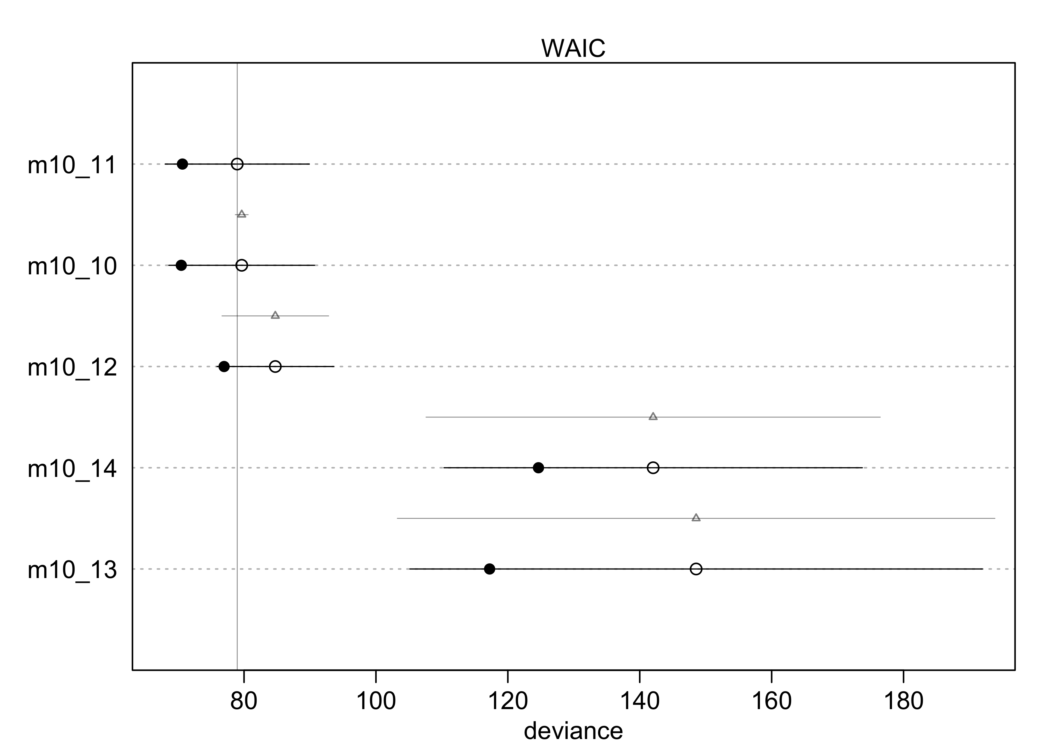
- interpretation:
- the top models include both predictors, but the weight is split
50:50 between the model without the interaction and the one with
the interaction
- indicates both predictors are informative
- suggests the interaction is probably not important
- the top models include both predictors, but the weight is split
50:50 between the model without the interaction and the one with
the interaction
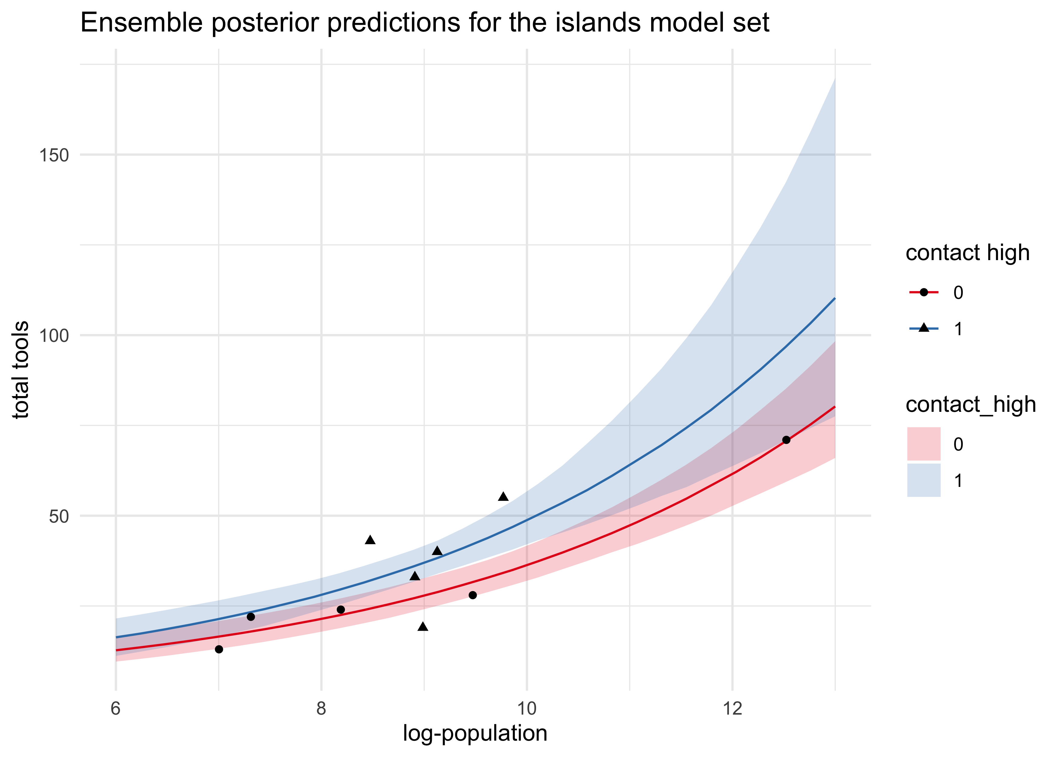
- plot counterfactual predictions using the ensemble of the top 3
models
- the input data is the log-population over the natural range with
contact_highset to both 0 and 1 - both trends curve up as log-pop increases
- the impact of contact rate can be seen by the distance between the curves a little overlap of the 89% intervals
- the input data is the log-population over the natural range with
log_pop_seq <- seq(6, 13, length.out = 30)
d_pred <- bind_rows(
    tibble(log_pop = log_pop_seq,
           contact_high = 1),
    tibble(log_pop = log_pop_seq,
           contact_high = 0)
)
lambda_pred <- ensemble(m10_10, m10_11, m10_12, data = d_pred)
lambda_med <- apply(lambda_pred$link, 2, median)
lambda_pi <- apply(lambda_pred$link, 2, PI) %>% pi_to_df()

d_pred %>%
    mutate(lambda_med,
           contact_high = factor(contact_high)) %>%
    bind_cols(lambda_pi) %>%
    ggplot(aes(x = log_pop)) +
    geom_ribbon(aes(ymin = x5_percent, ymax = x94_percent,
                    fill = contact_high),
                alpha = 0.2) +
    geom_line(aes(y = lambda_med, group = contact_high,
                  color = contact_high)) +
    geom_point(data = d, aes(y = total_tools, shape = factor(contact_high))) +
    scale_fill_brewer(palette = "Set1") +
    scale_color_brewer(palette = "Set1") +
    labs(x = "log-population", y = "total tools",
         color = "contact high", shape = "contact high",
         title = "Ensemble posterior predictions for the islands model set")
10.2.2 MCM islands
- verify that the MAP estimates made above accurately describe the shape of the posterior by fitting with MCMC
stash("m10_10_stan", {
    m10_10_stan <- map2stan(m10_10, iter=3e3, warmup = 1e3, chains = 4)
})
#> Loading stashed object.
precis(m10_10_stan)
#>            mean         sd       5.5%     94.5%    n_eff    Rhat4
#> a    0.93343837 0.35388776  0.3587592 1.4814245 3285.362 1.001707
#> bp   0.26448526 0.03403057  0.2112632 0.3198451 3302.021 1.001876
#> bc  -0.08465070 0.82696216 -1.4025301 1.2376410 3150.089 1.000979
#> bpc  0.04216315 0.09063509 -0.1031858 0.1880385 3117.835 1.000841
plot(m10_10_stan)
- the MAP estimates are the same as before, so the posterior is approximately Gaussian
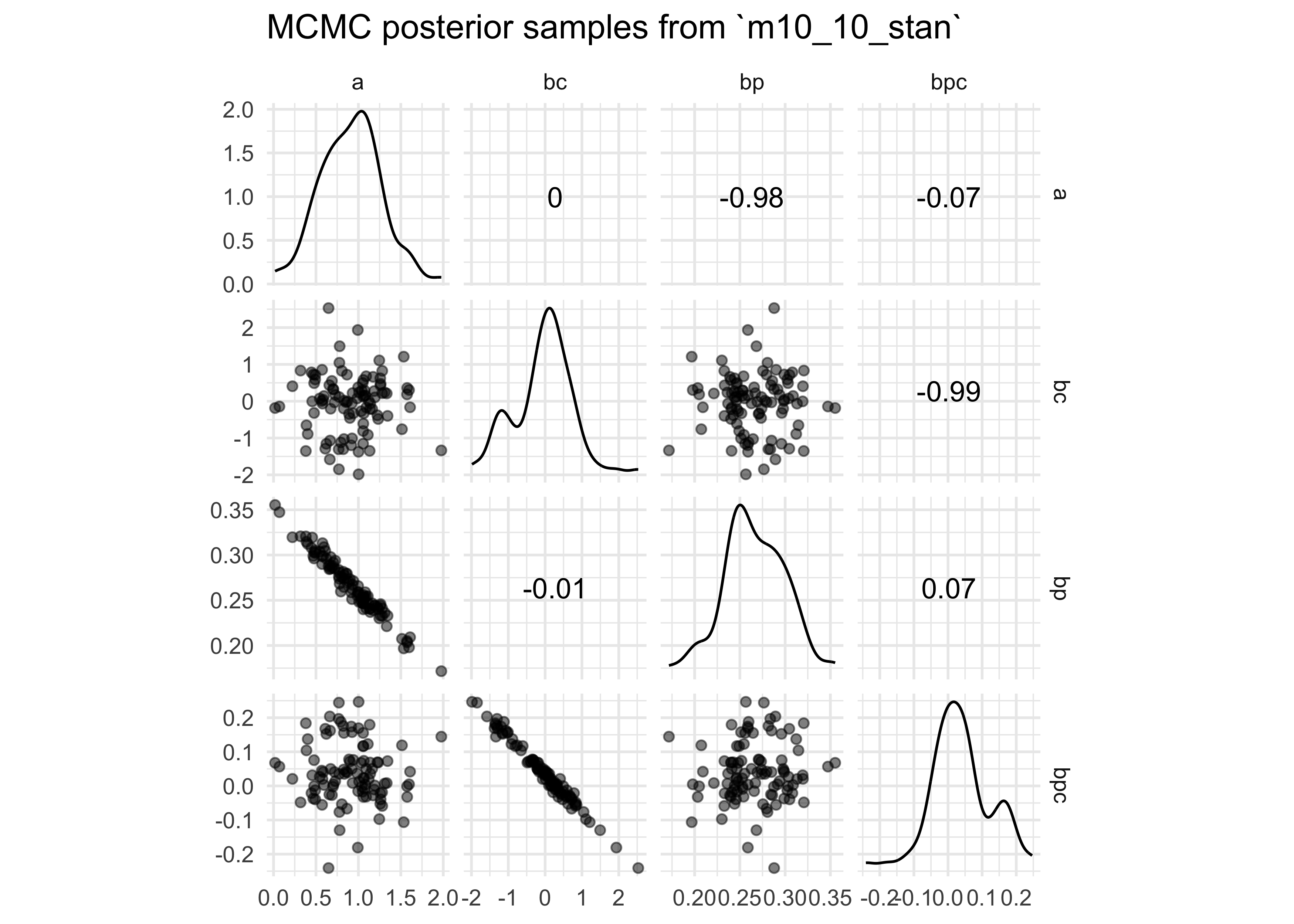
- look at pairs plots of the posterior distributions from the MCMC
- samples of the intercept and coefficient for contact rate are high correlated
- MCMC can help overcome problems from correlated coefficients, though it is still best to try to avoid them
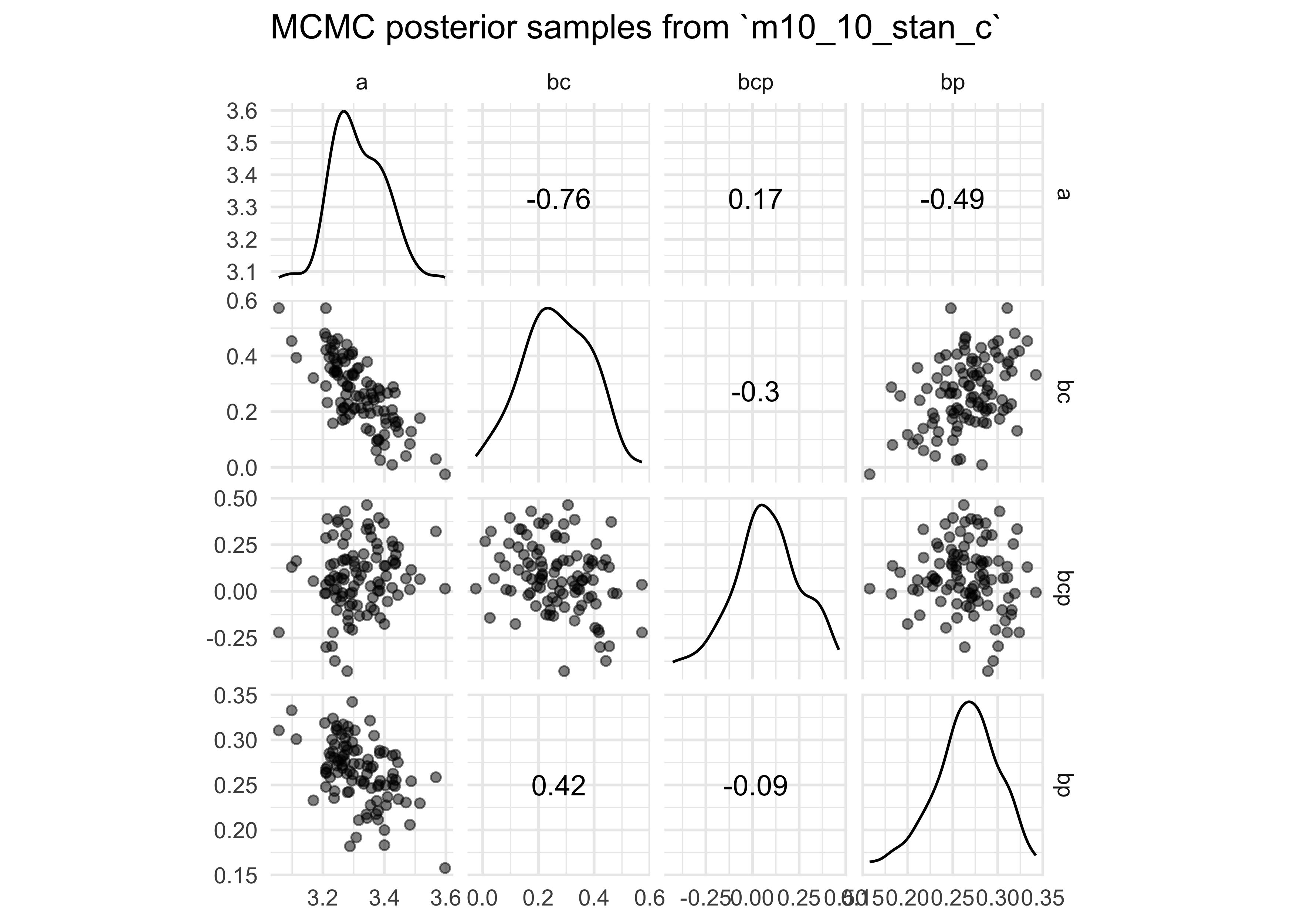
- try centering log-population and re-fitting
m10_10_stan - this removes the correlation between the intercept and
coefficient for
contact_high- the chains were also more efficient (more effective
samples; larger
n_eff)
- the chains were also more efficient (more effective
samples; larger
extract.samples(m10_10_stan) %>%
    as_tibble() %>%
    sample_n(100) %>%
    GGally::ggscatmat(alpha = 0.5) +
    labs(title = "MCMC posterior samples from `m10_10_stan`")
#> Registered S3 method overwritten by 'GGally':
#>   method from
#>   +.gg   ggplot2
d$log_pop_c <- d$log_pop - mean(d$log_pop)

stash("m10_10_stan_c", depends_on = "d", {
    m10_10_stan_c <- map2stan(
        alist(
            total_tools ~ dpois(lambda),
            log(lambda) <- a + bp*log_pop_c + bc*contact_high + bcp*log_pop_c*contact_high,
            a ~ dnorm(0, 10),
            bp ~ dnorm(0, 1),
            bc ~ dnorm(0, 1),
            bcp ~ dnorm(0, 1)
        ),
        data = d,
        iter = 3e3,
        warmup = 1e3,
        chains = 4
    )
})
#> Loading stashed object.
precis(m10_10_stan_c)
#>           mean         sd        5.5%     94.5%    n_eff     Rhat4
#> a   3.30958348 0.08969397  3.16619500 3.4485627 3704.475 1.0000835
#> bp  0.26279100 0.03494568  0.20658046 0.3176263 4748.530 1.0001081
#> bc  0.28633303 0.11742884  0.09794991 0.4754851 3863.480 1.0002169
#> bcp 0.06699003 0.16995322 -0.20517522 0.3342323 5237.044 0.9999841
plot(m10_10_stan_c)

extract.samples(m10_10_stan_c) %>%
    as_tibble() %>%
    sample_n(100) %>%
    GGally::ggscatmat(alpha = 0.5) +
    labs(title = "MCMC posterior samples from `m10_10_stan_c`")
10.2.3 Example: Exposure and the offset
- use an example where the exposure varies across observations
- e.g. length of observation, area of sampling, intensity of sampling
- Poisson assumes the rate of events is constant in time or space
- offset: add the logarithm of exposure to the linear model as another term
- simulated data:
- own a monastery where the monks copy books by hand
- we know the rate at which manuscripts are completed each day
- suppose the true rate is $\lambda=1.5$ manuscripts per day
set.seed(0)
num_days <- 30
y <- rpois(num_days, 1.5)
table(y)
#> y
#> 0 1 2 3 4 5
#> 7 8 8 4 2 1
- are thinking of purchasing another monastery, but want to know the
productivity of the new monastery
- but only have data for the other monastery on a per week basis
- suppose the daily rate of the new monastery is actually
$\lambda=0.5$ manuscripts per day
- thus, the real per week rate if $\lambda = 0.5 \times 7 = 3.5$
set.seed(0)
num_weeks <- 4
y_new <- rpois(num_weeks, 0.5*7)
table(y_new)
#> y_new
#> 2 3 4 6
#> 1 1 1 1
- build a data frame with data from both monasteries
y_all <- c(y, y_new)
exposure <- c(rep(1, length(y)), rep(7, length(y_new)))
monastery <- c(rep(0, length(y)), rep(1, length(y_new)))
d <- tibble(y = y_all, days = exposure, monastery)
d
#> # A tibble: 34 x 3
#>        y  days monastery
#>    <int> <dbl>     <dbl>
#>  1     3     1         0
#>  2     1     1         0
#>  3     1     1         0
#>  4     2     1         0
#>  5     3     1         0
#>  6     0     1         0
#>  7     3     1         0
#>  8     4     1         0
#>  9     2     1         0
#> 10     2     1         0
#> # … with 24 more rows
- fit the model to estimate the rate of manuscript production at each
monastery
- include log of exposure as a variable in the linear model
d$log_days <- log(d$days)
m10_15 <- quap(
    alist(
        y ~ dpois(lambda),
        log(lambda) ~ log_days + a + b*monastery,
        a ~ dnorm(0, 100),
        b ~ dnorm(0, 1)
    ),
    data = d
)

precis(m10_15)
#>         mean        sd       5.5%      94.5%
#> a  0.4694331 0.1429827  0.2409192  0.6979470
#> b -1.0273421 0.2772045 -1.4703683 -0.5843158
- compute the posterior distribution of $\lambda$ in each monastery
- sample from the posterior and use the linear model without the offset
- don’t use the offset again because the parameters are already on the daily scale
post <- extract.samples(m10_15)
lambda_old <- exp(post$a + post$b * 0)
lambda_new <- exp(post$a + post$b * 1)
precis(tibble(lambda_old, lambda_new))
#>                 mean        sd      5.5%     94.5%     histogram
#> lambda_old 1.6149928 0.2325102 1.2754919 2.0144941     ▁▁▃▇▇▃▁▁▁
#> lambda_new 0.5907316 0.1443564 0.3898033 0.8423707 ▁▂▅▇▅▃▁▁▁▁▁▁▁
tibble(`old monastery` = lambda_old,
       `new monastery` = lambda_new) %>%
    pivot_longer(c("old monastery", "new monastery")) %>%
    ggplot(aes(x = value, color = name, fill = name)) +
    geom_density(alpha = 0.2) +
    scale_color_brewer(palette = "Set2") +
    scale_fill_brewer(palette = "Set2") +
    scale_y_continuous(expand = expansion(mult = c(0, 0.02))) +
    theme(legend.title = element_blank(),
          legend.position = c(0.8, 0.8)) +
    labs(x = "posterior samples of manuscripts per day (lambda)",
         y = "probability density",
         title = "Model the production rates of two monasteries")
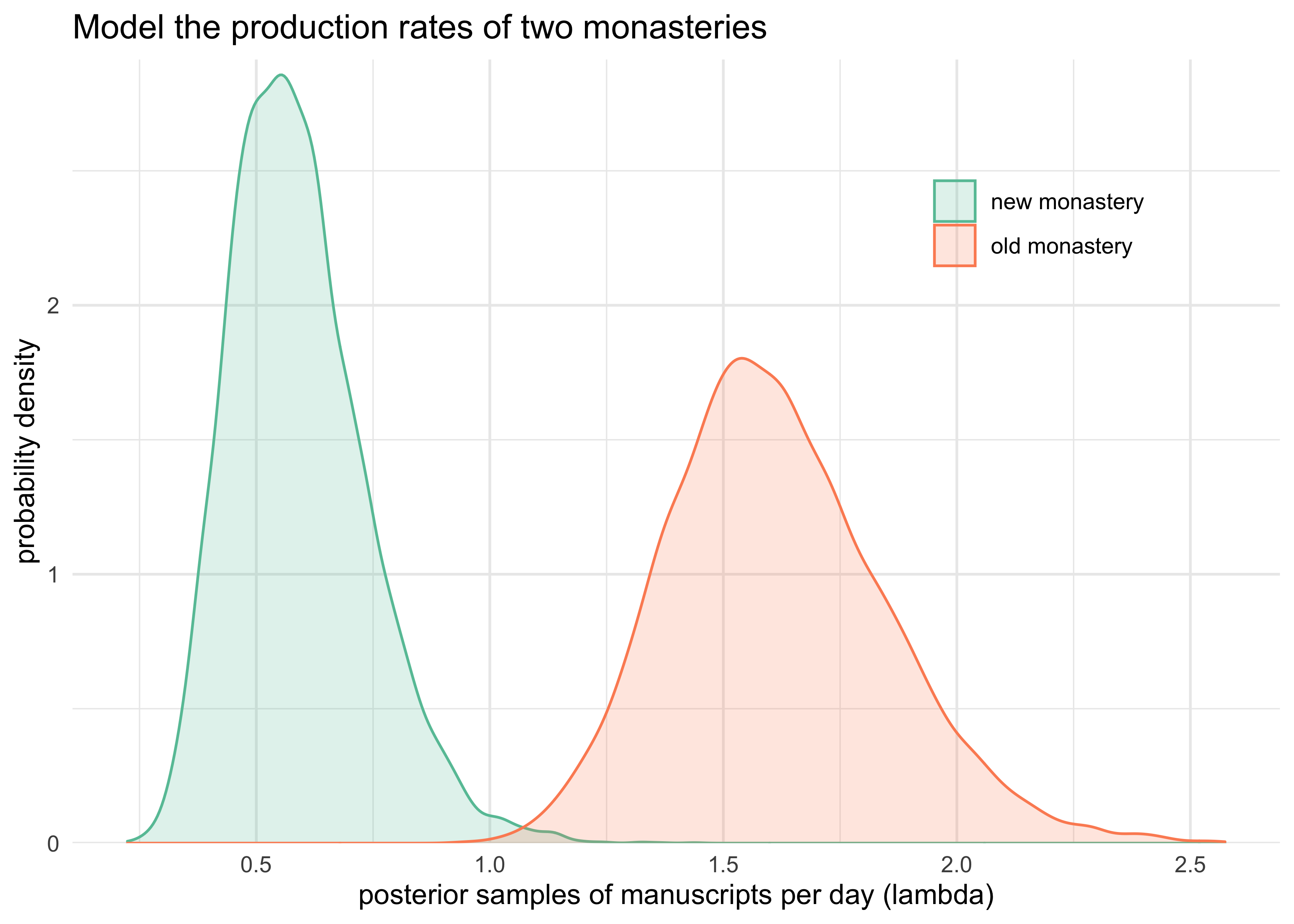
- interpretation
- the MAP of the two posteriors are pretty close to the known rates of manuscript production per day
- the new monastery is predicted to produce 0.6 manuscripts per day while the old monastery produces 1.6 per day
- the 89% intervals are well above 0 and not overlapping
10.3 Other count regressions
- binomial works when there are only 2 outcomes, but there are situations where we are counting more than two outcomes
- multinomial distribution: when more than two types of unordered
events are possible and the probability of each type of event is
constant across trials
- the binomial is actually just a special case of this distribution
- also called categorical regression or maximum entropy classifier (in ML)
$$ \Pr(y_1, …, y_k | n, p_1, …, p_K) = \frac{n!}{\Pi_i y_i !} \Pi_{i=1}^{K} p_i^{y_i} $$
- two approaches to modeling the multinomial:
- explicit approach: directly uses the multinomial likelihood, and uses a generalization of the logit link function
- transform the multinomial likelihood into a series of Poisson likelihoods
10.3.1.1 Explicit multinomial models
- use the multinomial logit as the link function
- takes a vector of “scores”, one for each of $K$ event types
- computes the probability of a particular type of event $k$ as
- available using the
softmax()function from the ‘rethinking’ package
$$ \Pr(k | s_1, …, s_K) = \frac{exp(s_k)}{\sum_{i=1}^{K} exp(s_i)} $$
- use the multinomial logit to create a multinomial logistic
regression
- actually build $K-1$ linear models
- each can use different predictors
- two types of cases when building a multinomial logistic
regression:
- the predictors have different value for different types of
events
- useful when each type of event has its own traits
- want to estimate the association of those traits with the probability of each type of event
- parameters are distinct for each type of event
- useful when interesting in features of some entity that produces each event
- the predictors have different value for different types of
events
- example of case 1: modeling choice of career for many people
- a relevant predictor is expected income
- $\beta_{\text{INCOME}}$ will be in each model
- a different income value multiplies the parameter in each linear model
- simulated data of 500 people with 3 career choices
- each career has a different expected income
- a relevant predictor is expected income
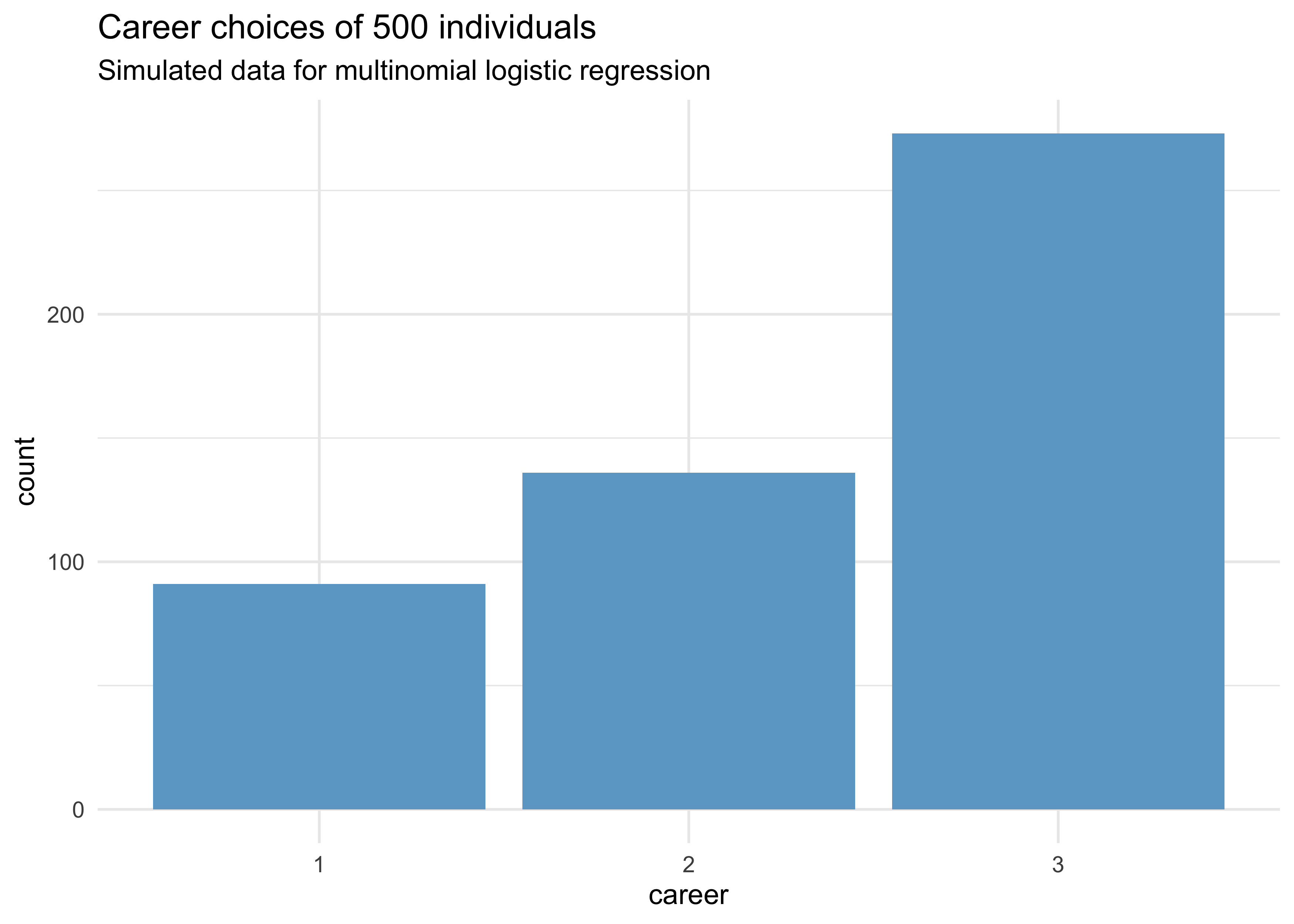
N <- 500               # number of individuals
income <- 1:3          # expected income for each career
score <- 0.5 * income  # scores for each career based on income

# convert scores to probabilities
p <- softmax(score[1], score[2], score[3])

# Sample chosen careers for each person
set.seed(0)
career <- map_dbl(1:N, ~ sample(1:3, size = 1, prob = p))

tibble(career) %>%
    ggplot(aes(x = factor(career))) +
    geom_bar(fill = "skyblue3") +
    labs(x = "career", y = "count",
         title = "Career choices of 500 individuals",
         subtitle = "Simulated data for multinomial logistic regression")
- fit the model with
dcategorical()likelihood- the multinomial logistic regression distribution
- works when each value of the outcome variable (
career) contains individual event types on each row
- convert all the scores to probabilities using
softmax()- this is the multinomial logit link
- one of the event types will be used as the reference type
- this is why there are $K-1$ linear models (where $K$ is the number of event types)
- instead of getting a linear model, this event type is assigned a constant
- the other linear models contain parameters relative to the reference type
m10_16 <- quap(
    alist(
        career ~ dcategorical(softmax(0, s2, s3)),
        s2 <- b*2,
        s3 <- b*3,
        b ~ dnorm(0, 5)
    ),
    data = list(career = career)
)

precis(m10_16)
#>      mean         sd      5.5%     94.5%
#> b 0.38192 0.04258927 0.3138541 0.4499859
- parameter estimates are difficult to interpret
- must instead convert them to a vector of probabilities to make sense of them
- the estimate’s value depends upon which event type is assigned as the reference
b_income <- m10_16@coef["b"]
tibble(
    career = 1:3,
    real = p,
    estimate = softmax(1*0, 2*b_income, 3*b_income)
)
#> # A tibble: 3 x 3
#>   career  real estimate
#>    <int> <dbl>    <dbl>
#> 1      1 0.186    0.159
#> 2      2 0.307    0.341
#> 3      3 0.506    0.500
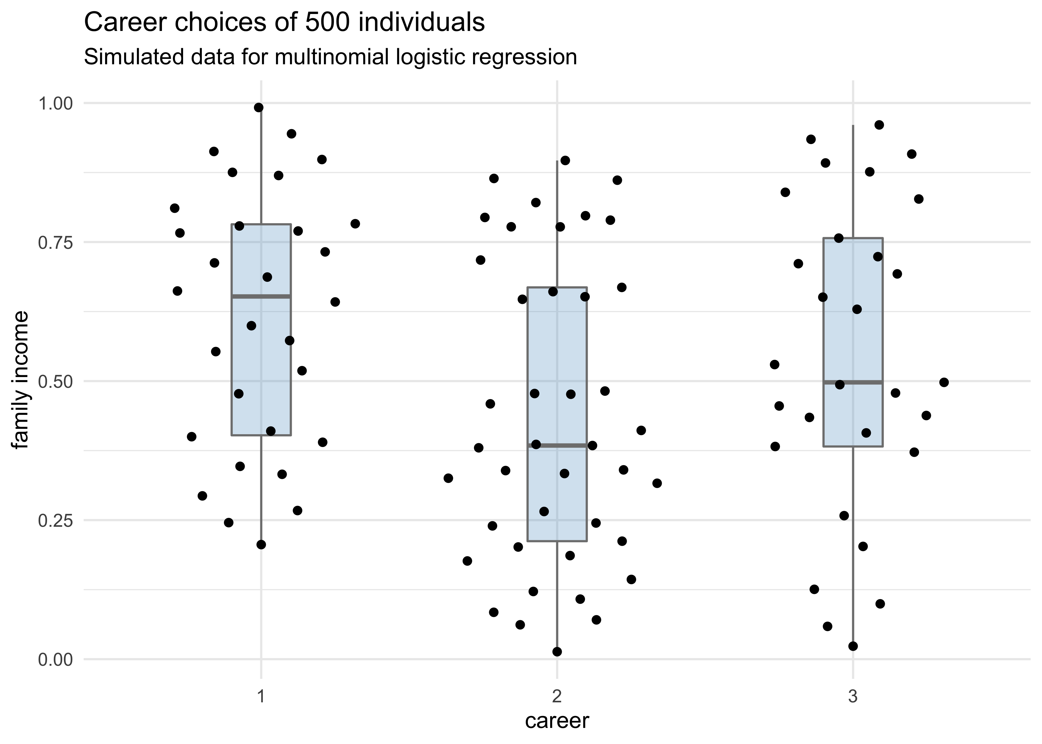
- example of case 2:
- still modeling career choice
- now want to estimate the association between each person’s family income and the career choice
- the predictor variable will have the same value in each linear model, for each row of data
- instead, there is a unique parameter multiplying it in each
model
- is the estimate of the impact of family income on the choice of career
set.seed(0)

N <- 100                   # number of people
family_income <- runif(N)  # family income for each person
b <- seq(1, -1)            # real coefficient values

# Sample the career for each person
career <- map_dbl(1:N, function(i) {
    score <- 0.5 * 1:3 + b*family_income[i]
    p <- softmax(score[1], score[2], score[3])
    return(sample(1:3, size = 1, prob = p))
})

tibble(career) %>%
    ggplot(aes(x = factor(career), y = family_income)) +
    geom_boxplot(color = "grey50", fill = "skyblue3",
                 alpha = 0.3, width = 0.2) +
    ggbeeswarm::geom_quasirandom() +
    labs(x = "career", y = "family income",
         title = "Career choices of 500 individuals",
         subtitle = "Simulated data for multinomial logistic regression")
career_data <- tibble(career, family_income)

m10_17 <- quap(
    alist(
        career ~ dcategorical(softmax(0, s2, s3)),
        s2 <- a2 + b2*family_income,
        s3 <- a3 + b3*family_income,
        c(a2, a3, b2, b3) ~ dnorm(0, 5)
    ),
    data = career_data
)
#> Warning in if (class(prob) == "matrix") {: the condition has length > 1 and only
#> the first element will be used
precis(m10_17)
#>          mean        sd       5.5%      94.5%
#> a2  1.5917877 0.5617334  0.6940293  2.4895461
#> a3  0.5383479 0.6201641 -0.4527942  1.5294900
#> b2 -2.4413279 0.9357371 -3.9368164 -0.9458393
#> b3 -1.0002994 0.9801092 -2.5667032  0.5661044
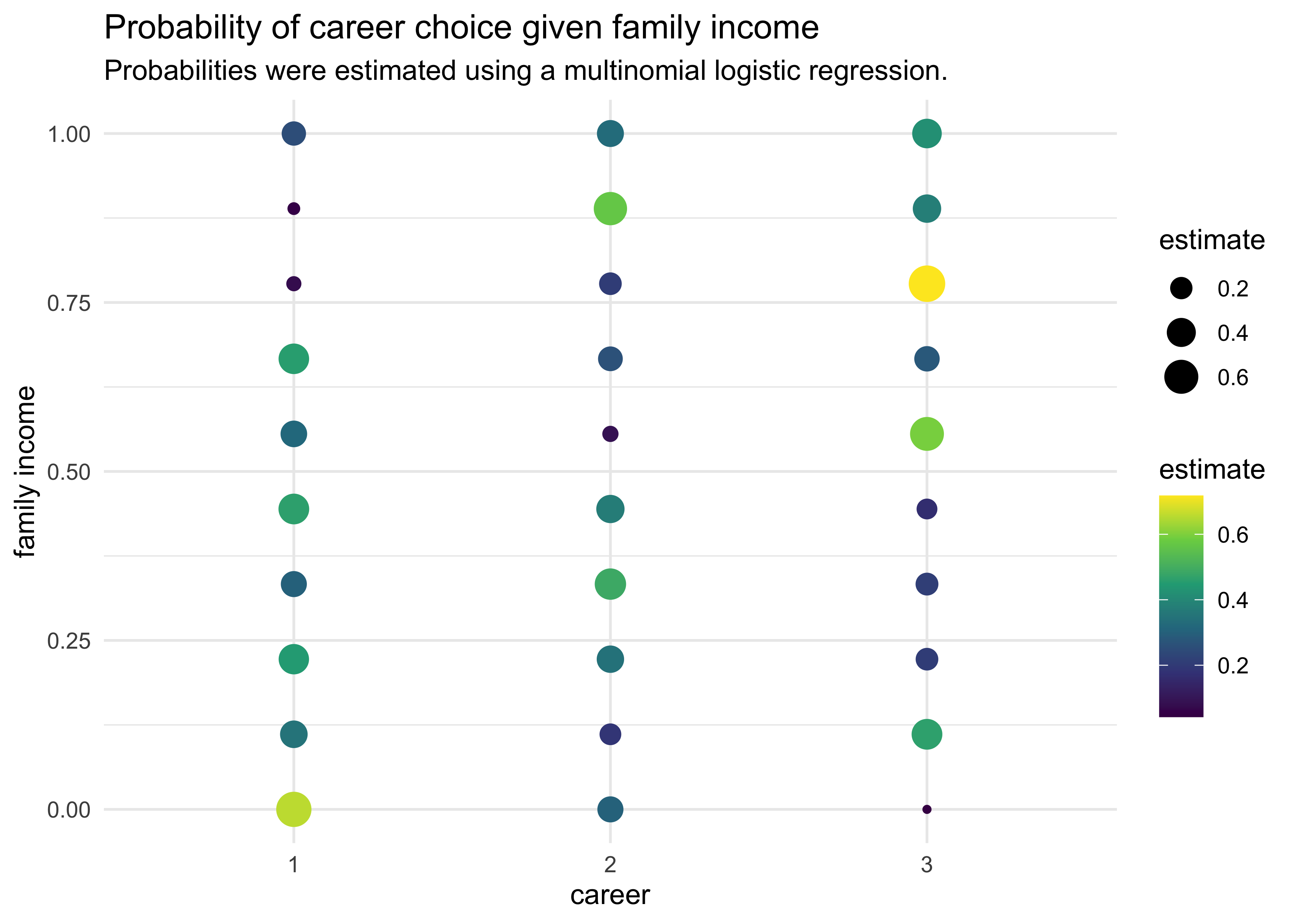
- again, the estimates are difficult to interpret without computing implied predictions
pred_data <- tibble(
    career = rep(1:3, each = 10),
    family_income = rep(seq(0, 1, length.out = 10), 3)
)

pred <- sim(m10_17, pred_data)

pred_data %>%
    mutate(estimate = apply(pred, 2, mean)) %>%
    group_by(family_income) %>%
    mutate(estimate = softmax(estimate)) %>%
    ungroup() %>%
    arrange(family_income, career) %>%
    ggplot(aes(x = factor(career), y = family_income)) +
    geom_point(aes(size = estimate, color = estimate)) +
    scale_color_viridis_c() +
    labs(x = "career",
         y = "family income",
         title = "Probability of career choice given family income",
         subtitle = "Probabilities were estimated using a multinomial logistic regression.",
         color = "estimate", size = "estimate")
10.3.1.2 Multinomial in disguise as Poisson
- another way to fit a multinomial likelihood is to refactor it into a
series of Poisson likelihoods
- is mathematically sound and computationally efficient
- example: UC Berkeley admissions data
- this is binomial, but that is just a special case of the multinomial
- build both the binomial and Poisson models to compare them
d <- as_tibble(UCBadmit) %>%
janitor::clean_names() %>%
rename(rej = "reject")
# Binomial model of overall admission probability.
m_binom <- quap(
alist(
admit ~ dbinom(applications, p),
logit(p) <- a,
a ~ dnorm(0, 10)
),
data = d
)
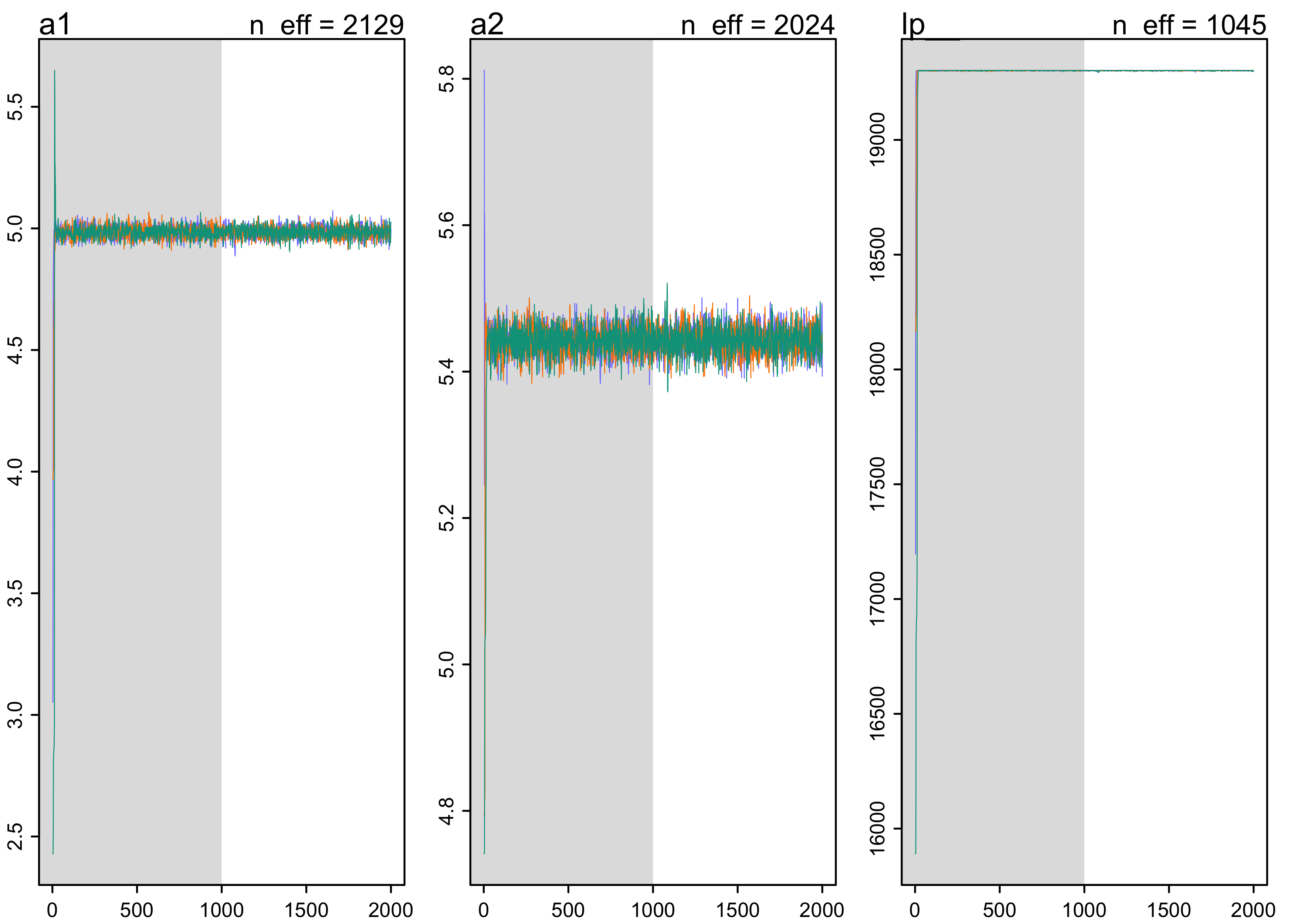
# Poisson model of overall admission rate and rejection rate
stash("m_pois", depends_on = "d", {
m_pois <- map2stan(
alist(
admit ~ dpois(lambda1),
rej ~ dpois(lambda2),
log(lambda1) <- a1,
log(lambda2) <- a2,
c(a1, a2) ~ dnorm(0, 10)
),
data = d,
chains = 3,
cores = 3
)
})
#> Loading stashed object.
plot(m_pois)
- for simplicity, only inspect the posterior means
- the inferred binomial probability of admission over the entire data set:
logistic(coef(m_binom))
#>         a
#> 0.3877606
- calculate the implied probability of admission for the Poisson model
$$ p_\text{ADMIT} = \frac{\lambda_1}{\lambda_1 + \lambda_2} = \frac{\exp(a_1)}{\exp(a_1) + \exp(a_2)} $$
k <- as.numeric(coef(m_pois))
exp(k[1]) / (exp(k[1]) + exp(k[2]))
#> [1] 0.3874979
- the inferences are the same
10.3.2 Geometric
- have a count variable of the number of events until something
happened
- a.k.a. event history analysis or survival analysis
- geometric distribution: likelihood function for when the
probability of the terminating event is constant through time
(or space) and the units of time (or distance) are discrete
- $y$: number of time steps (Events) until the terminating event
- $p$: the probability of the event at each time point
$$ \Pr(y | p) = p(1-p)^{y-1} $$
- simulation example
set.seed(0)
N <- 1e2
x <- runif(N) # a predictor variable
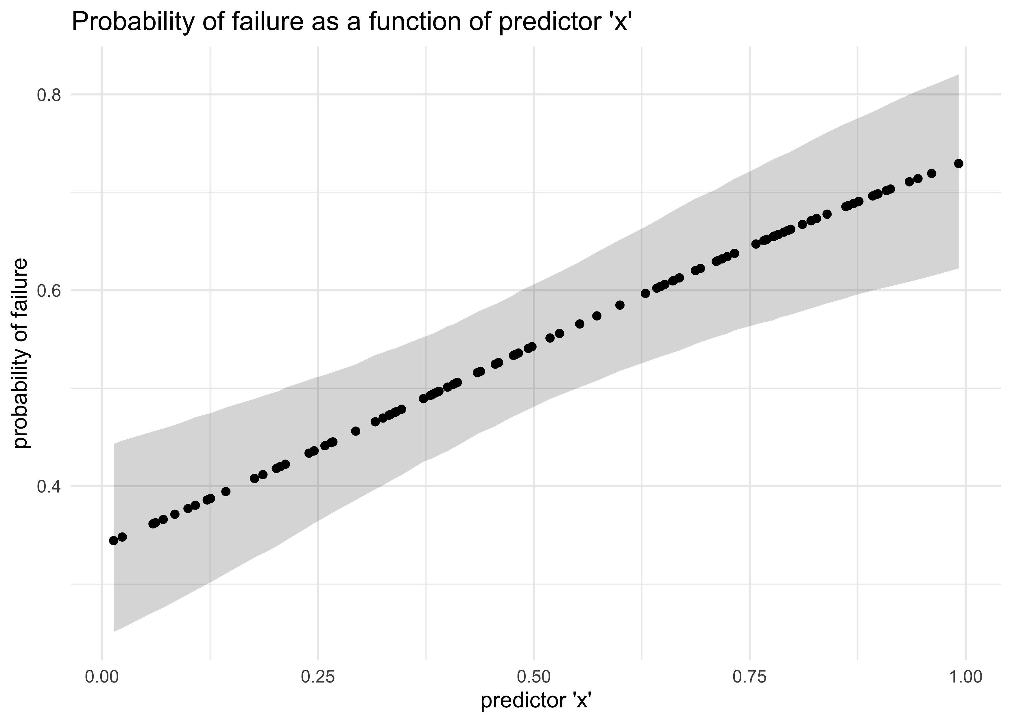
p <- logistic(-1 + 2*x) # probability of failure given a value `x`
y <- rgeom(N, prob = p) # the number of steps until failure
d <- tibble(x, y)
m10_18 <- quap(
alist(
y ~ dgeom(p),
logit(p) <- a + b*x,
a ~ dnorm(0, 10),
b ~ dnorm(0, 1)
),
data = d
)
precis(m10_18)
#>         mean        sd       5.5%      94.5%
#> a -0.6846385 0.2684581 -1.1136864 -0.2555906
#> b  1.7184947 0.5062962  0.9093355  2.5276538
post_p <- link(m10_18)
post_p_avg <- apply(post_p, 2, mean)
post_p_pi <- apply(post_p, 2, PI) %>% pi_to_df()

tibble(x, post_p_avg) %>%
    bind_cols(post_p_pi) %>%
    ggplot(aes(x = x, y = post_p_avg)) +
    geom_ribbon(aes(ymin = x5_percent, ymax = x94_percent),
                alpha = 0.2) +
    geom_point() +
    labs(x = "predictor 'x'",
         y = "probability of failure",
         title = "Probability of failure as a function of predictor 'x'")
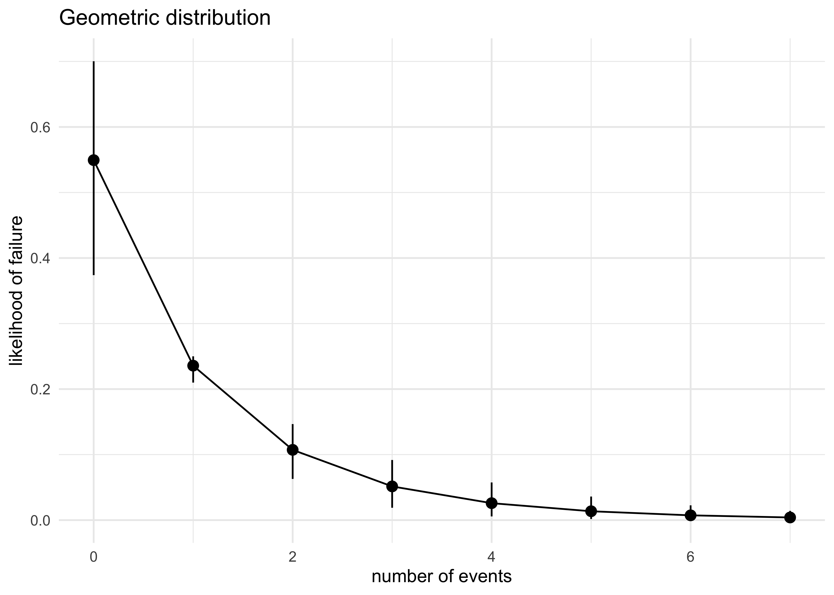
num_events <- seq(0, max(y))
expand.grid(num_events, post_p_avg) %>%
    as_tibble() %>%
    set_names(c("num_events", "p")) %>%
    mutate(density = map2_dbl(num_events, p, ~ dgeom(.x, .y))) %>%
    group_by(num_events) %>%
    summarise(
        avg_density = mean(density),
        density_pi = list(pi_to_df(PI(density)))
    ) %>%
    ungroup() %>%
    unnest(density_pi) %>%
    ggplot(aes(x = num_events, y = avg_density)) +
    geom_pointrange(aes(ymin = x5_percent, ymax = x94_percent)) +
    geom_line() +
    labs(x = "number of events",
         y = "likelihood of failure",
         title = "Geometric distribution")
10.3.3 Negative-binomial and beta-binomial
- example:
- we have several bags of marbles, each containing some number of blue and white marbles
- we sample from one bag at a time, counting the number of blue marbles
- because we are using different sets of marbles, the counts of blues will vary more than if we only used one bag
- this is an example of a mixture
- multiple different maximum entropy distributions
- we will explore these more in the next chapter
- the most common generalizations of count GLMs for mixtures are
beta-binomial and negative-binomial
- used then the counts are thought to be over-dispersed: the variation exceeds the expected from just a binomial or Poisson
10.5 Practice
Easy
10E1. If an event has probability 0.35, what are the log-odds of this event?
$\log\frac{0.35}{1 - 0.35} \approx -0.619$
10E2. If an event has log-odds 3.2, what is the probability of this event?
$$ y = \log \frac{p}{1-p} $$ $$ p = \frac{1}{1 + \exp(-x)} $$ $$ \text{logit} 3.2 \approx 0.961 $$
10E3. Suppose that a coefficient in a logistic regression has value 1.7. What does this imply about the proportional change in odds of the outcome?
Taking the exponent of the coefficient returns the proportional change in odds, a relative effect size for the predictor.
$\exp(1.7) \approx 5.47$
This implies that for each unit increase in the predictor, there is an increase in the odds of the event happening by 5.47.
10E4. Why do Poisson regressions sometimes require the use of an offset? Provide an example.
The offset is required when there are two different types of rates being used in the model for a single predictor. It effectively normalizes the values to use the same unit of rate.
Medium
10M1. As explained in the chapter, binomial data can be organized in aggregated and disaggregated forms, without any impact on inference. But the likelihood of the data does change when the data are converted between the two formats. Can you explain why?
Because we are moving from binomial events (i.e. 1 or 0) to a counts-based metric that is still discrete but not restricted to outcome of 0 and 1, we use a Poisson likelihood function instead of a binomial likelihood function.
10M2. If a coefficient in a Poisson regression has value 1.7, what does this imply about the change in the outcome?
An unit increase in the predictor is expected to have a $\exp(1.7) = 5.47$ increase in the positive probability of the predicted event happening.
10M3. Explain why the logit link is appropriate for a binomial generalized linear model.
It resales a linear function to one that is bound between 0 and 1 so it will be a possible value of a probability.
10M4. Explain why the log link is appropriate for a Poisson generalized linear model.
It ensures that the parameter being estimated is restricted to positive values as expected for a value of a rate.
10M5. What would it imply to use a logit link for the mean of a Poisson generalized linear model? Can you think of a real research problem for which this would make sense?
It would constrain the value for the rate to be between 0 and 1.
10M6. State the constraints for which the binomial and Poisson distributions have maximum entropy. Are the constraints different at all for binomial and Poisson? Why or why not?
Both are only used when there are two possible outcomes. The probability of the outcome happening is constant.
The constraints are not different because a Poisson is a generalization of the binomial GLM.
Hard
10H1. Use map to construct a quadratic approximate posterior distribution for the chimpanzee model that includes a unique intercept for each actor, m10.4 (page 299). Compare the quadratic approximation to the posterior distribution produced instead from MCMC. Can you explain both the differences and the similarities between the approximate and the MCMC distributions?
d <- chimpanzees %>%
    as_tibble() %>%
    janitor::clean_names()

m10h_1 <- quap(
    alist(
        pulled_left ~ dbinom(1, p),
        logit(p) <- alpha[actor] + bp*prosoc_left + bpc*prosoc_left*condition,
        alpha[actor] ~ dnorm(0, 10),
        c(bp, bpc) ~ dnorm(0, 10)
    ),
    data = d
)

stash("m10h_2", depends_on = "d", {
    m10h_2 <- map2stan(
        alist(
            pulled_left ~ dbinom(1, p),
            logit(p) <- alpha[actor] + bp*prosoc_left + bpc*prosoc_left*condition,
            alpha[actor] ~ dnorm(0, 10),
            c(bp, bpc) ~ dnorm(0, 10)
        ),
        data = d,
        chains = 3, iter = 2e3, warmup = 500, cores = 3
    )
})
#> Loading stashed object.
precis(m10h_1)
#> 7 vector or matrix parameters hidden. Use depth=2 to show them.

#>           mean        sd       5.5%     94.5%
#> bp   0.8221311 0.2610079  0.4049901 1.2392721
#> bpc -0.1318304 0.2969351 -0.6063901 0.3427292
precis(m10h_2)
#> 7 vector or matrix parameters hidden. Use depth=2 to show them.

#>           mean        sd       5.5%     94.5%    n_eff     Rhat4
#> bp   0.8403843 0.2572503  0.4320854 1.2593873 2474.788 1.0013597
#> bpc -0.1390248 0.3022528 -0.6228900 0.3453836 3655.271 0.9995638
m10h_1_link <- extract.samples(m10h_1, clean = FALSE) %>%
    as.data.frame() %>%
    as_tibble() %>%
    janitor::clean_names() %>%
    pivot_longer(tidyselect::everything()) %>%
    add_column(type = "QUAP")

m10h_2_link <- extract.samples(m10h_2, clean = FALSE) %>%
    as.data.frame() %>%
    as_tibble() %>%
    janitor::clean_names() %>%
    add_column(type = "MCMC") %>%
    pivot_longer(-type, names_to = "name", values_to = "value")

bind_rows(m10h_1_link, m10h_2_link) %>%
    ggplot(aes(x = value, fill = type, color = type)) +
    facet_wrap(~ name, scales = "free") +
    geom_density(alpha = 0.2) +
    scale_color_brewer(palette = "Set1") +
    scale_fill_brewer(palette = "Set1")
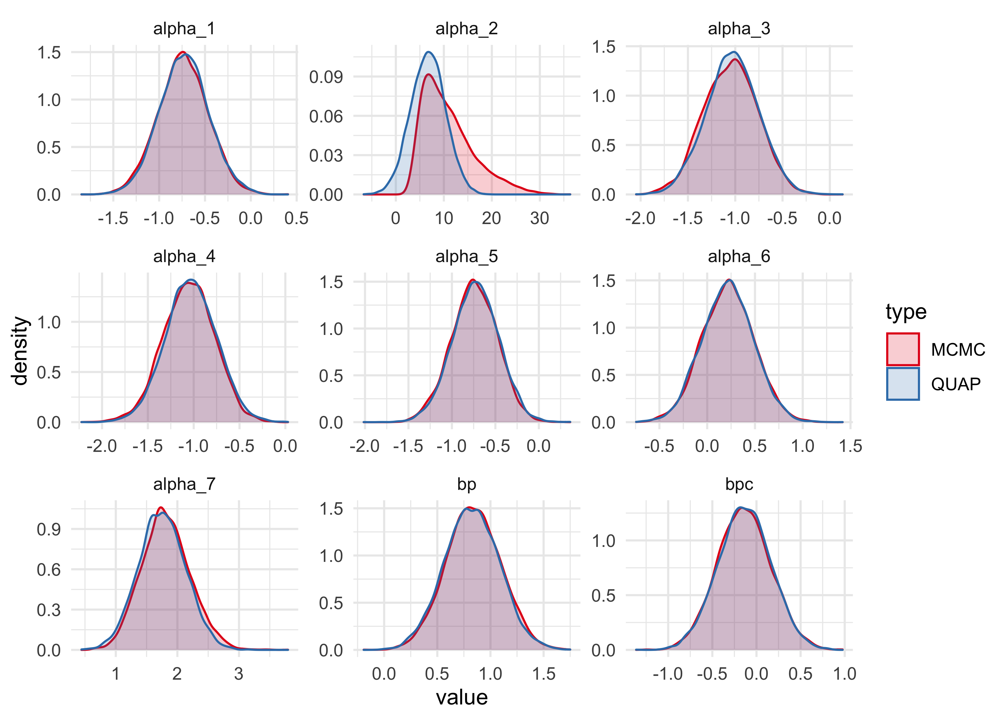
The only obvious distinction between the samples from the quadratic approximation and the MCMC are for the intercept for actor number 2. The MCMC samples suggest that the distribution is not Gaussian, but instead highly skewed. This means we should not rely on the quadratic approximation for this analysis.
10H2. Use WAIC to compare the chimpanzee model that includes a unique
intercept for each actor, m10.4 (page 299), to the simpler models fit
in the same section.
stash("m10h_3", depends_on = "d", {
    m10h_3 <- map2stan(
        m10_1,
        data = d,
        chains = 3, iter = 2e3, warmup = 500, cores = 3
    )
})
#> Loading stashed object.
stash("m10h_4", depends_on = "d", {
    m10h_4 <- map2stan(
        m10_2,
        data = d,
        chains = 3, iter = 2e3, warmup = 500, cores = 3
    )
})
#> Loading stashed object.
stash("m10h_5", depends_on = "d", {
    m10h_5 <- map2stan(
        m10_3,
        data = d,
        chains = 3, iter = 2e3, warmup = 500, cores = 3
    )
})
#> Loading stashed object.
compare(m10h_2, m10h_3, m10h_4, m10h_5)
#>            WAIC        SE    dWAIC      dSE     pWAIC       weight
#> m10h_2 529.8900 19.969422   0.0000       NA 8.3479741 1.000000e+00
#> m10h_4 680.5999  9.344300 150.7099 19.24396 2.0520918 1.878275e-33
#> m10h_5 682.3688  9.480240 152.4788 19.19259 3.0144773 7.756330e-34
#> m10h_3 687.9294  7.176113 158.0393 19.96052 0.9943216 4.810575e-35
10H3. The data contained in library(MASS);data(eagles) are records
of salmon pirating attempts by Bald Eagles in Washington State. See
?eagles for details. While one eagle feeds, sometimes another will
swoop in and try to steal the salmon from it. Call the feeding eagle the
“victim” and the thief the “pirate.” Use the available data to build a
binomial GLM of successful pirating attempts.
(a) Consider the following model:
$$ y_i ~ \text{Binomial}(n_i, p_i) $$ $$ \log \frac{p_i}{1 - p_i} = \alpha + \beta_P P_i + \beta_V V_i + \beta_A A_i $$ $$ \alpha ~ \text{Normal}(0, 10) $$ $$ \beta_P ~ \text{Normal}(0, 5) $$ $$ \beta_V ~ \text{Normal}(0, 5) $$ $$ \beta_A ~ \text{Normal}(0, 5) $$
data("eagles")
d <- as_tibble(eagles) %>%
    mutate(large_pirate = as.numeric(P == "L"),
           adult_pirate = as.numeric(A == "A"),
           large_victim = as.numeric(V == "L"))


m10h3_1 <- quap(
    alist(
        y ~ dbinom(n, p),
        logit(p) <- alpha + b_psize*large_pirate + b_vsize*large_victim + b_padult*adult_pirate,
        alpha ~ dnorm(0, 10),
        c(b_psize, b_vsize, b_padult) ~ dnorm(0, 5)
    ),
    data = d
)

stash("m10h3_1_stan", depends_on = "d", {
    m10h3_1_stan <- map2stan(
        alist(
            y ~ dbinom(n, p),
            logit(p) <- alpha + b_psize*large_pirate + b_vsize*large_victim + b_padult*adult_pirate,
            alpha ~ dnorm(0, 10),
            c(b_psize, b_vsize, b_padult) ~ dnorm(0, 5)
        ),
        data = d,
        chains = 2, iter = 2e3, warmup = 500, cores = 2
    )
})
#> Loading stashed object.
precis(m10h3_1)
#>                mean        sd       5.5%     94.5%
#> alpha     0.5915989 0.6622744 -0.4668436  1.650041
#> b_psize   4.2417198 0.8959878  2.8097583  5.673681
#> b_vsize  -4.5925533 0.9613695 -6.1290074 -3.056099
#> b_padult  1.0813713 0.5339177  0.2280677  1.934675
precis(m10h3_1_stan)
#>                mean        sd       5.5%     94.5%    n_eff     Rhat4
#> alpha     0.6558778 0.6894632 -0.4258674  1.766055 1404.090 0.9998688
#> b_psize   4.6313846 0.9646882  3.2190820  6.275450 1388.673 0.9997662
#> b_vsize  -5.0396598 1.0048863 -6.6805765 -3.508317 1454.409 0.9993940
#> b_padult  1.1314736 0.5531476  0.2192818  1.970850 1529.977 1.0005094
m10h3_1_samples <- extract.samples(m10h3_1,
                                   clean = FALSE) %>%
    as.data.frame() %>%
    as_tibble() %>%
    janitor::clean_names() %>%
    pivot_longer(tidyselect::everything()) %>%
    add_column(type = "QUAP")

m10h3_1_stan_samples <- extract.samples(m10h3_1_stan,
                                        clean = FALSE) %>%
    as.data.frame() %>%
    as_tibble() %>%
    janitor::clean_names() %>%
    add_column(type = "MCMC") %>%
    pivot_longer(-type, names_to = "name", values_to = "value")

bind_rows(m10h3_1_samples, m10h3_1_stan_samples) %>%
    ggplot(aes(x = value, fill = type, color = type)) +
    facet_wrap(~ name, scales = "free") +
    geom_density(alpha = 0.2) +
    scale_color_brewer(palette = "Set1") +
    scale_fill_brewer(palette = "Set1")
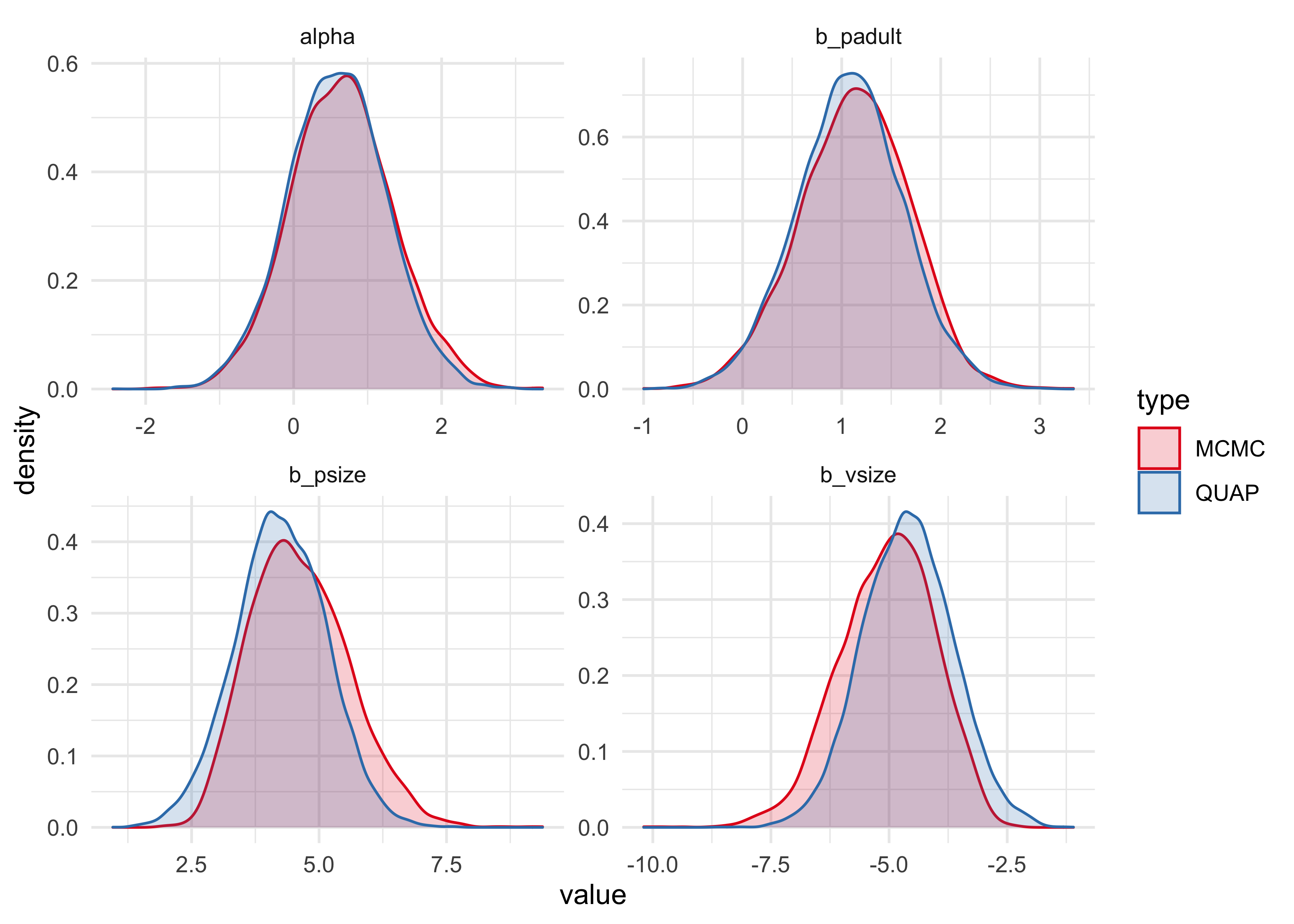
The quadratic approximation seems to undestimate the coefficient for the
size of the pirate, and overestimate the coefficient for the size of the
victim. Therefore, I will move forward using the map2stan results.
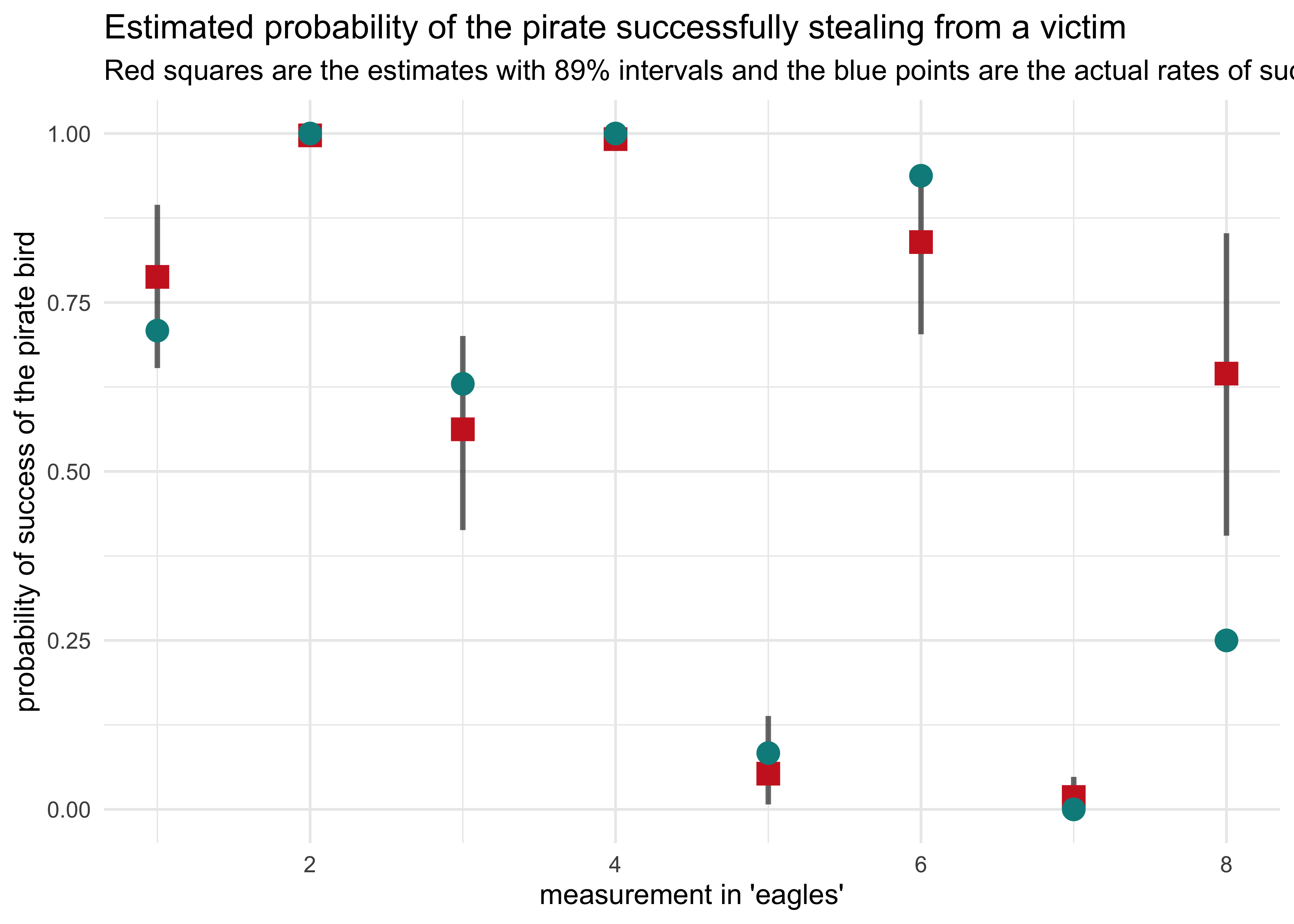
(b) Now interpret the estimates. If the quadratic approximation turned out okay, then it’s okay to use the map estimates. Otherwise stick to map2stan estimates. Then plot the posterior predictions. Compute and display both (1) the predicted probability of success and its 89% interval for each row (i) in the data, as well as (2) the predicted success count and its 89% interval. What different information does each type of posterior prediction provide?
post <- link(m10h3_1_stan)
#> [ 100 / 1000 ][ 200 / 1000 ][ 300 / 1000 ][ 400 / 1000 ][ 500 / 1000 ][ 600 / 1000 ][ 700 / 1000 ][ 800 / 1000 ][ 900 / 1000 ][ 1000 / 1000 ]
pred_prob <- apply(post, 2, mean)
pred_pi <- apply(post, 2, PI) %>% pi_to_df()

d %>%
    mutate(frac_success = y / n,
           row_idx = row_number(),
           prob_success = pred_prob) %>%
    bind_cols(pred_pi) %>%
    ggplot(aes(x = row_idx)) +
    geom_linerange(aes(ymin = x5_percent, ymax = x94_percent),
                alpha = 0.6, size = 1) +
    geom_point(aes(y = prob_success),
               shape = 15, color = "firebrick3", size = 4) +
    geom_point(aes(y = frac_success),
               shape = 16, color = "cyan4", size = 4) +
    labs(x = "measurement in 'eagles'",
         y = "probability of success of the pirate bird",
         title = "Estimated probability of the pirate successfully stealing from a victim",
         subtitle = "Red squares are the estimates with 89% intervals and the blue points are the actual rates of success.")
d %>%
    mutate(row_idx = row_number(),
           prob_success = pred_prob,
           pred_num_success = pred_prob * n) %>%
    bind_cols(pred_pi) %>%
    mutate(x5_percent = x5_percent * n,
           x94_percent = x94_percent * n) %>%
    ggplot(aes(x = row_idx)) +
    geom_linerange(aes(ymin = x5_percent, ymax = x94_percent),
                alpha = 0.6, size = 1) +
    geom_point(aes(y = pred_num_success),
               shape = 15, color = "firebrick3", size = 4) +
    geom_point(aes(y = y),
               shape = 16, color = "cyan4", size = 4) +
    labs(x = "measurement in 'eagles'",
         y = "num. of successful events",
         title = "Estimated number of successful raids by the pirate eagles",
         subtitle = "Red squares are the estimates with 89% intervals and the blue points are the actual number of successful events.")
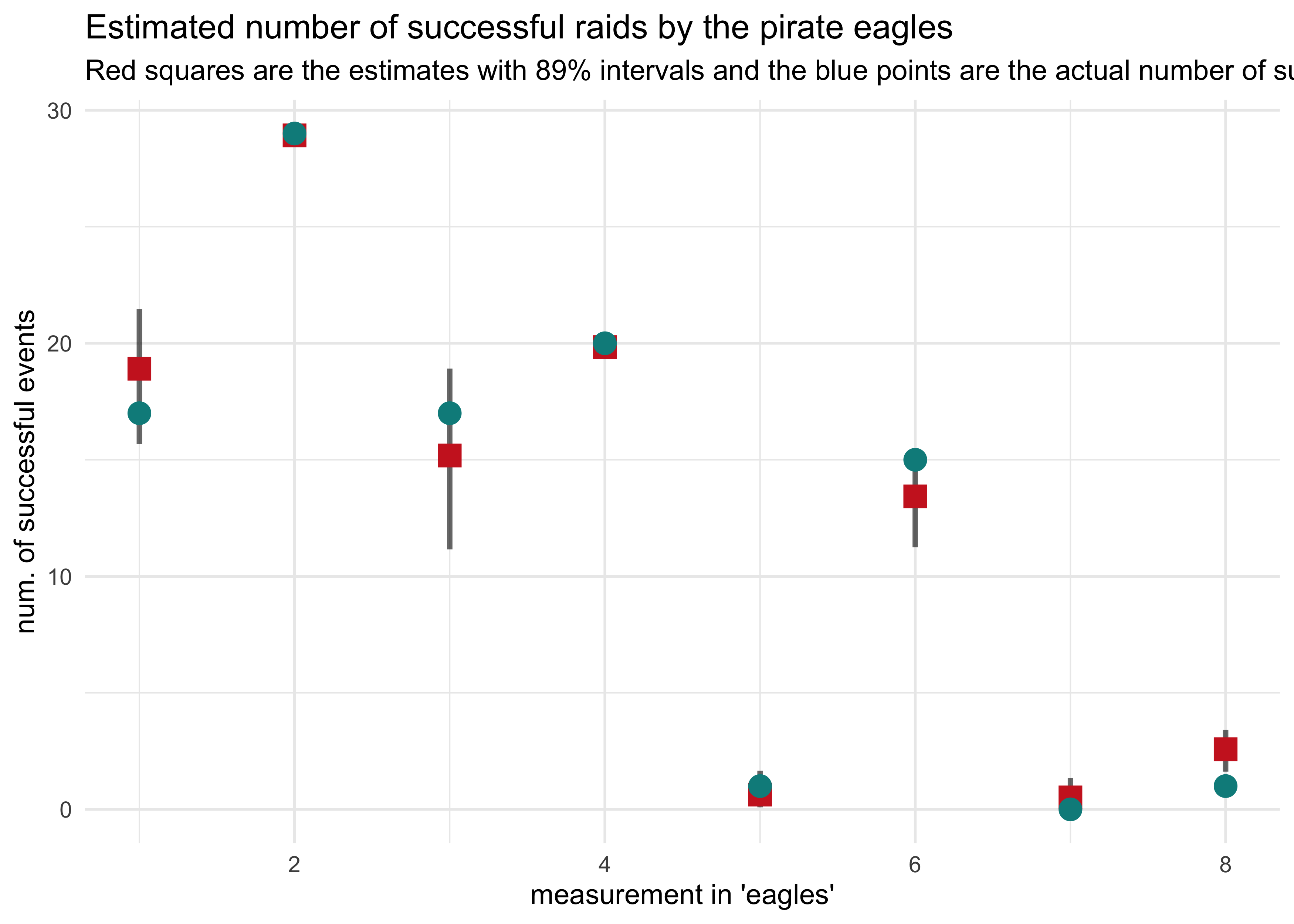
The most striking difference between the two plots is for the last column where the probability of success was outside of the 89% interval estimated by the model, but the actual number of successful events was quite accurate.
Joshua Cook
Graduate Student
My research interests include cancer genetics and evolution. I also learning about programming and computer science in general.